Introduction
Building an image
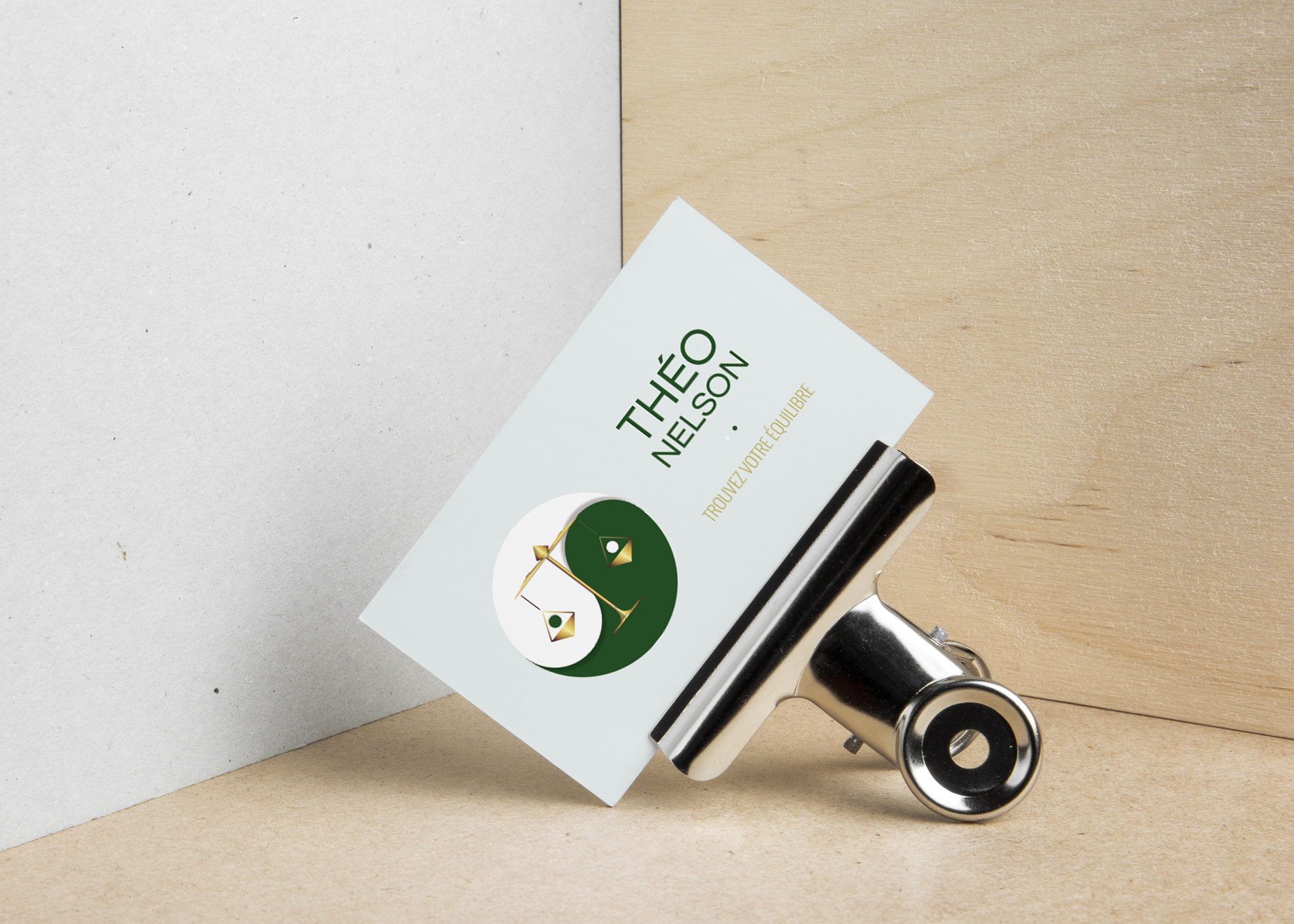
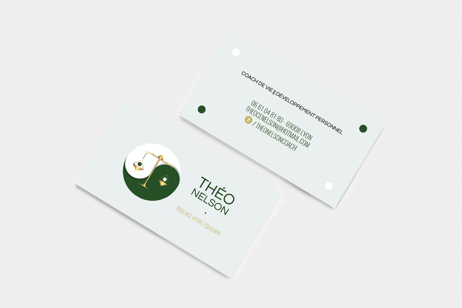
The client wanted to combine body and mind in his company image, and emphasise that
he would help you bring back balance in and between both.
The Yin and Yang imagery
came quickly and became a request from the client. We ended up adding the picture of
a balance that I first suggested as an alternative. Still, the client insisted on
keeping both to really highlight the tangible and the ideology.
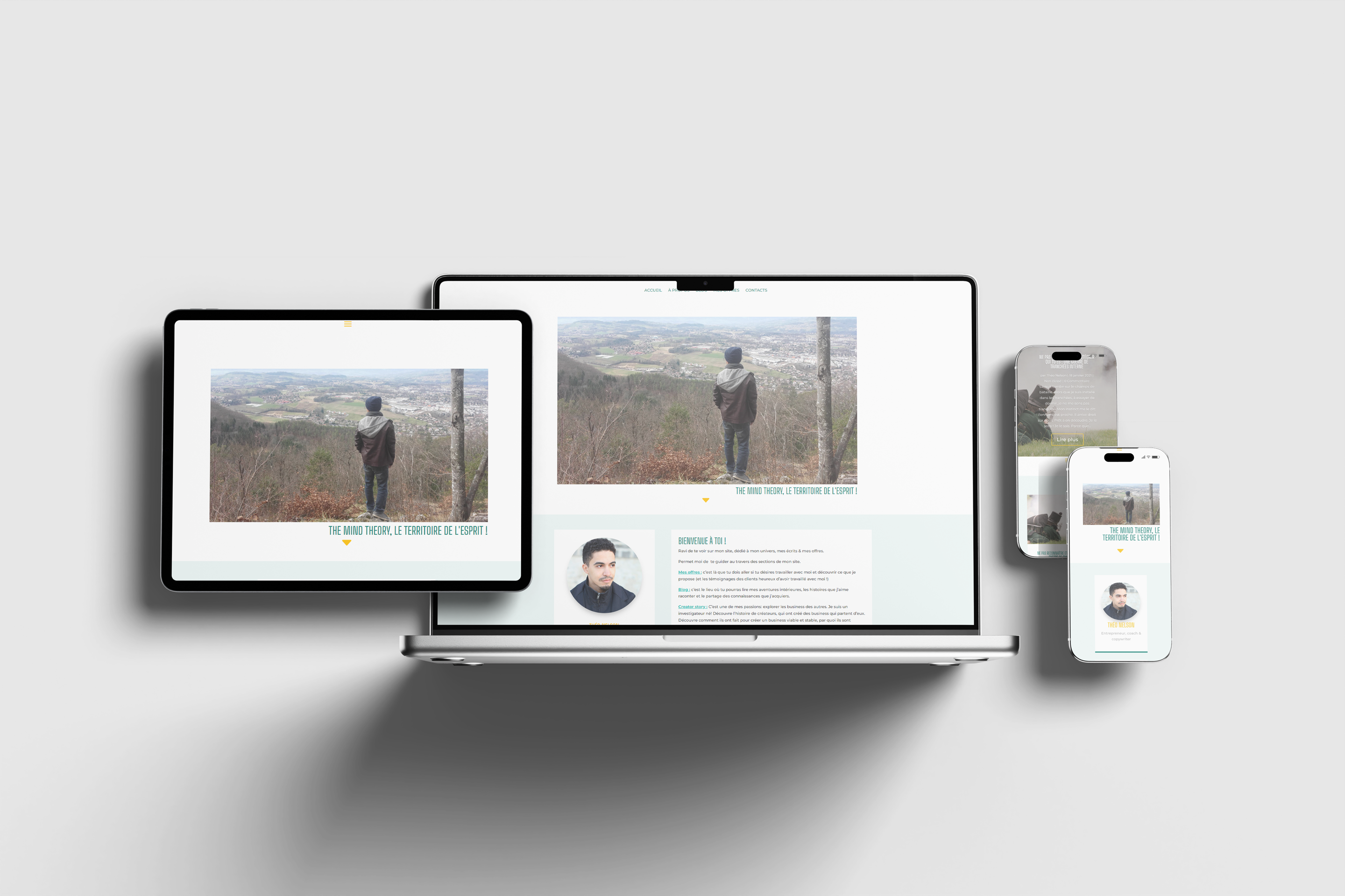
Building a plateform
As a coach and copywriter, the client and his business needed a place to post online.
A hub that better fit his image and where he could post more complex texts and longer
thoughts than he could on classic social media.
To offer him a functional, intuitive,
and secure back office, WordPress was an easy choice.