On my way!

Ô Soleils !

Branding / Print

Community Coffee Shop fighting the isolation of disadvantaged people such as elders, single parents, minorities, etc.

Introduction

The Goal

Ô Soleils is a charity project that wants to reduce and even eliminate the isolation of vulnerable people like elders, single parents, disadvantaged youth, minorities, people in rehabilitation programs, etc.
The idea is to create a space where those people can get out of a lonely situation, find community, build human connections, and even find a new family by organising workshops and events and offering a place where they can share a passion, a specific interest, a skill, or whatever.
The Coffee Shop would then become a hub for people to come to when they feel lonely or want to meet people, drink a coffee, have a chat over a meal, and so forth.

The Image

To create a warm and welcoming image, we first had to be mindful of the project's name.
"Au Soleil" was nice and could have been an easy way for people to say, "Allons au Soleil ! / Let's go to Au Soleil/under the sun!", but it is already used by another charity in a neighbouring region. So we went for "Ô Soleils !", plurals, which keep the same twist pronounced but give a more collective feeling and the "Ô" a feeling of spectacular, a highlight to the Soleils, hinting that the various people are themselves the suns shinning on each other, people with solar presence, easy to be around, generous, rich of stories, skills, and more.
Description

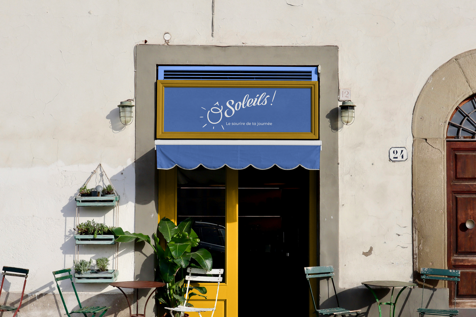
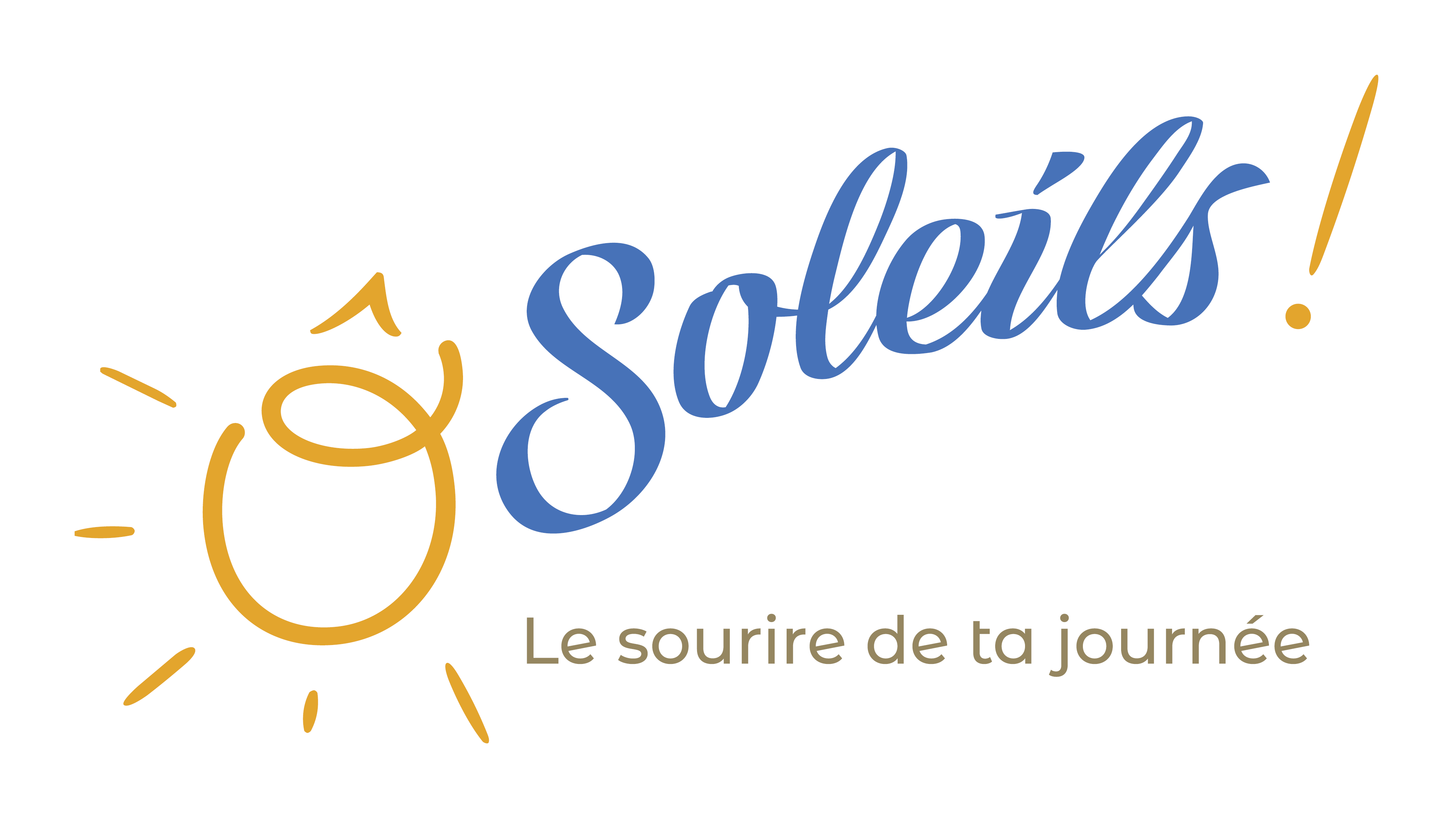
The logo uses a manuscript-style font on a curved baseline to emphasise the dynamism the client wants to convey in the identity.
The "Ô" is a different font because we wanted a more circular shape so it could be used as the sun, which is also why we chose "Ô Soleils !" rather than "Au Soleil".
For the colours, golden yellow was an obvious choice to suggest the warmth they want to provide to their audience. To contrast with the yellow, we picked a blue deeper than a sky or water blue to avoid any "beach" vibe for the logo..
The ! was almost mandatory with the "Ô", which is why it's yellow too and in the same style as the sunrays.

cafe associatif community coffee shop local support network families elders children minorities lgbtqi+ rehabilitation event charity group activities ain france del-ightful delphine morichon illustration graphic design webdesign stockholm sweden sverige
Logo

Branding

Flyers

Branding / Print

Flyers

Branding / Print

Flyers

Branding / Print

storefront

Branding / Sign


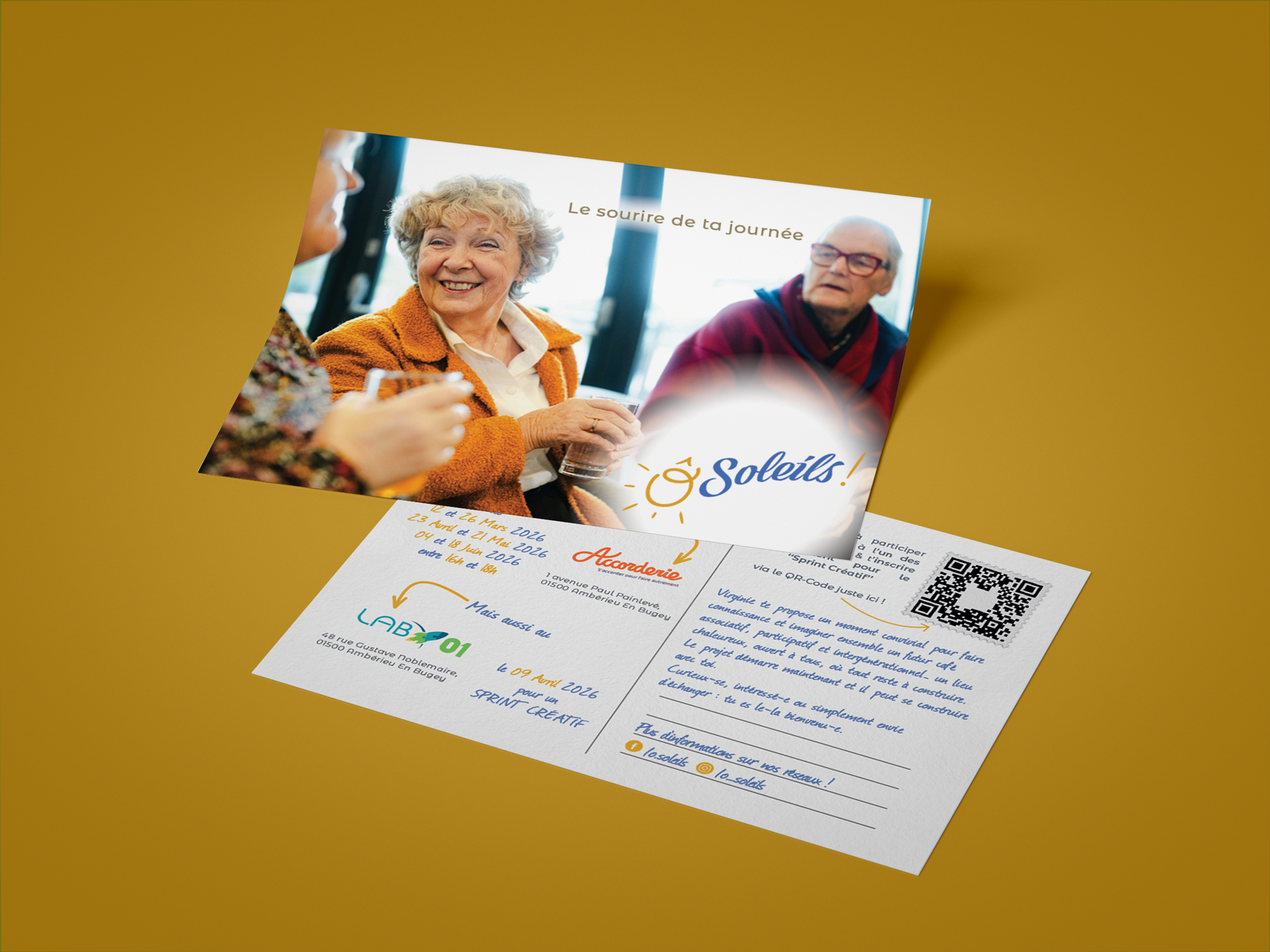
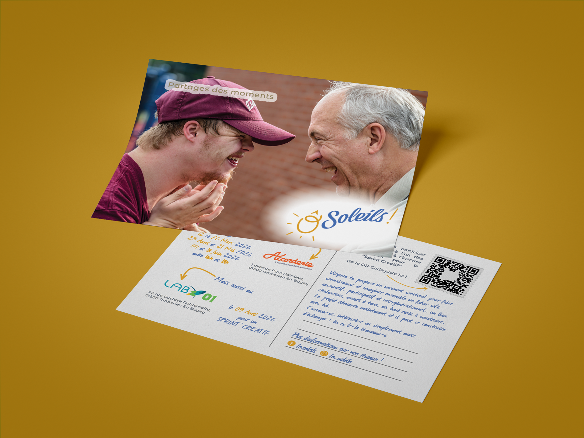
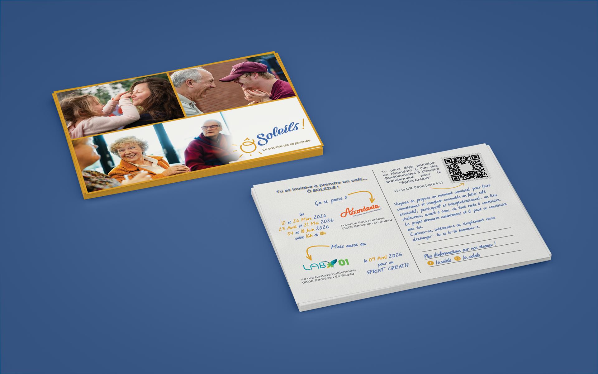
The project is still under development, and we're looking for a local. In the meantime, since the client needs to build the space for their future public, we're creating promotional postcards for several brainstorming sessions to learn what people would want from such a space.