Description
The main goal was to highlight the service, of course, but as freight is often
presented as a purely industrial service, we preferred a more elegant approach,
yet powerful still.
By emphasising the elements of water and air, we kept
this pure natural force of nature, while the overlay softens the texture and suggests
the easing of this force.
The company manages to navigate these elements to provide
the best services, an idea accentuated by the triangular lines mimicking a wake/trail
from the logo.
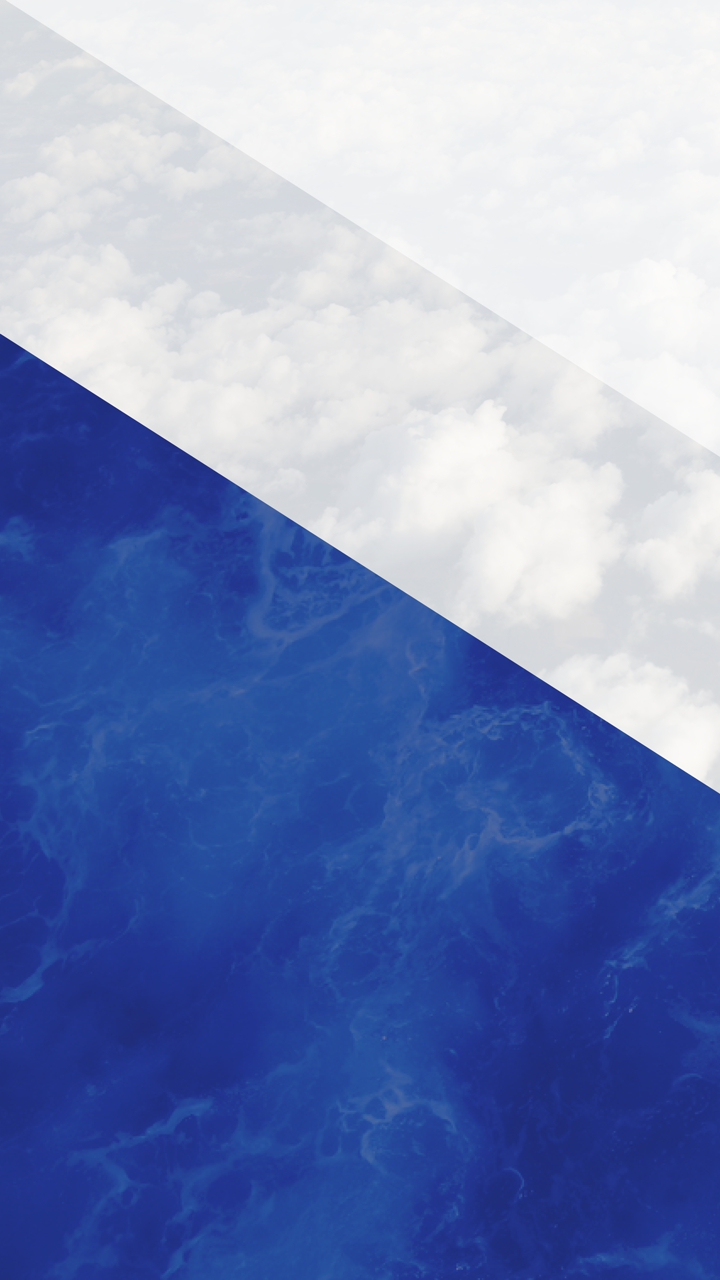
Background
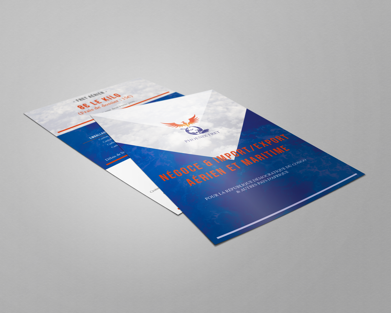
Brochure
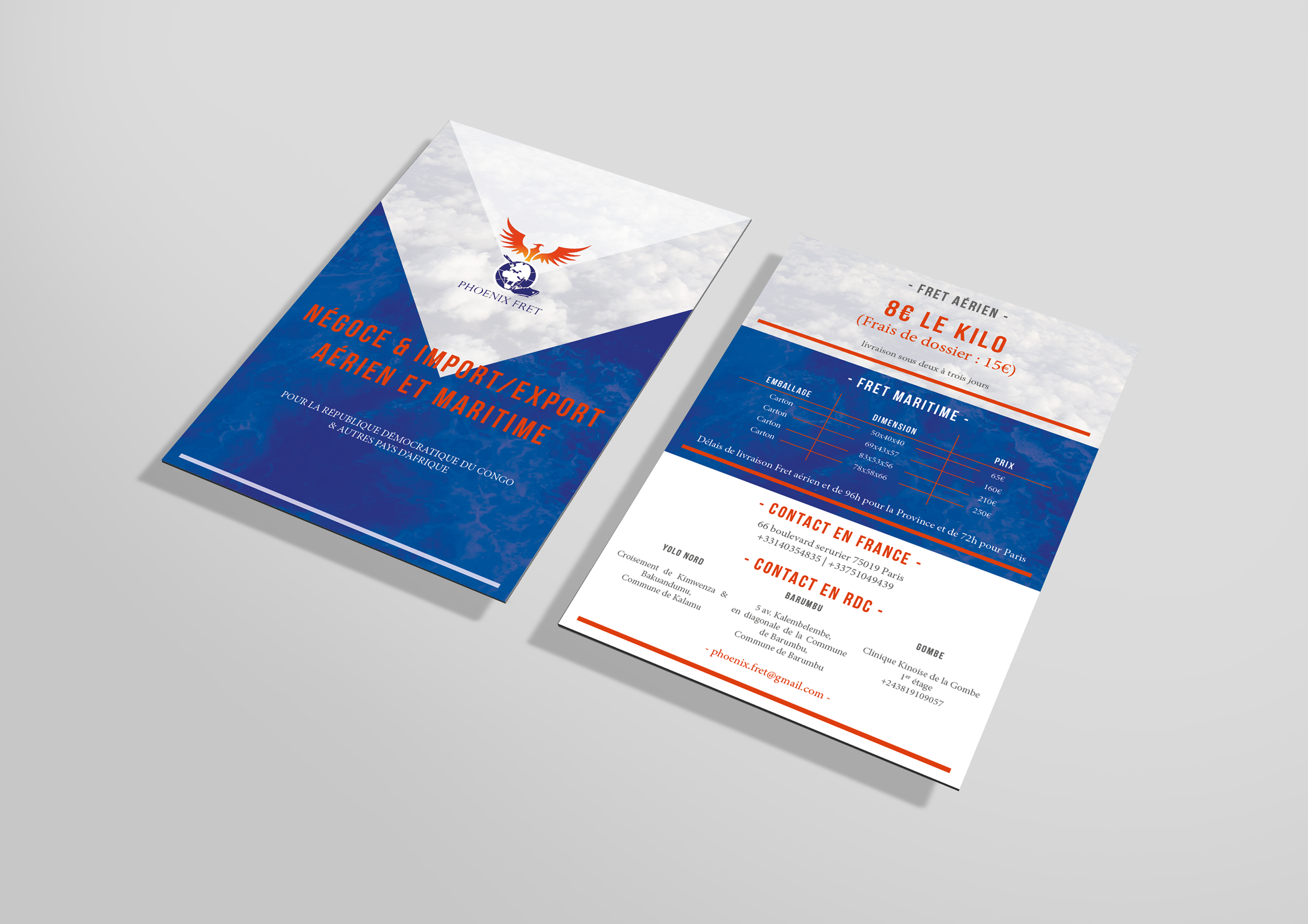
Brochure
In contrast to the mainly blue imagery, the pop of orange is inherited from
the logo and, as the complementary colour, blends well while guiding the eye through
the brochure.