Description
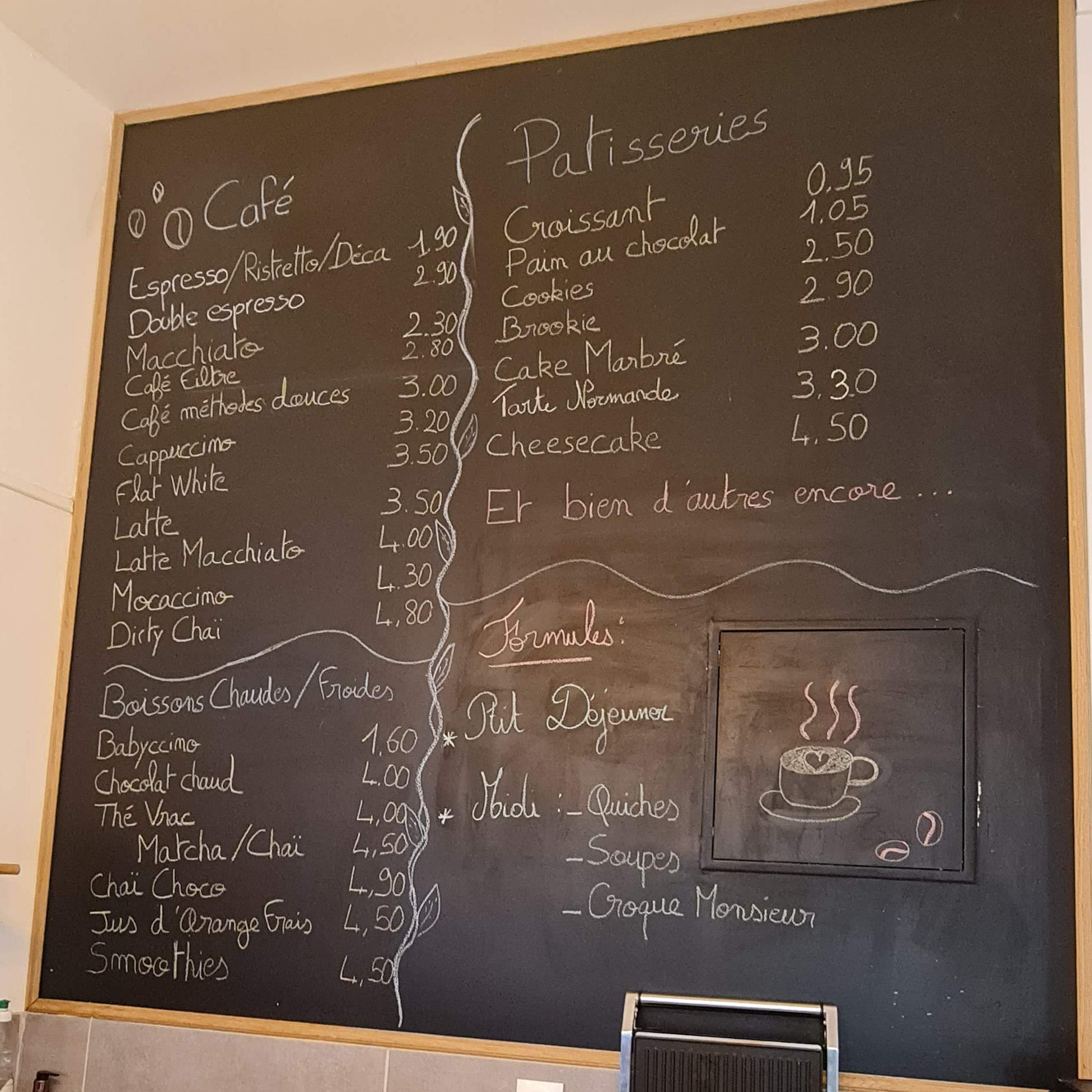
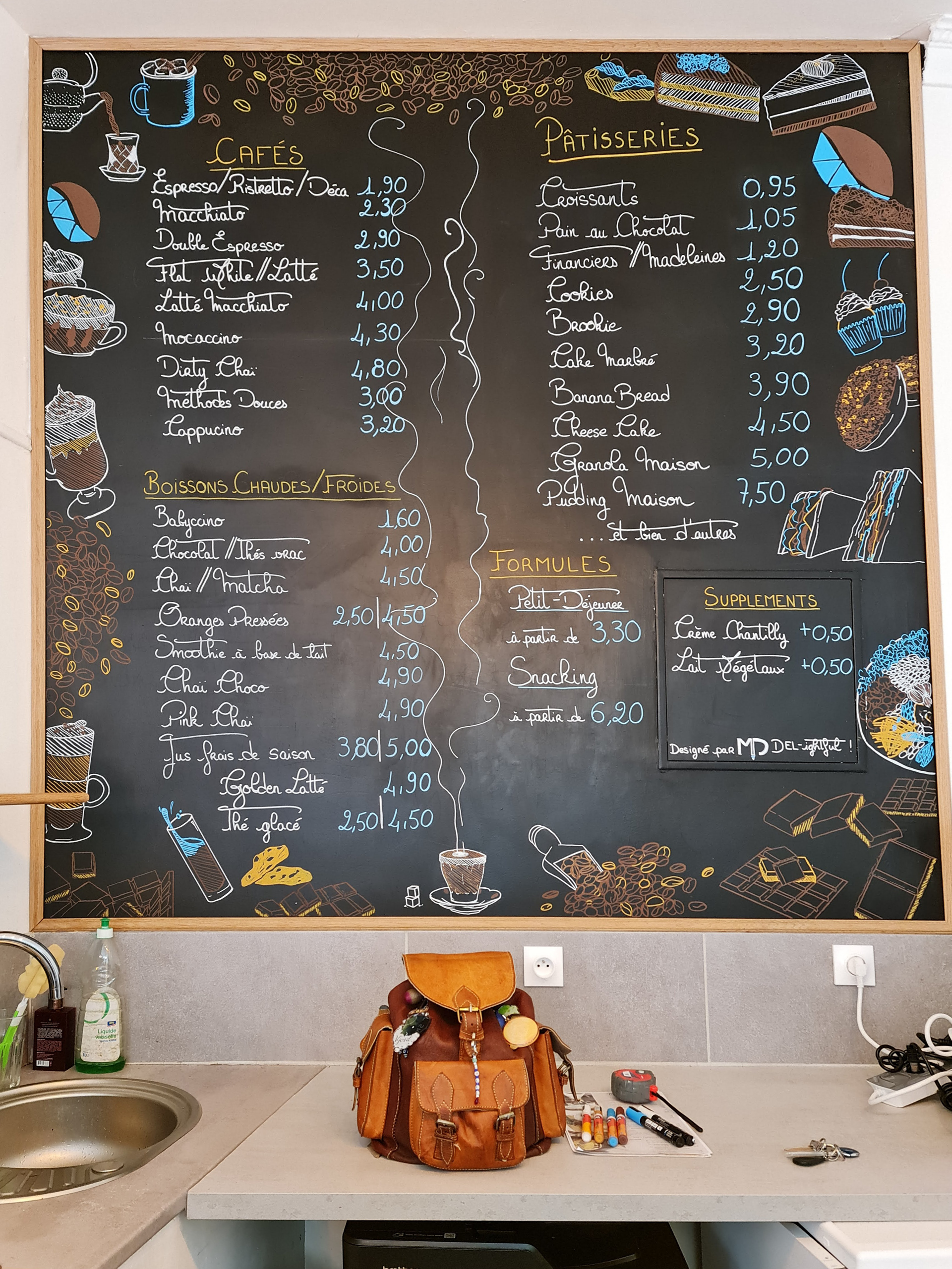
It was important that I keep the layout of the established slate, since clients were
already used to looking at specific spots to navigate the menu.
But I wanted to
play with the attempt at a vine in the middle, so my first proposal included coffee
leaves to frame the menu, and I switched the middle vine for a stream of hot coffee.
Most importantly, the main request was to illustrate the menu with the diversity
of products it proposed.
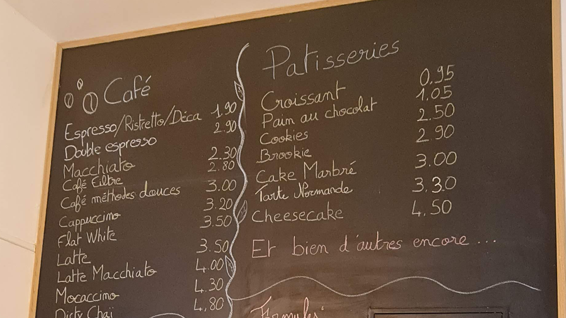
Before
Art / Illustration
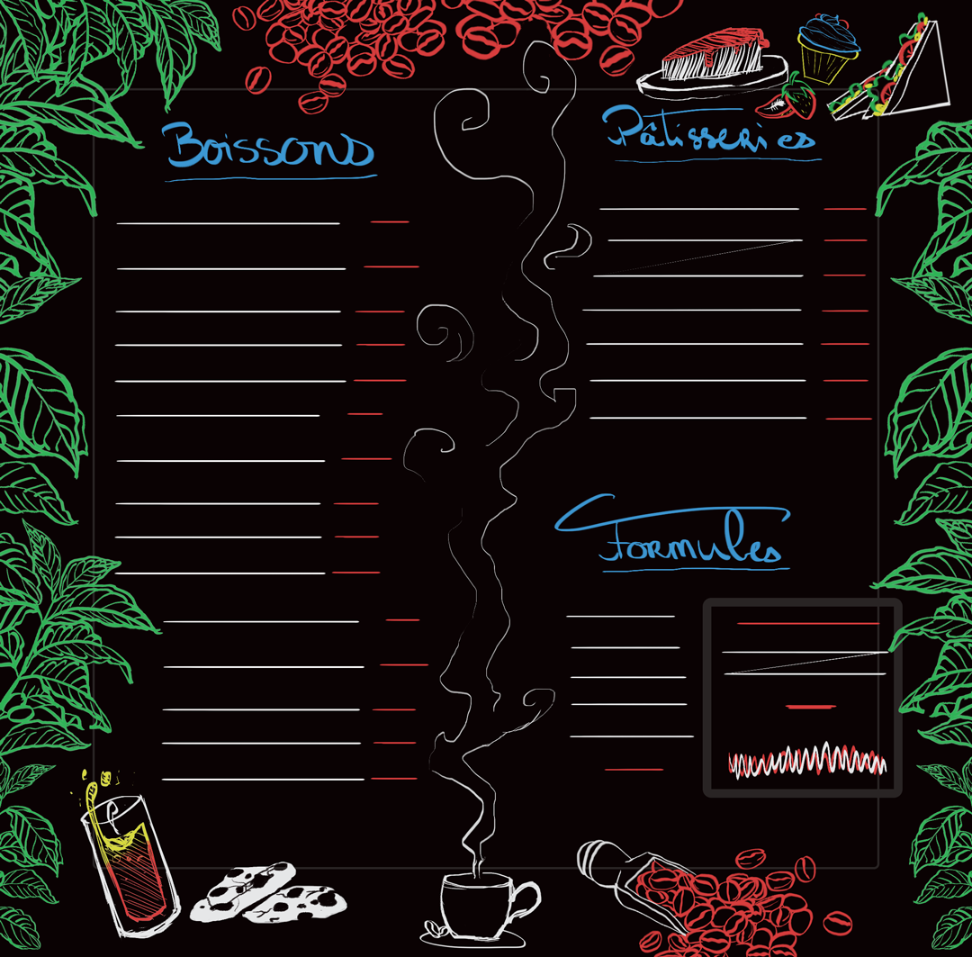
First Design
Art / Illustration
Approved Design
Art / Illustration
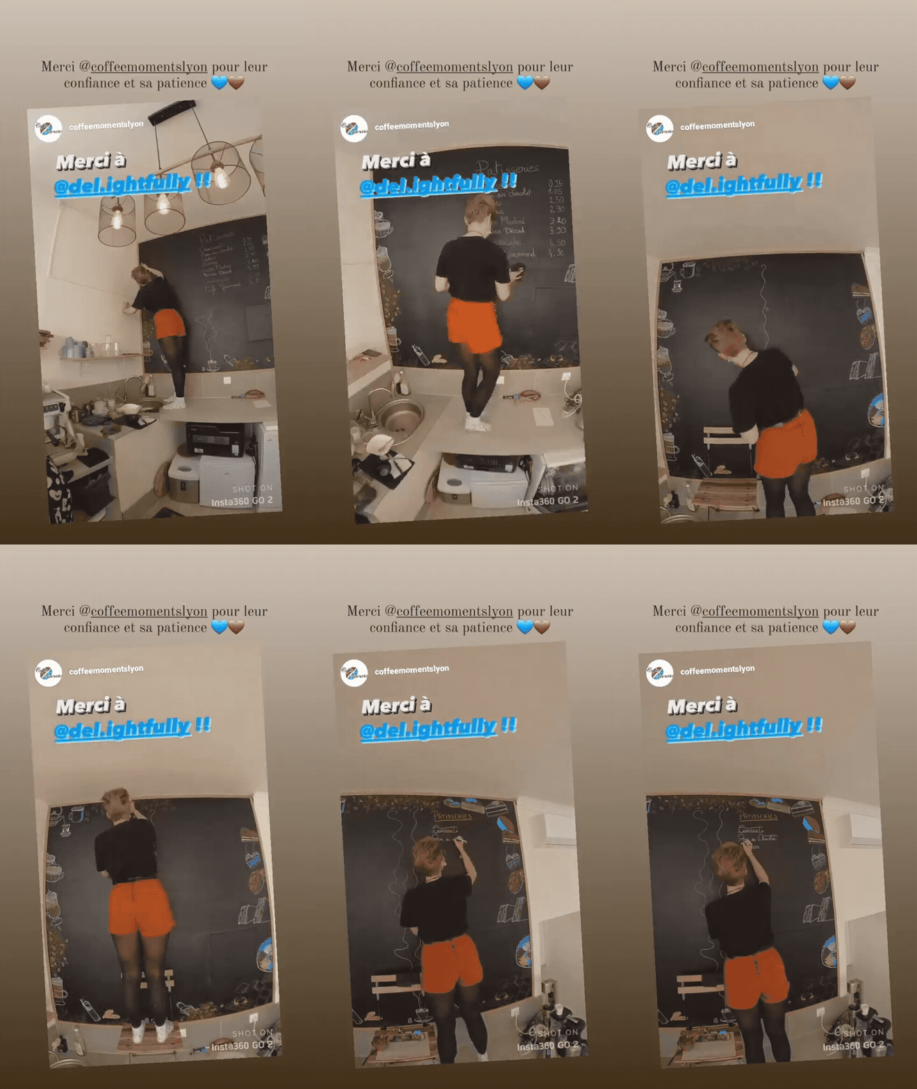
Drawing process
Art / Illustration
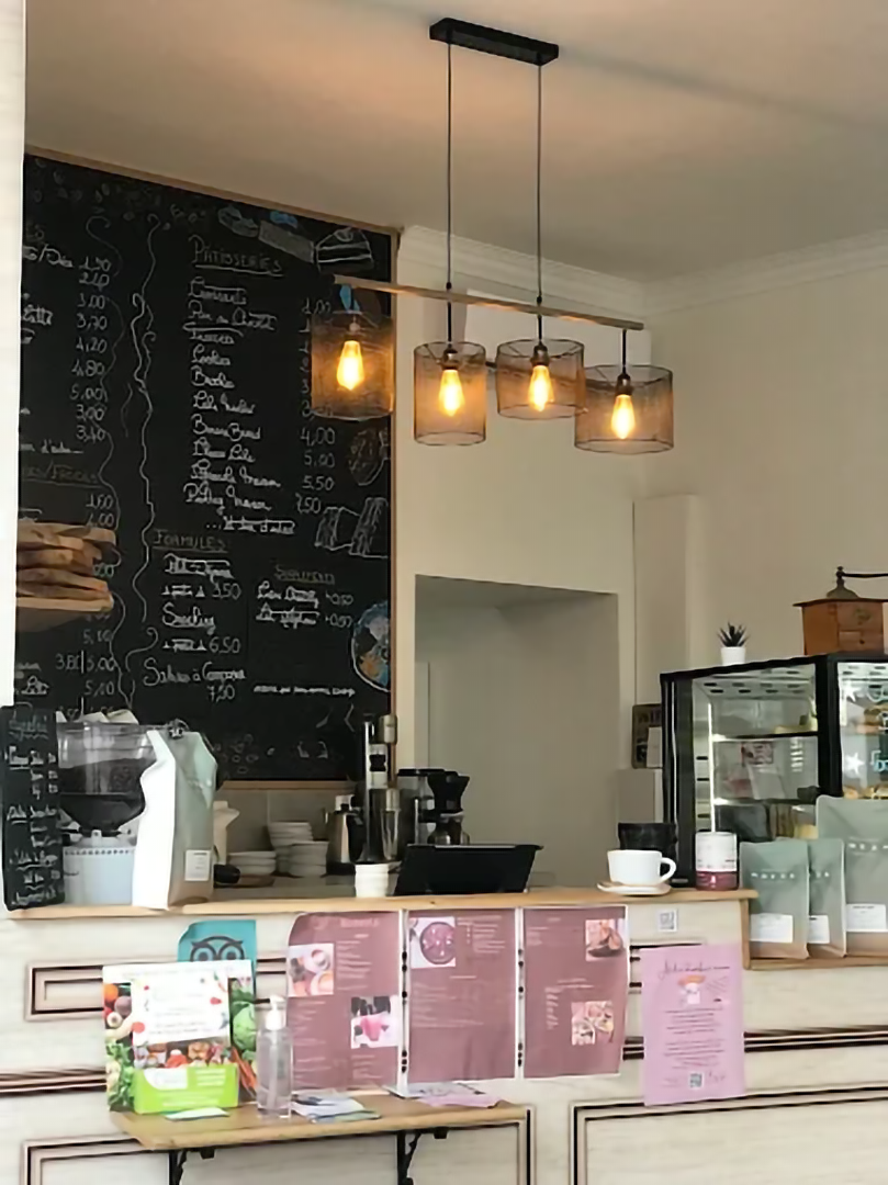
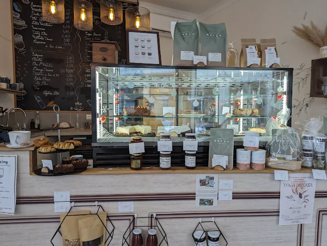
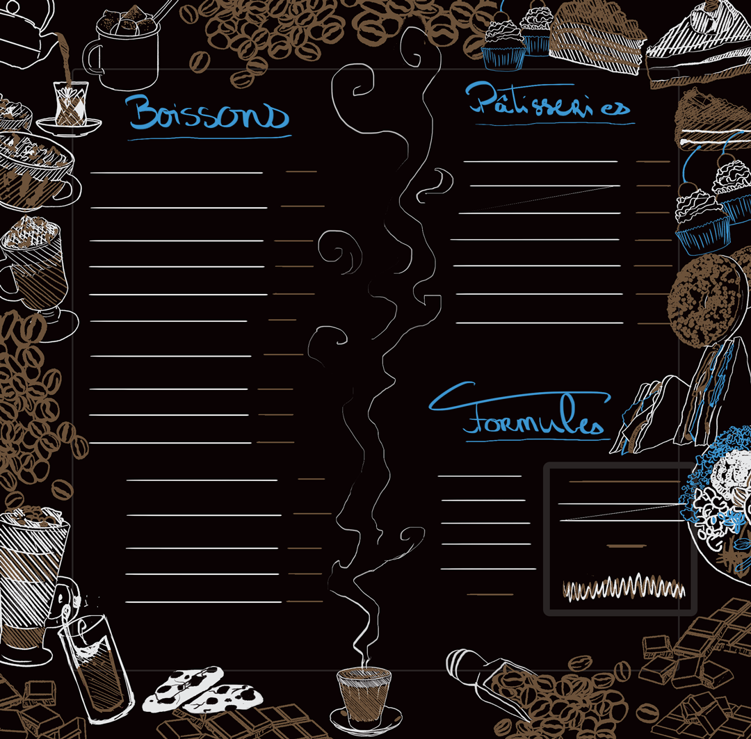
After a few discussions, the leaves were abandoned in favour of a full-gourmet
imagery using the main colours from the Coffee Shop's chart.
This way, the slate fit
perfectly with the rest of the interior design and the cosy vibe of the place. And most
importantly, even in a few colours, the different illustrations whet one's appetite.
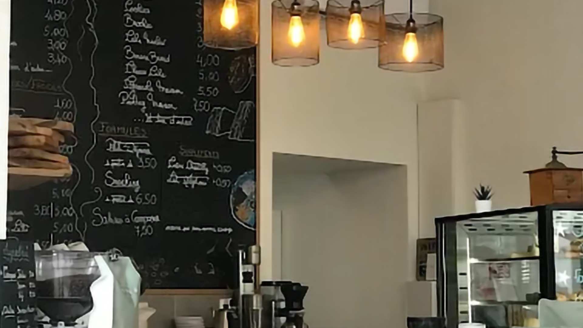
In situation
Illustration
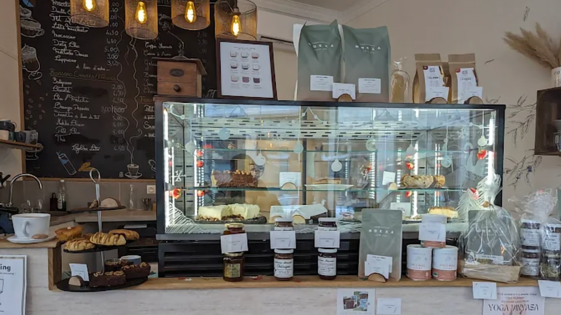
In situation
Illustration
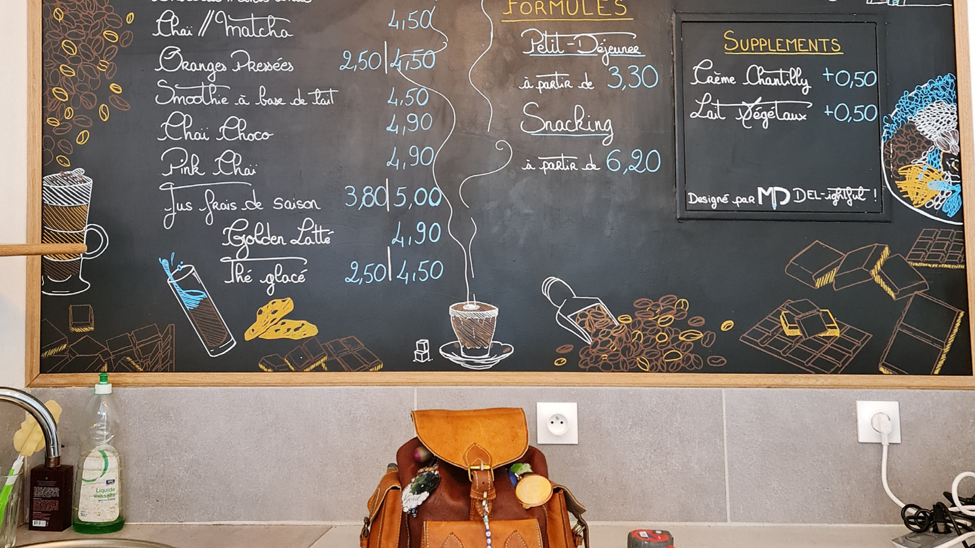
Finished Slate
Art / Illustration