On my way!

P.A.R.C

Branding / Print

Parc Animalier de la Région des Cévennes

Introduction

The Concept

The idea comes from the realisation that "Parc Animalier de la Région des Cévennes" makes an almost perfect acronym of "PARC".
But P.A.R.C is not a zoo; it's a Nature Reserve. So, how do you create a space where you can observe nature and animals without building pens?

The concept is to build structures made of glass and wood with organic shapes and architecture. The structures become paths that fully merge with the forest and mountains, hiding their shapes, so you can walk around and observe nature from inside, yet from a safe distance.

The Design

Francis BACON once said, "We cannot command Nature except by obeying her." So, the visual identity will showcase the duality and relationship between the human structure, meant to be as non-invasive as possible, and the nature that inspired it.
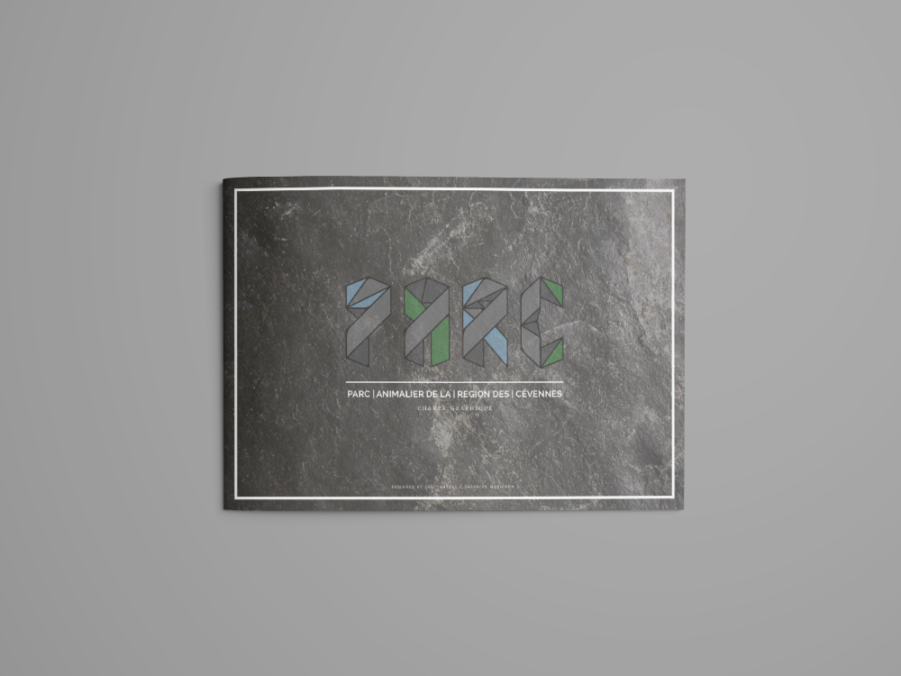
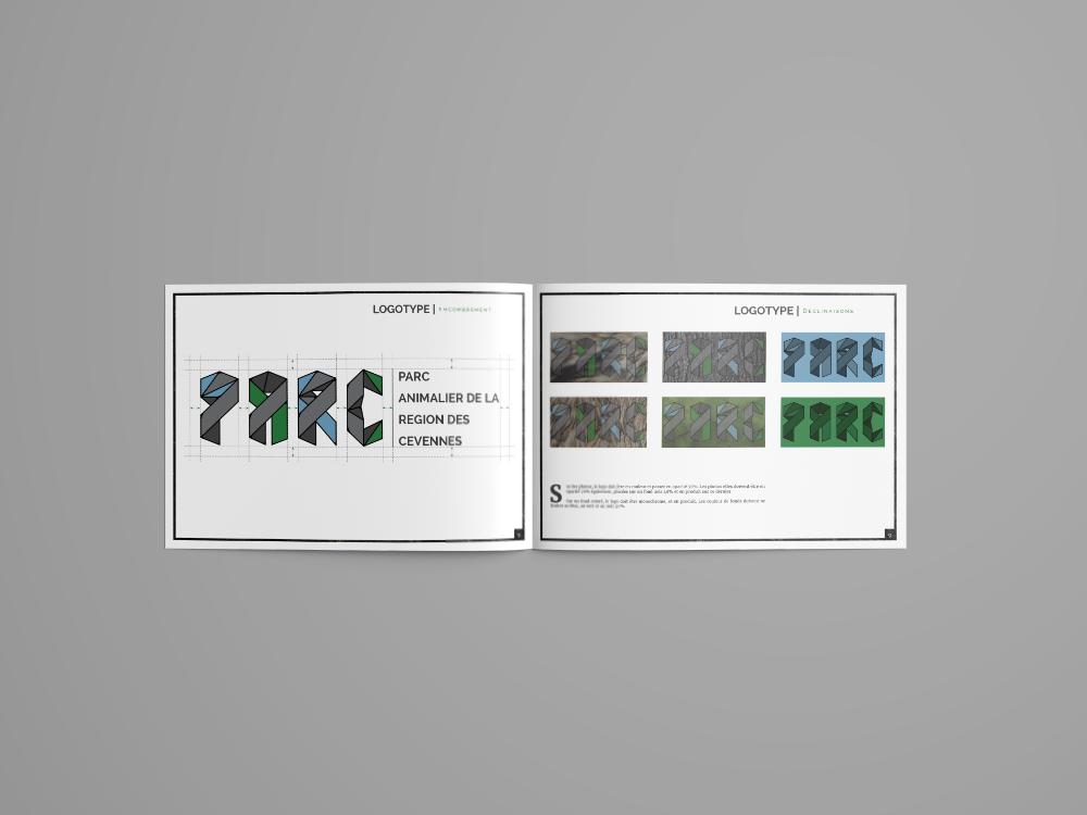
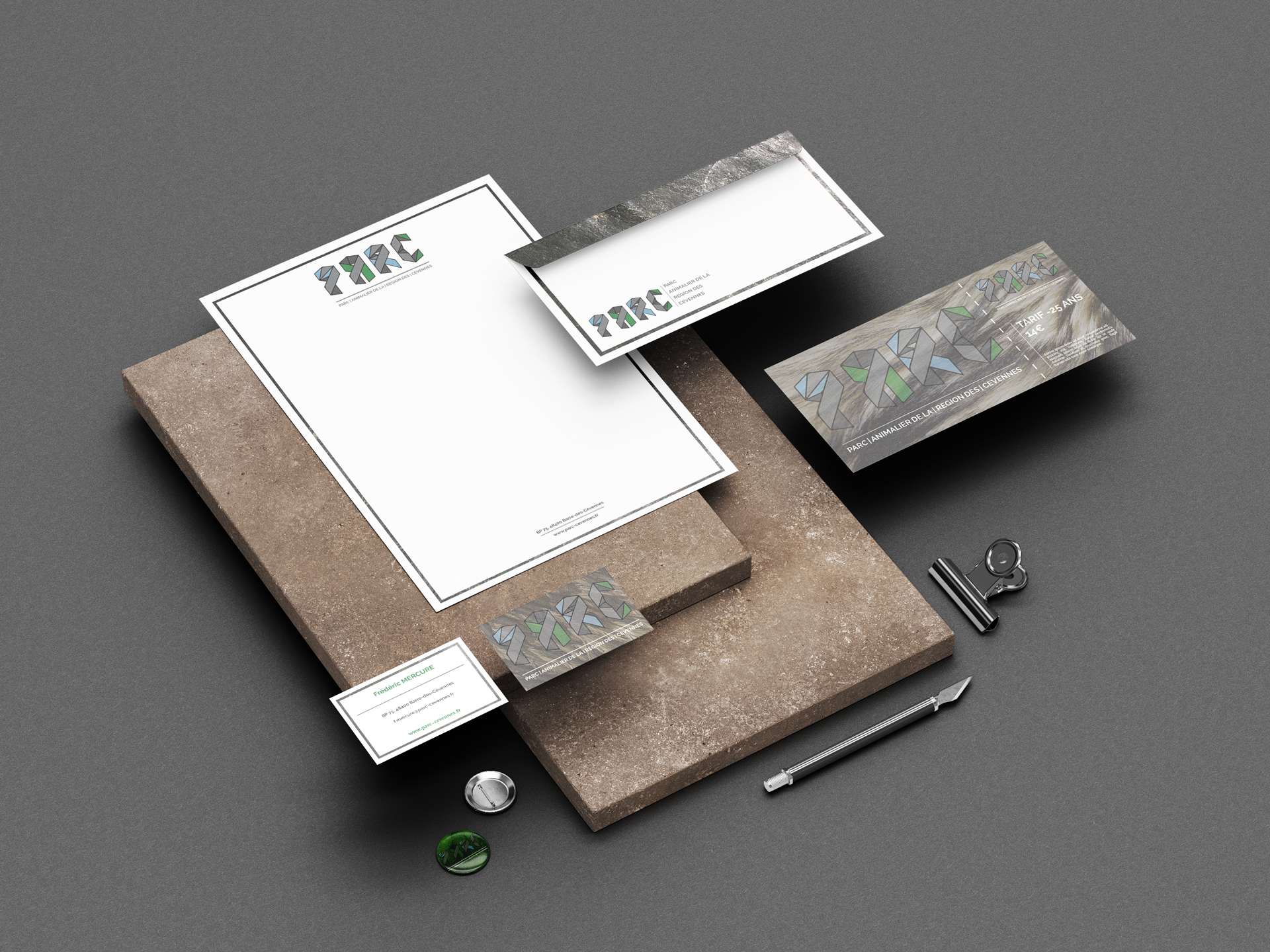
The logo is based on a monolith that shapes the letter in two shades of grey, blue, and green, as a reminder of rocks, greenery, water, sky, and the glass of the structures.
Description

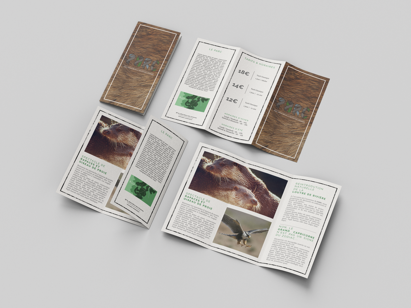
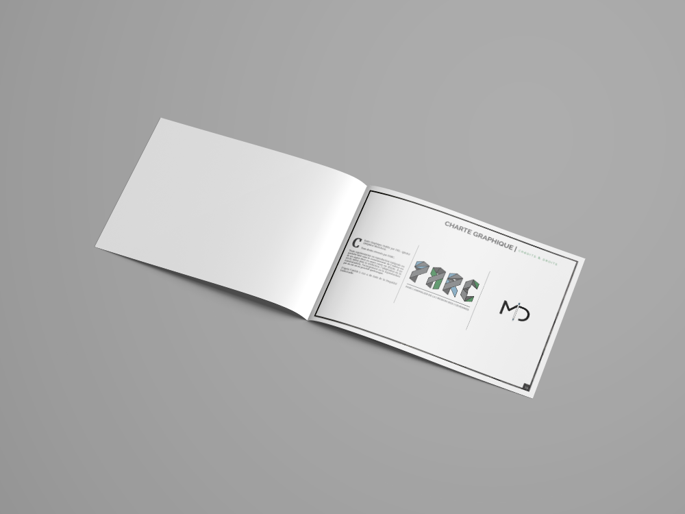
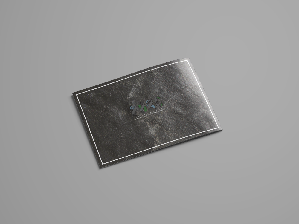
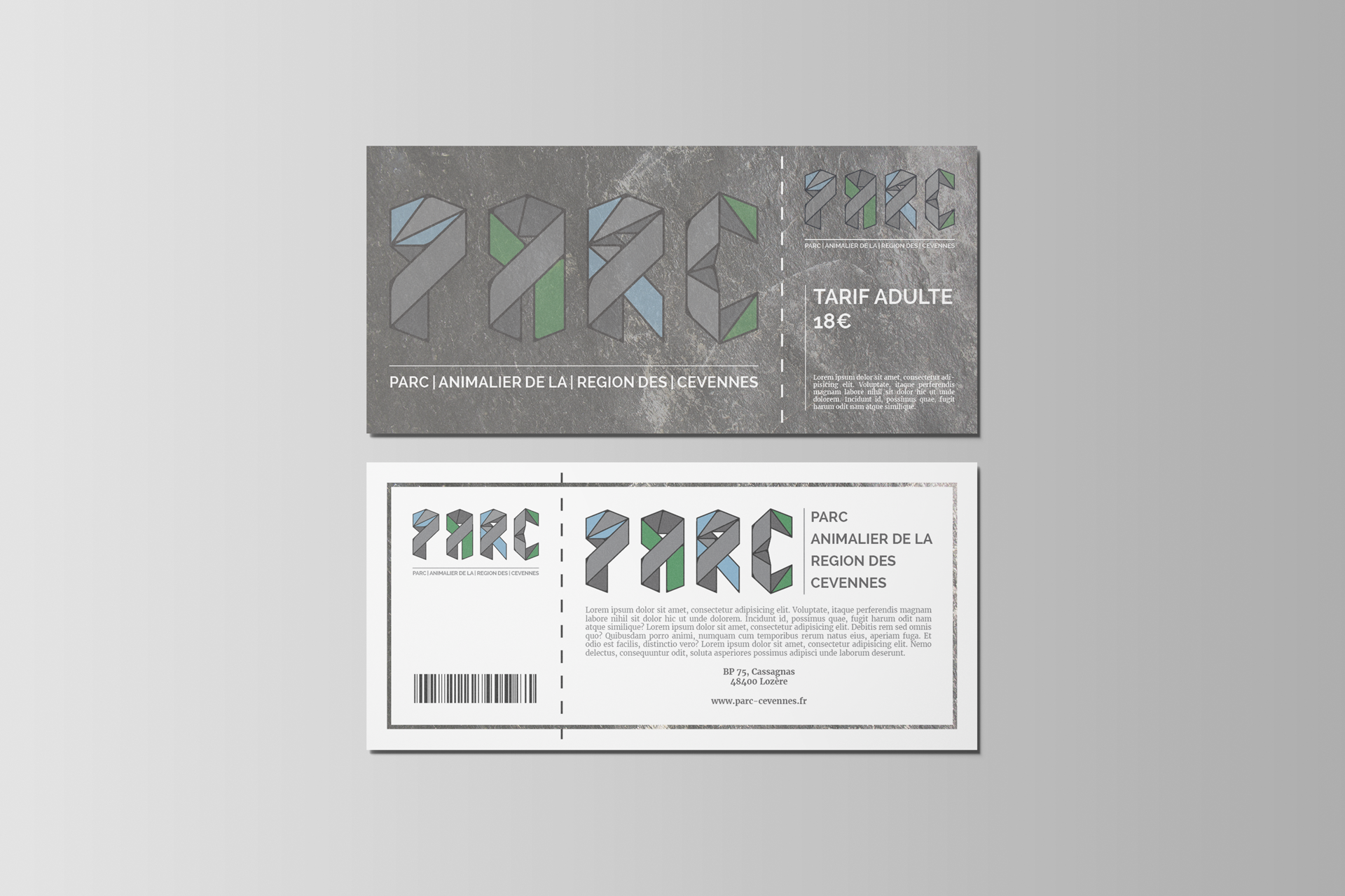
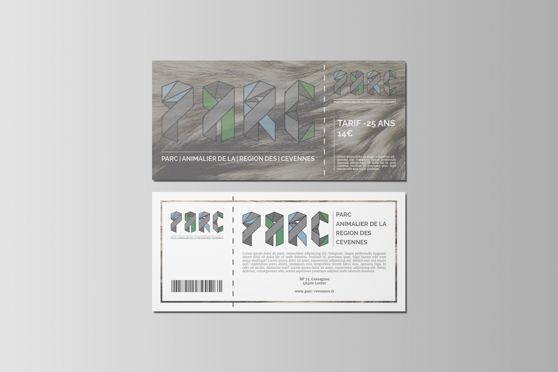
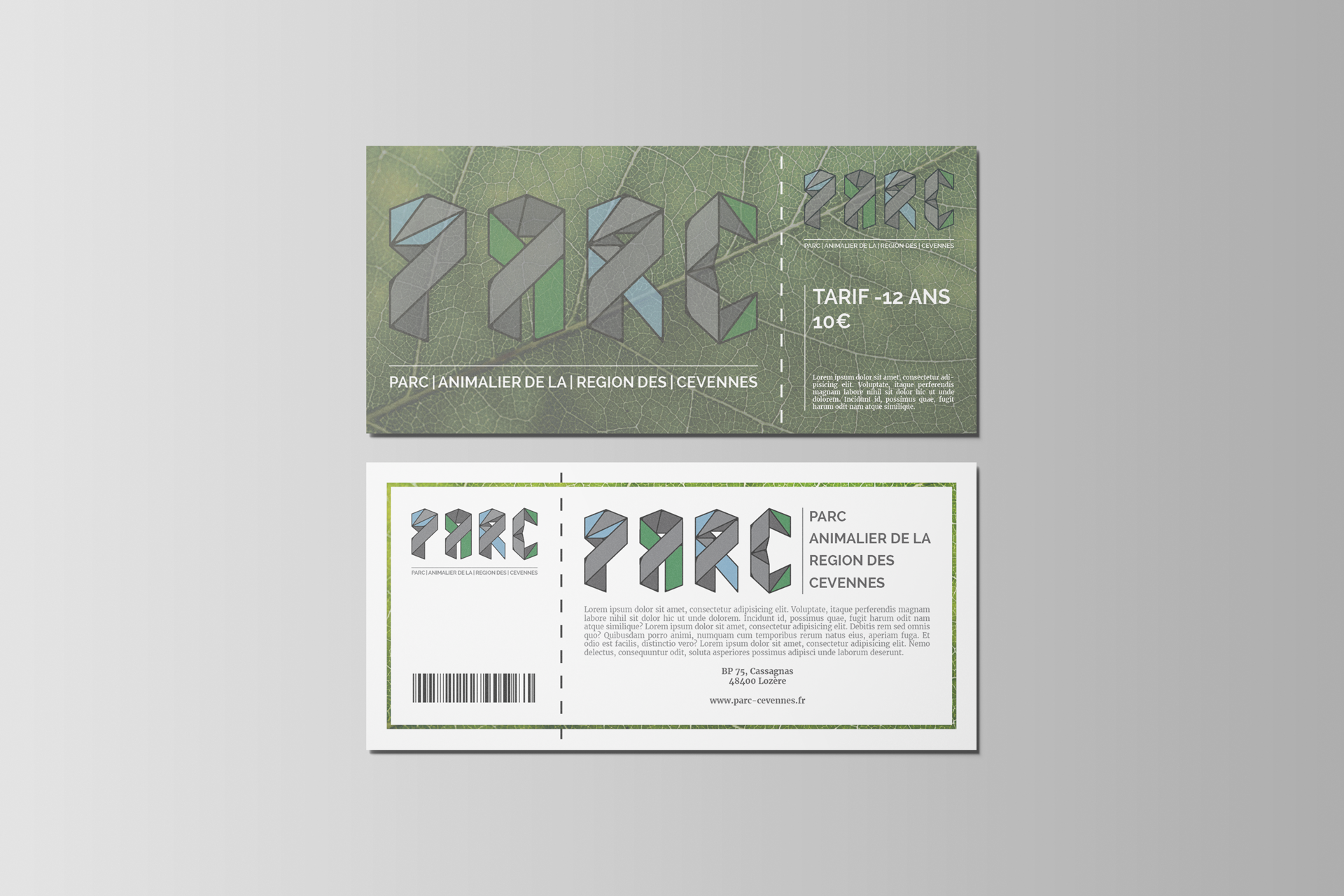
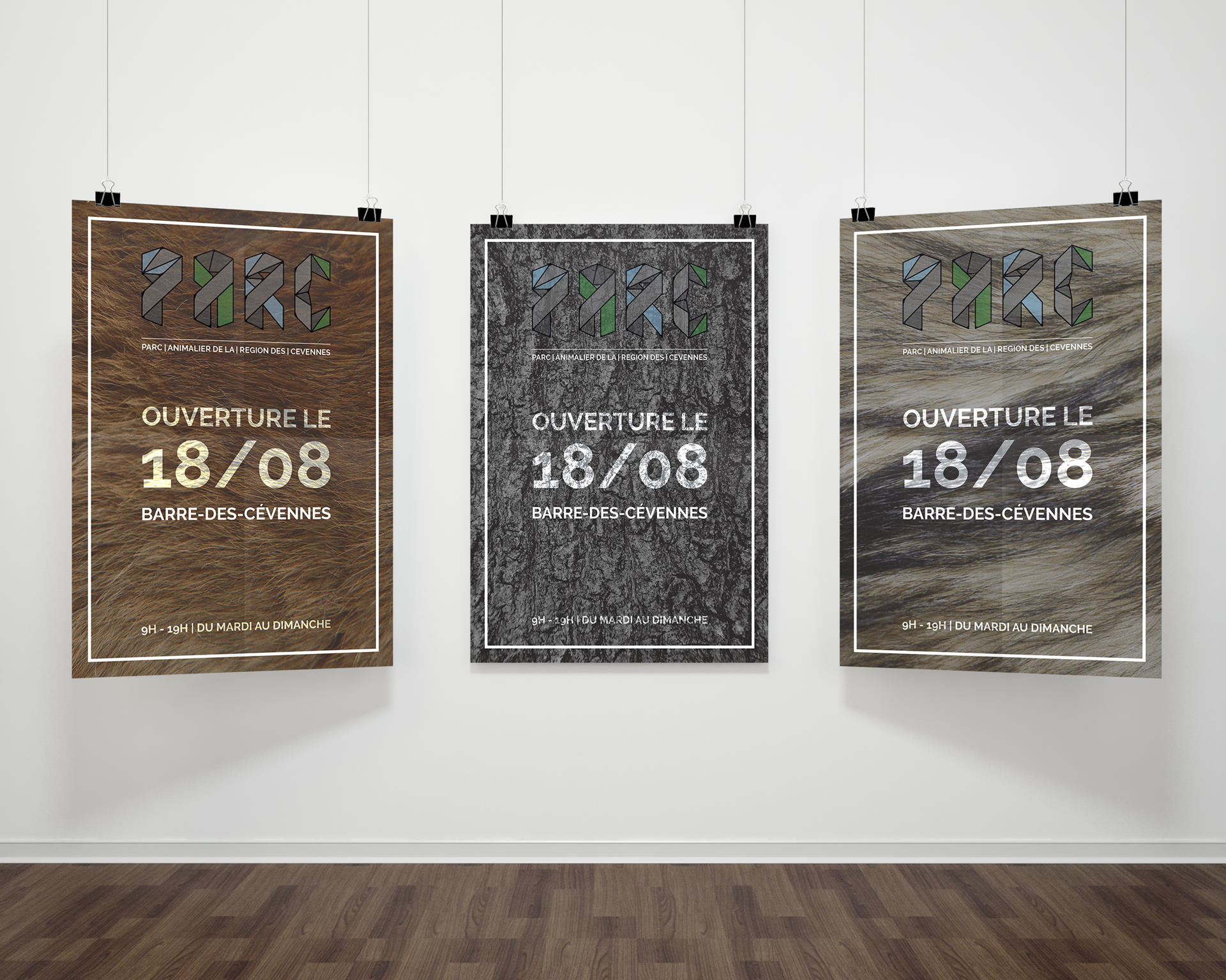
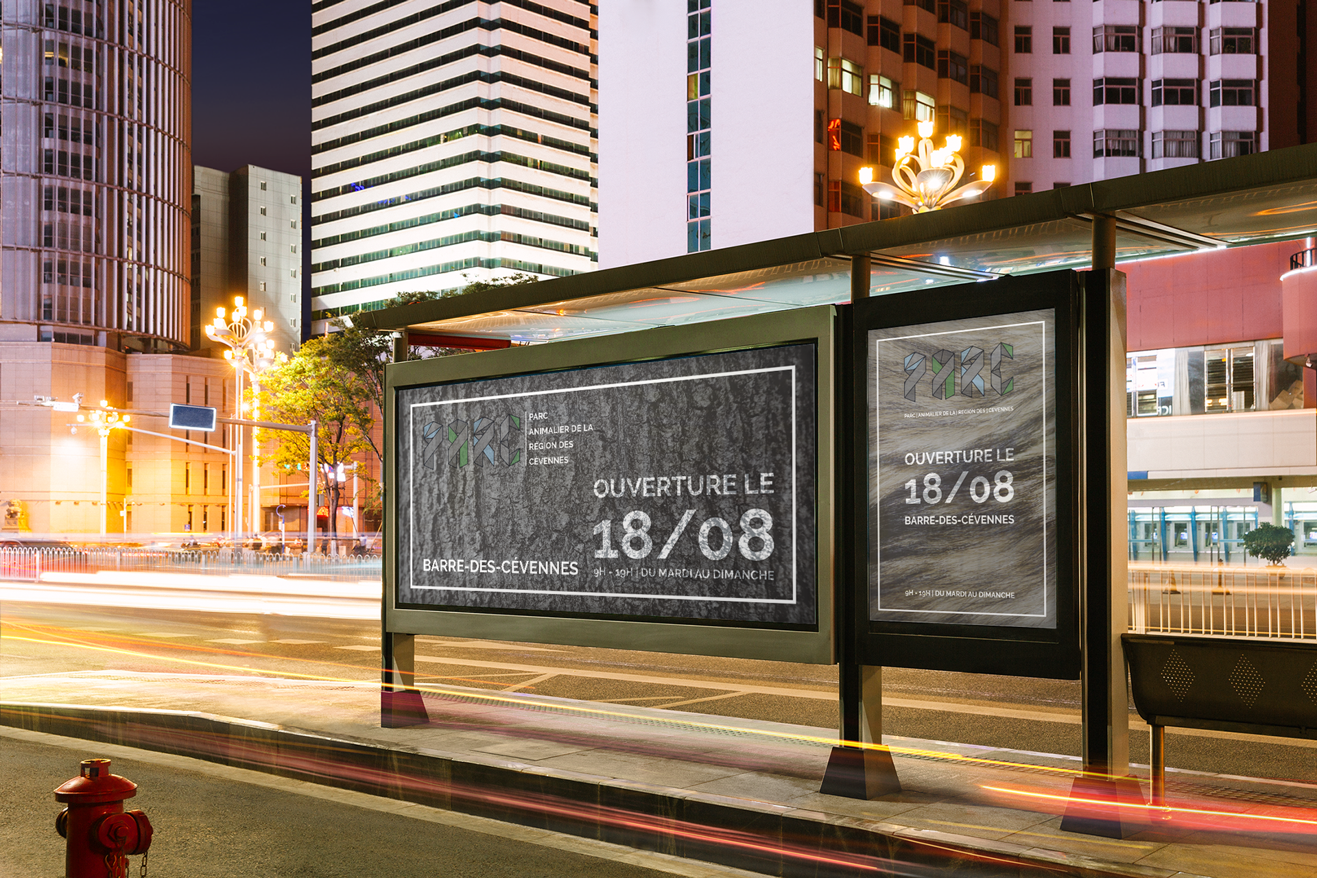
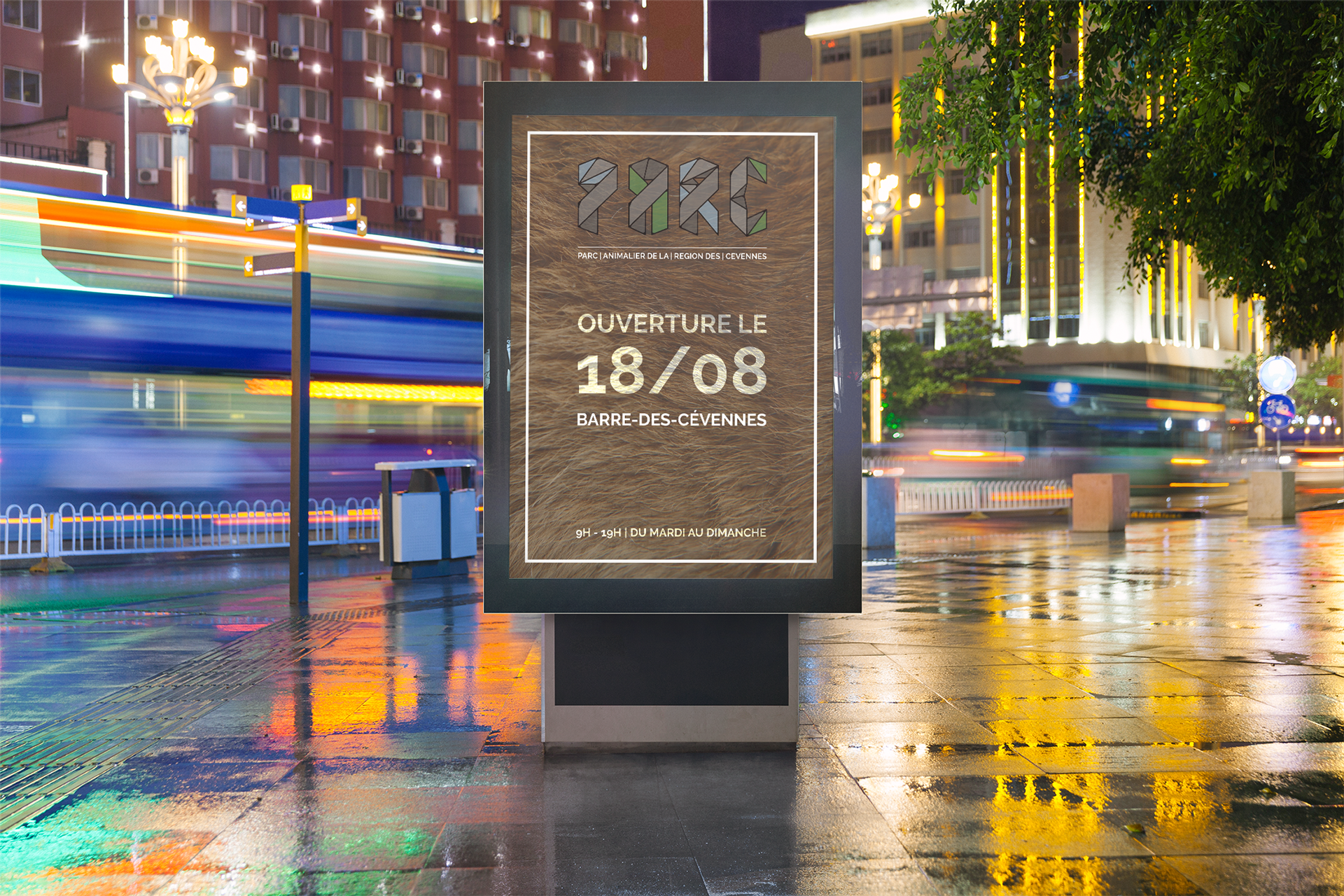
In addition to the logo, the overall identity is structured with a frame of textures reminiscent of nature: stone, leaf, wood, fur, etc.
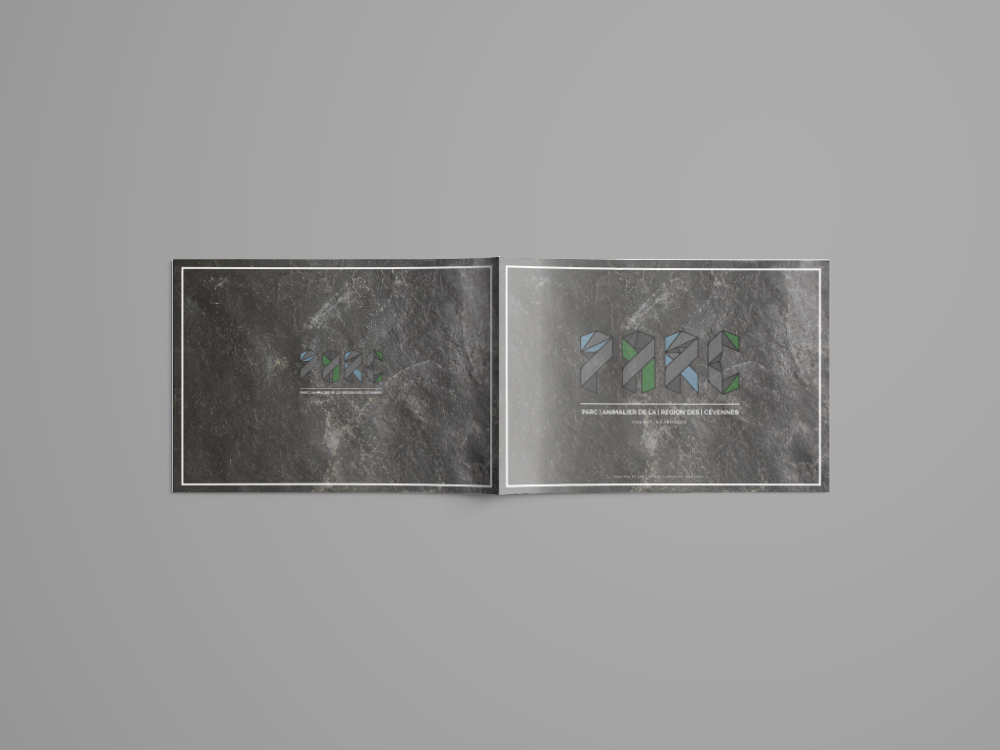
When it doesn't come in frames, it simply fills the different visuals. The logo then slightly blends into the textures, accentuating the goal of the structures to blend into nature. Mirroring the texture frames on blank visuals, the frame is now white.

Stationary

Branding / Print

Brochure

Branding / Print

Graphic Chart

Branding

Graphic Chart

Branding

Graphic Chart

Branding

Graphic Chart

Branding

Graphic Chart

Branding

Tickets

Branding / Print

Tickets

Branding / Print

Tickets

Branding / Print

Posters

Print / Sign

Posters

Print / Sign

Poster

Print / Sign


Most of the visuals mainly show textures to spotlight nature itself.

Like the logo, most of the larger text won't be fully opaque to blend with the different textures. The only exception is the logo's text.
The body text is in Merriweather, where figures dance a bit more around the baseline and give a slightly more organic yet readable impression.