On my way!

Les Siestes Électroniques

Branding / Print / Sign

Les Siestes celebrates adventurous music as generously and as fully as possible.

Introduction

The Festival

Based in Toulouse, Southern France, Les Siestes électroniques is a 4- or 5-day summer festival dedicated to emerging artists in music & digital culture.
Its motley line-up mainly focuses on electronic musicians and targets both a professional audience and the general public. Its free open-air concerts make Les Siestes Électroniques a rare occurrence in the landscape of European festivals. Les Siestes offers an opportunity to experience contemporary music through concerts, club nights, workshops and sometimes exhibitions.

The idea

The following visuals are just a concept I created for my own entertainment, and I never had the chance to work with Les Siestes for their 25th edition.

But the name of the festival, "Electronic Nap", inspired me earlier this year to try my hand at "How to visually combine two ideas that seem so far apart, like sleeping and electronic music?" I know about Lo-Fi, Electro chill, and more, but a 4- to 5-day electronic music festival got me thinking more about Tomorrowland than a chill event. So I started thinking...
Description

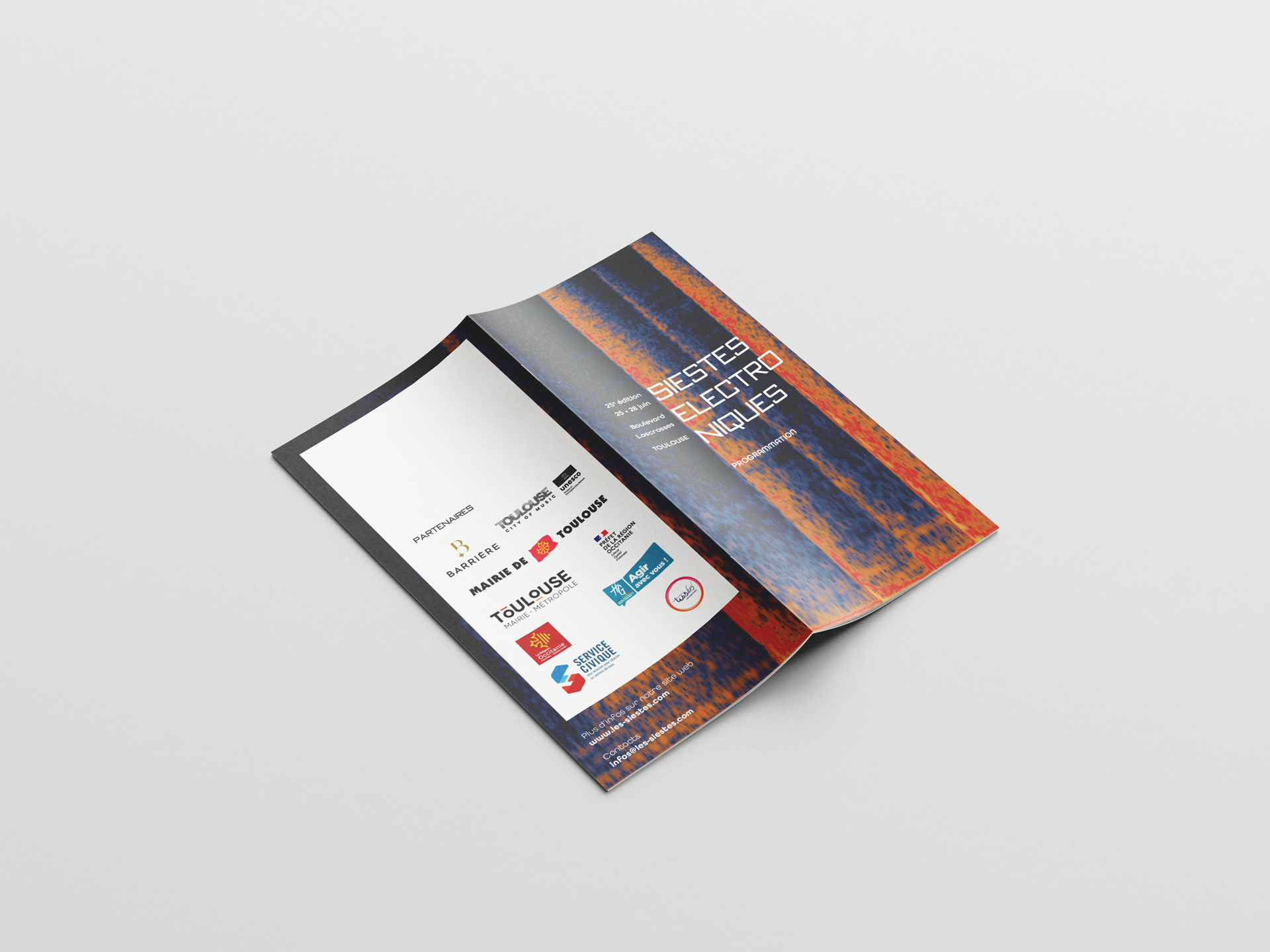
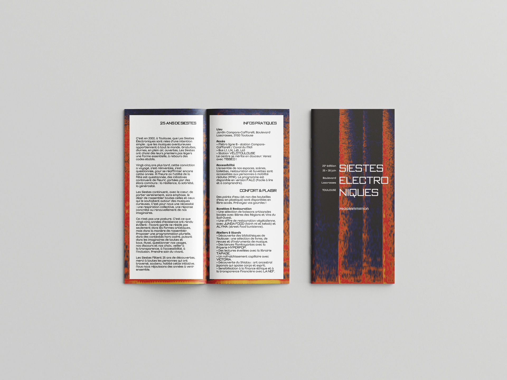
The idea of a cycle quickly came to mind—cycle, rhythm, and loop—s and how it is possible to show it electronically. So I took several electro songs I like to play with in software like Adobe Audition to see how the soundtracks would appear, since it is displayed the same way as Electroencephalograms of sleep cycles.

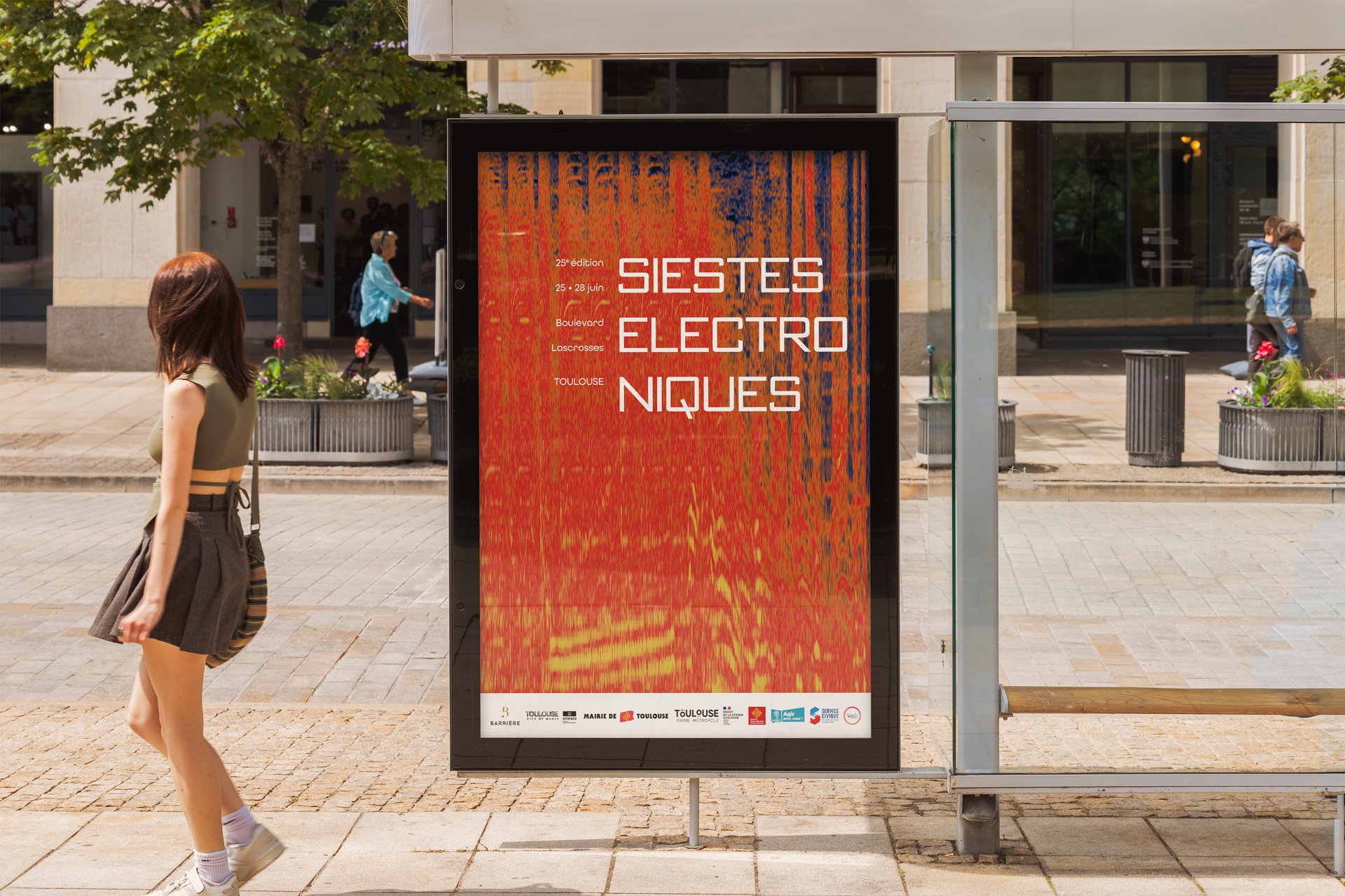
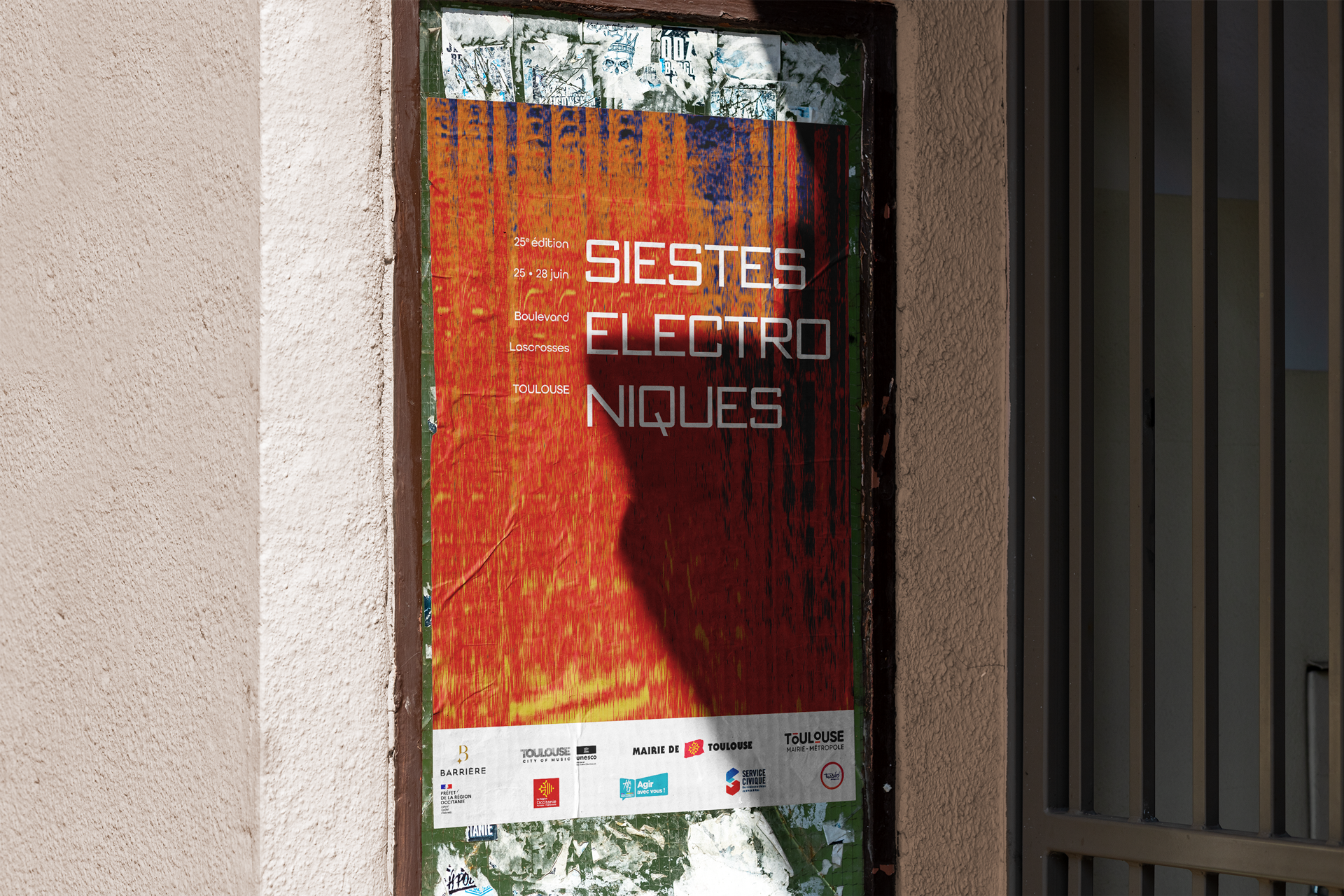
But what caught my eye was the Spectral Frequency Display.
The colourful, pixelated imagery on a black background clicked with the feeling I was looking for—a bold visual with strong contrast and an electronic yet warm feel.

Program

Branding / Print

Program

Branding / Print

Program

Branding / Print

Poster

Branding / Print

Poster

Branding / Print

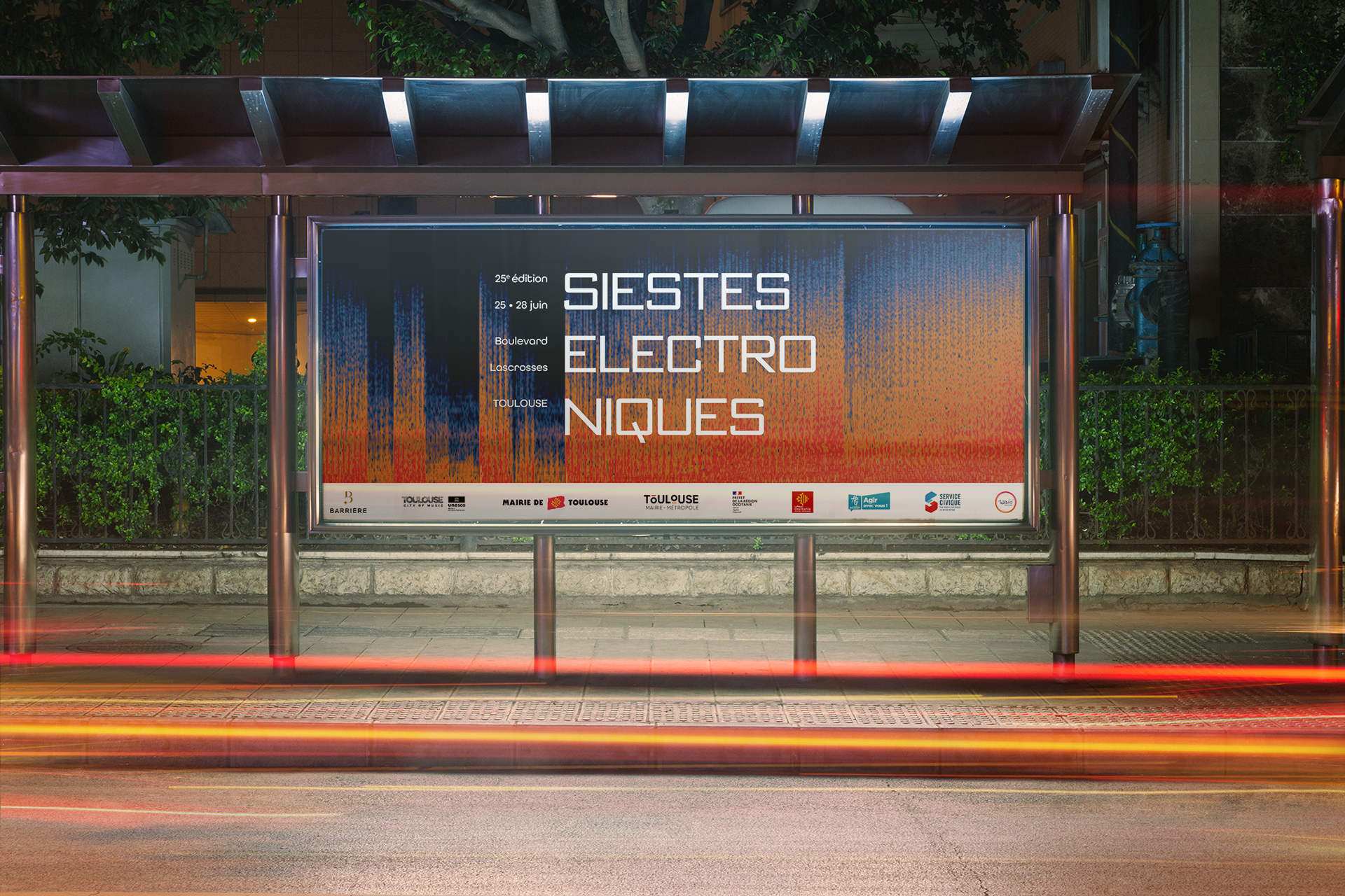
Billboard

Branding / Print


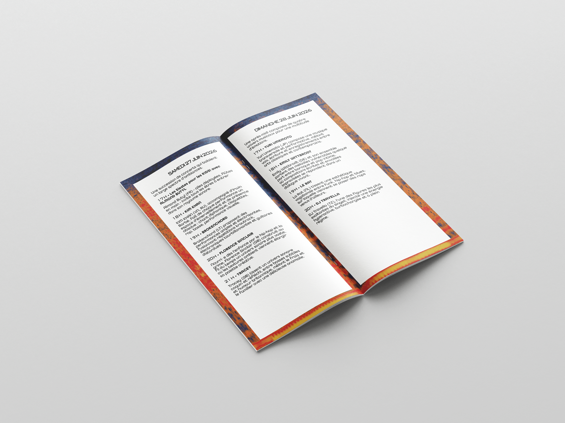
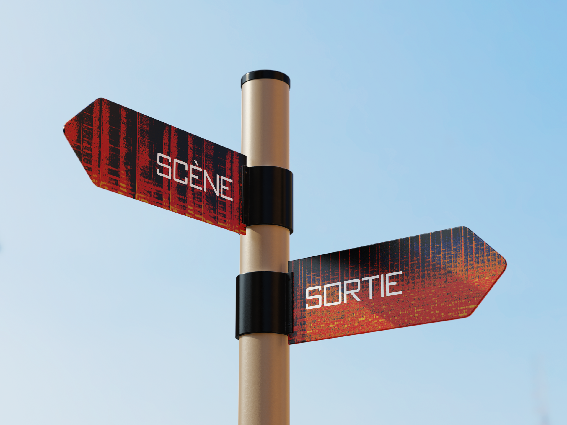
The text is structured around columns created by the varying sound heights used to dress the background. It marks the rhythm of the music and of sleep—of the four days of the festival.
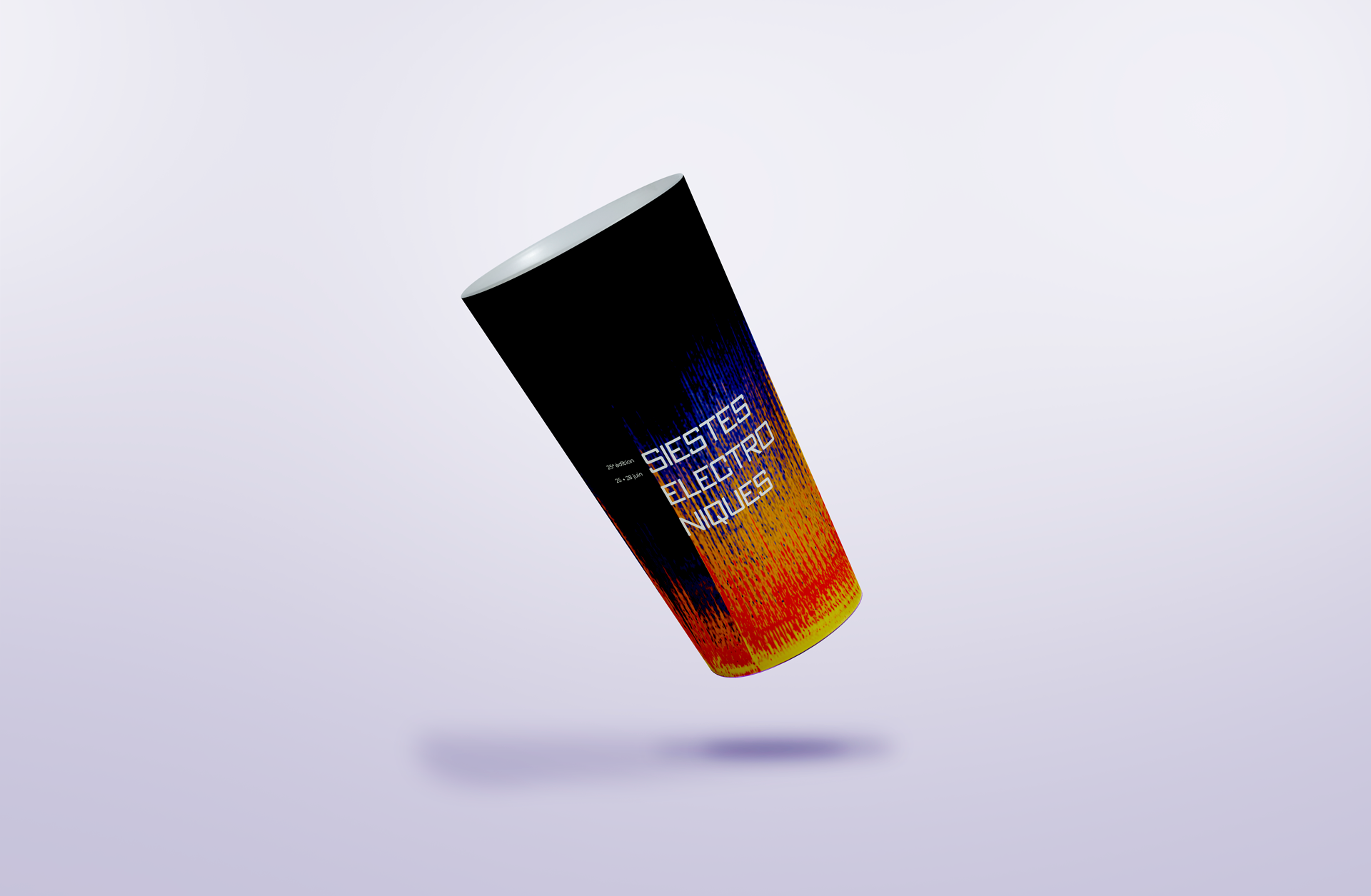
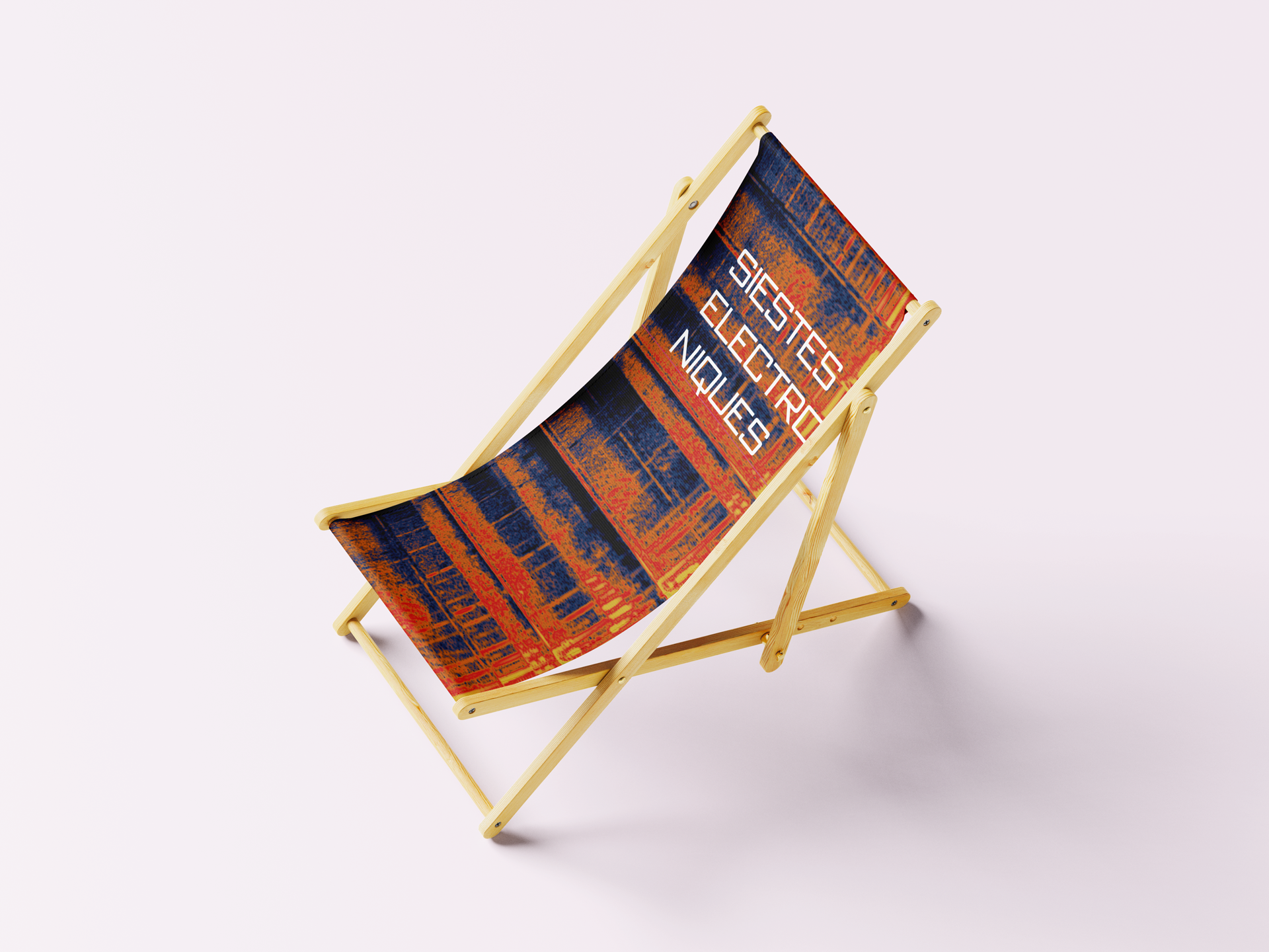
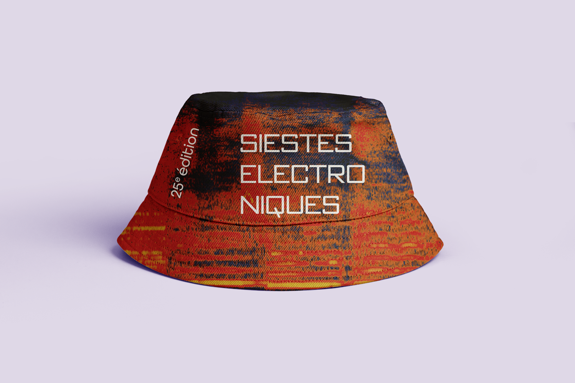
The text is a striking white against the intense background, set in Bank Gothic to bring balance and stability to the different visuals.

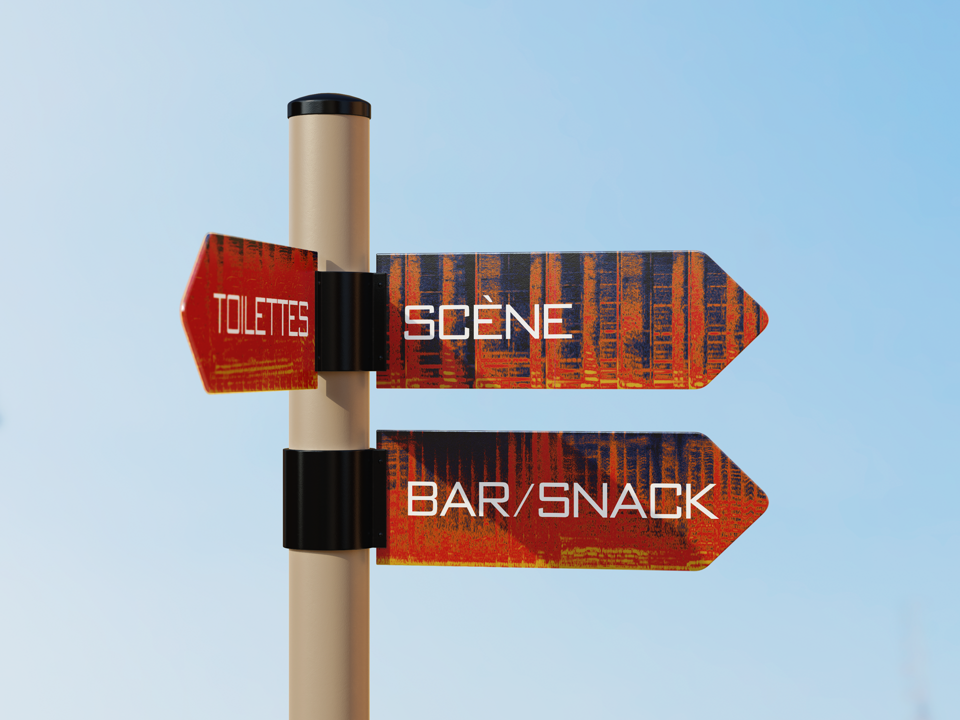
Direction Sign

Branding / Sign

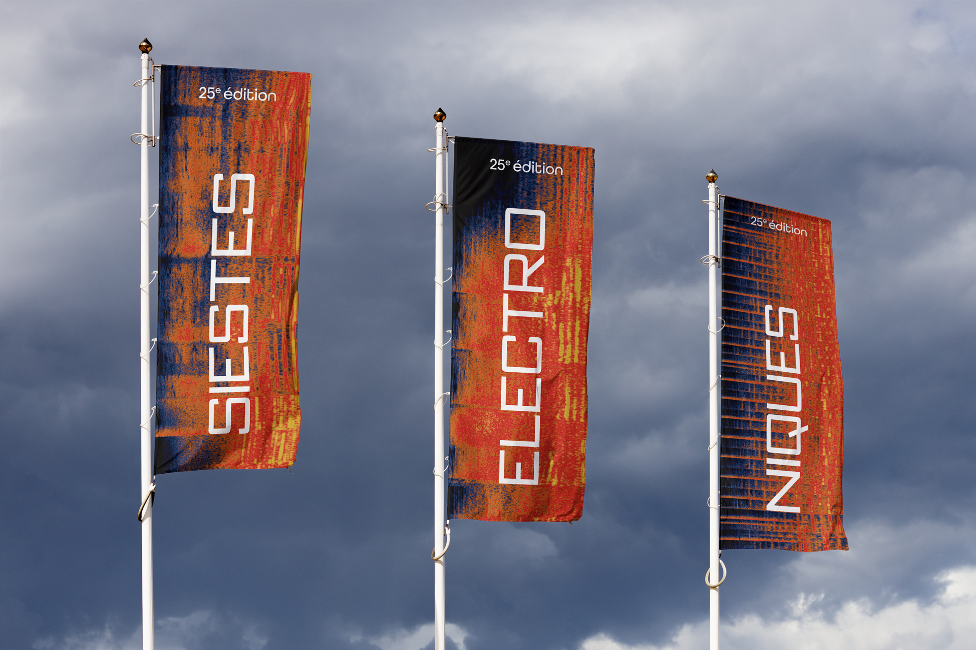
Event's Flags

Branding / Sign

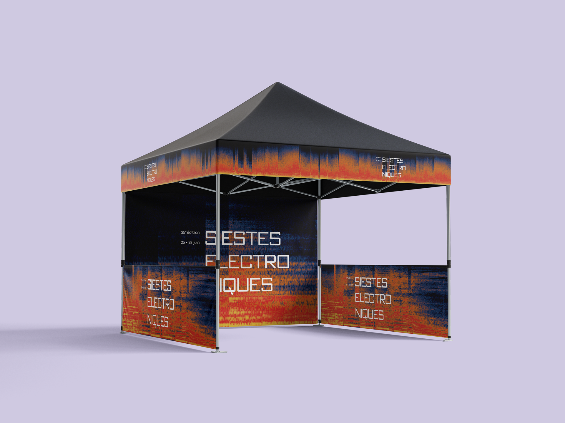
Gazebo

Branding / Sign

Direction Sign

Branding / Sign


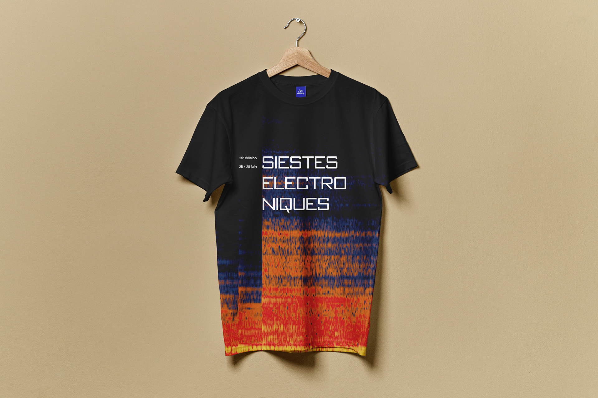
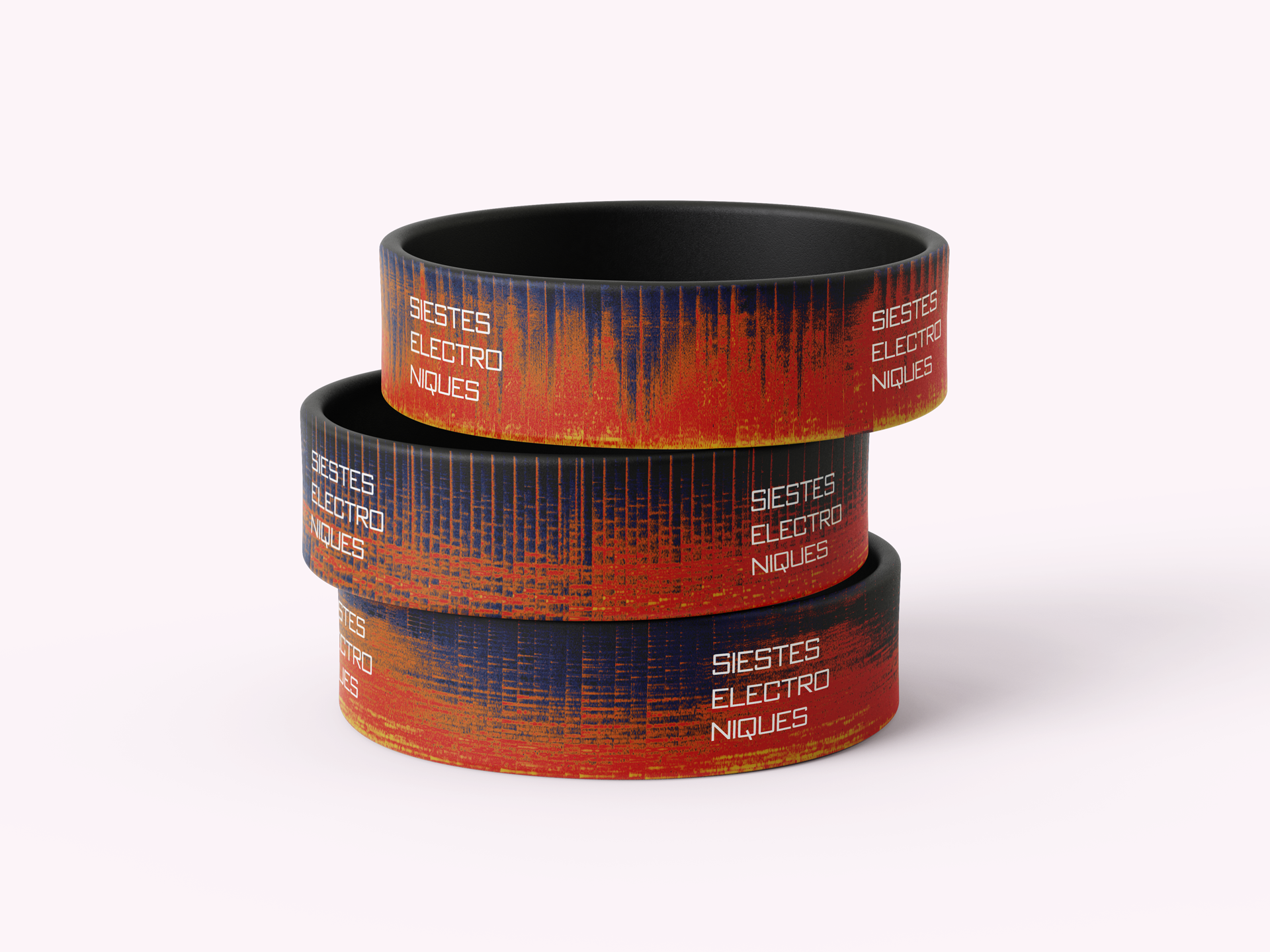
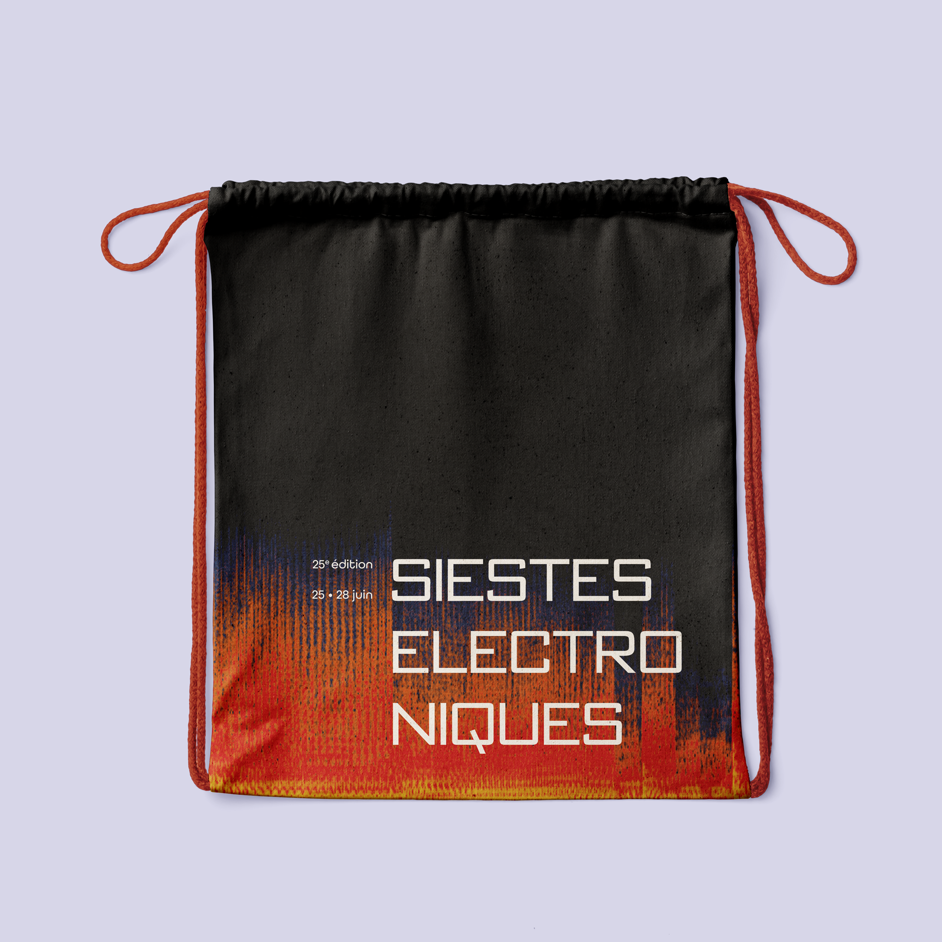
In addition to signage and printed elements, I had fun designing goodies and other objects.

Eco Cup

Branding / Goodies

Chairs

Branding / Sign

Bucket Hat

Branding / Goodies

T-Shirt

Branding / Goodies

Silicone Wristbrands

Branding / Goodies

Linen Bag

Branding / Goodies


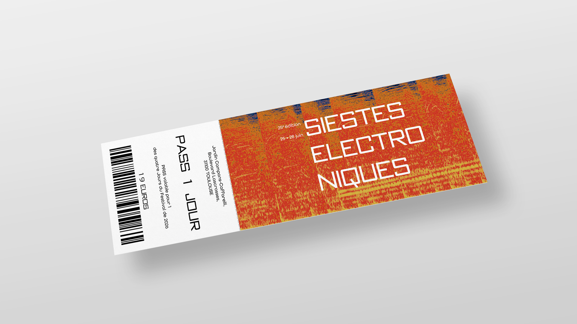
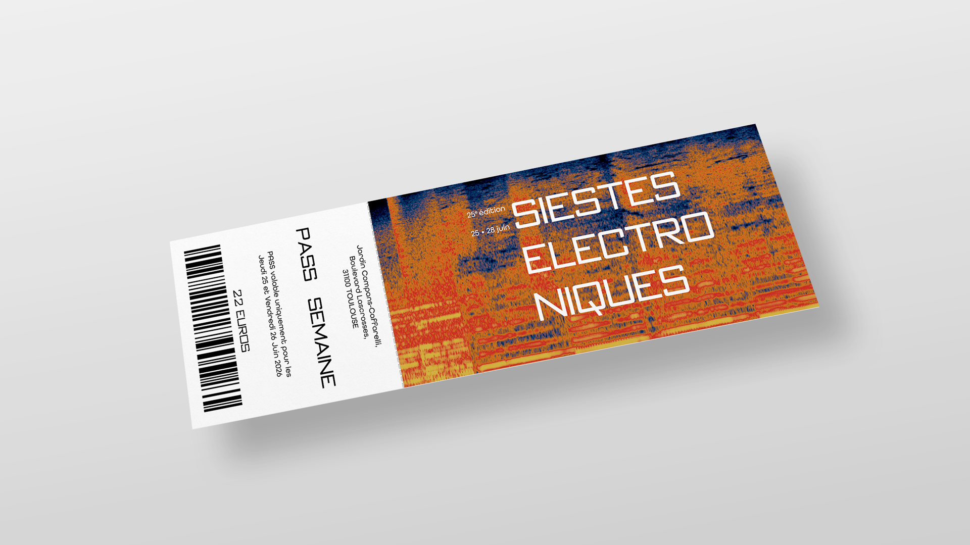
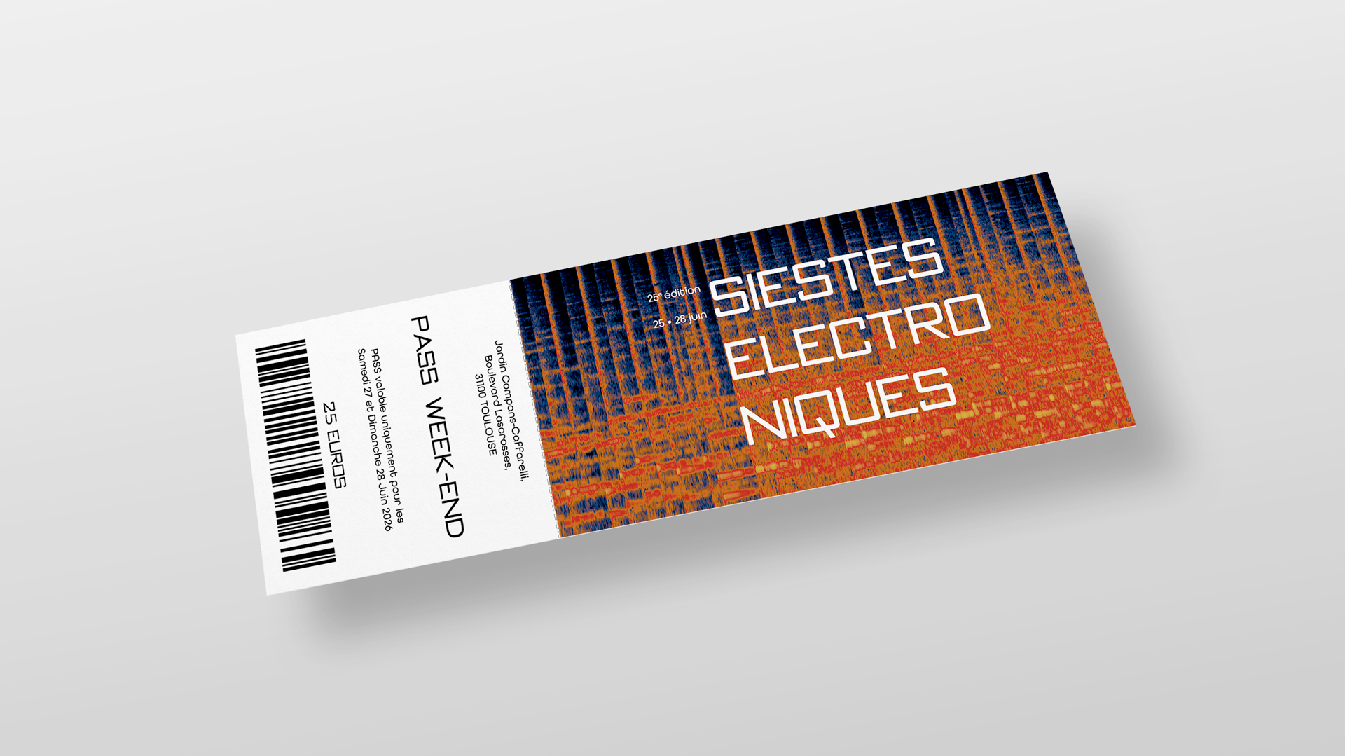
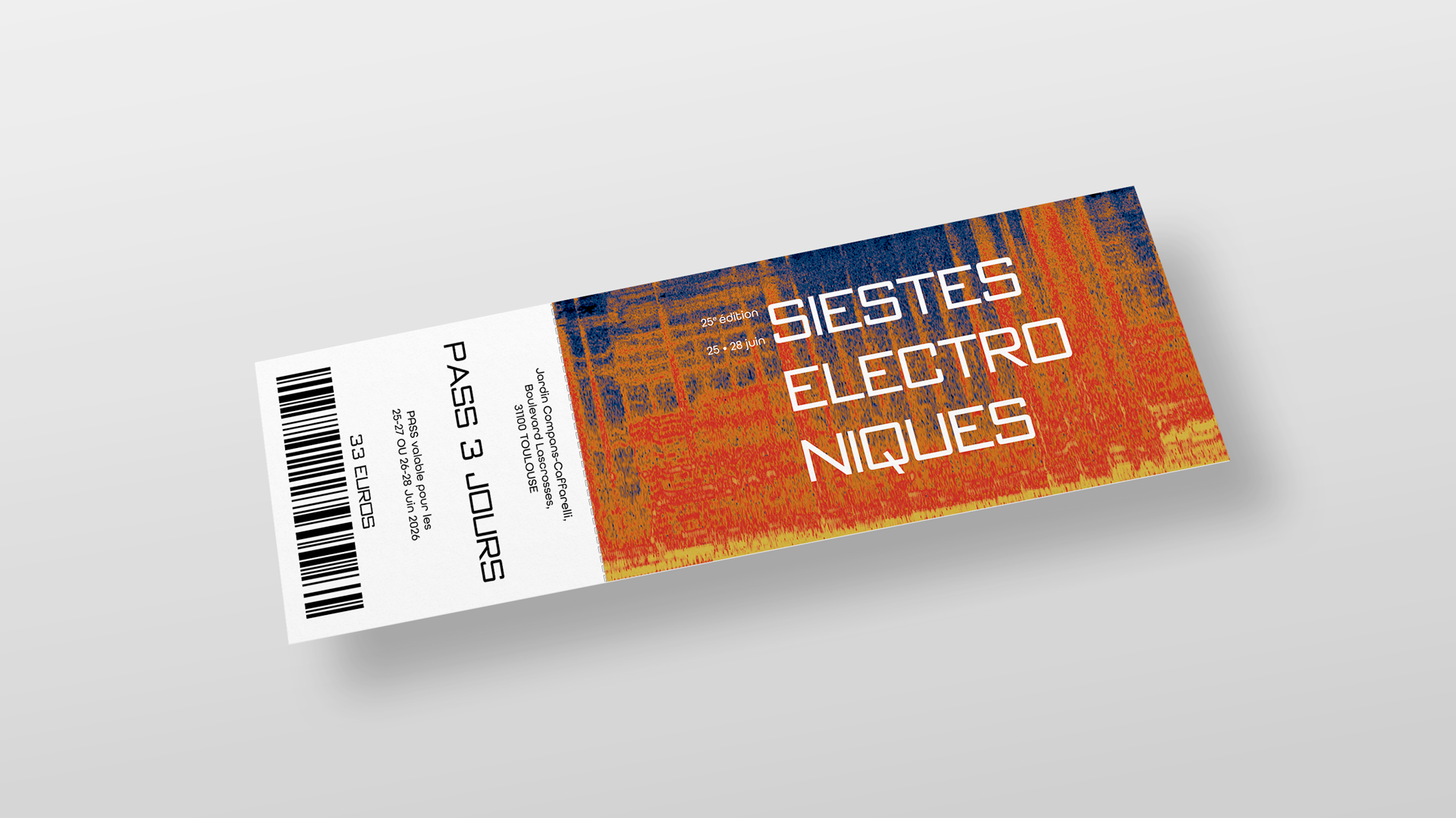
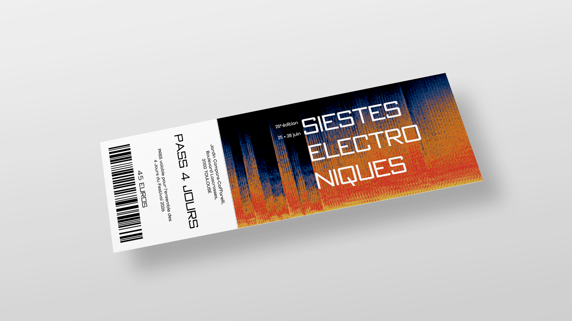
Lastly, even though the event is free, to follow through with the concept, I tried my hand at potential tickets for the festival.

1 DAY PASS

Branding / Print

WEEK PASS

Branding / Print

WEEK-END PASS

Branding / Print

3 DAYS PASS

Branding / Print

4 DAYS PASS

Branding / Print