On my way!

Science Infuse

Branding / Print / Packaging

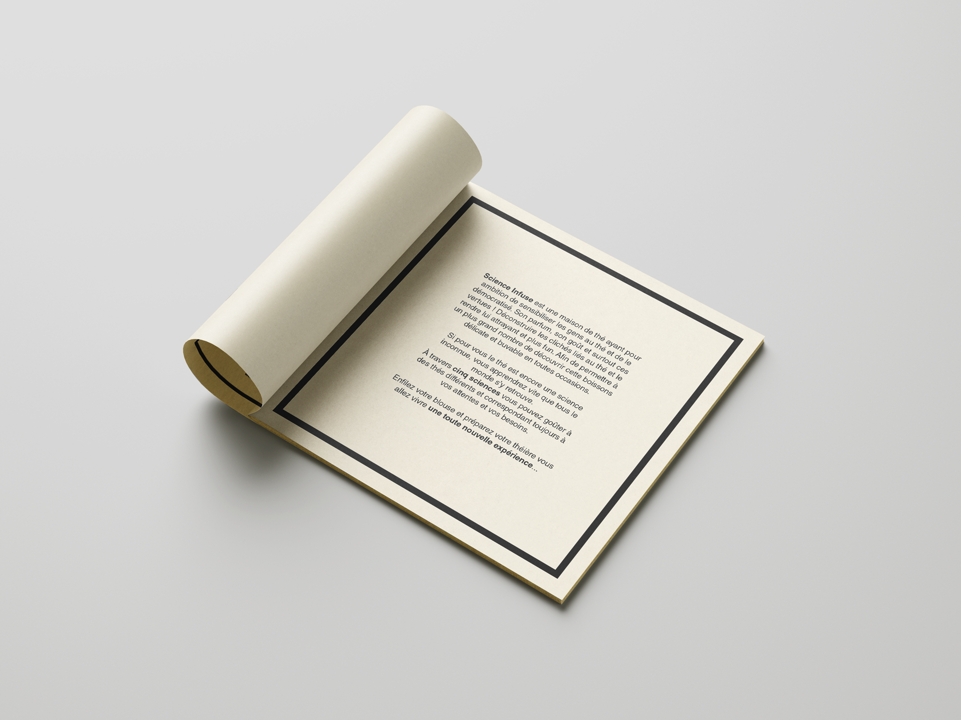
Study for a personal project: a Tea house that makes tea more accessible and offer a new perspective on this drink that can be enjoyed hot or cold on any occasion.

Introduction

Why?

I LOVE tea (and coffee, but mostly tea). I am really passionate about it, and I could yap about tea for hours. Since my sister gifted me a bunch of loose tea boxes from Dammann Frères, I fell in love with this concept of infusing dry leaves in hot (or not) water, and I became obsessed with it- how it works, how it's made, what it does. I was -and still- am fascinated by tea.

Moving forward to my last year of study, when we were asked to create a brand, fictional or not, and I didn't create a tea brand cause one of my classmates was also doing a tea brand. I wanted to do something different with a friend who started a business at the time, but... the idea of this tea brand stuck with me, living rent-free in my mind, nd it all came back with a stupid pun: Science Infuse.

Science Infuse, in French, means "know-it-all"; it's usually used to sarcastically mock someone who acts and/or speaks like a know-it-all: "Mais bien sûr, il a la science infuse lui." / "Of course, he's all-knowing, that guy.", and I love myself a good corny pun, but also, that was the perfect name for a project that screams "DEL-ightful" more than any other branding project I worked on, which would also be a way to share my love and everything I learnt about tea.
Last year, I got a bit more time on my hands, and that was all I needed to start the fake brand that had been haunting my thoughts for years.

How?

I really wanted to play with both words in the name: Science, Infuse.
I love the aesthetic of Science: the very clean, minimalistic, "techy" imagery versus the "green, organic, nature" or "British, noble, classy" we usually see with most well-known tea brands/houses, at least in France.

HOWEVER, something solely scientific-looking would not be as fun as I want it to be; here's where the Infuse comes in.
Because I also wanted this brand to be a learning experience to discover more about tea, the idea of gathering knowledge about it- facts while drinking it, literally infusing oneself with it- sounds cool! I wanted to show the infusion itself with visuals of ink on blotting paper that would illustrate each tea.

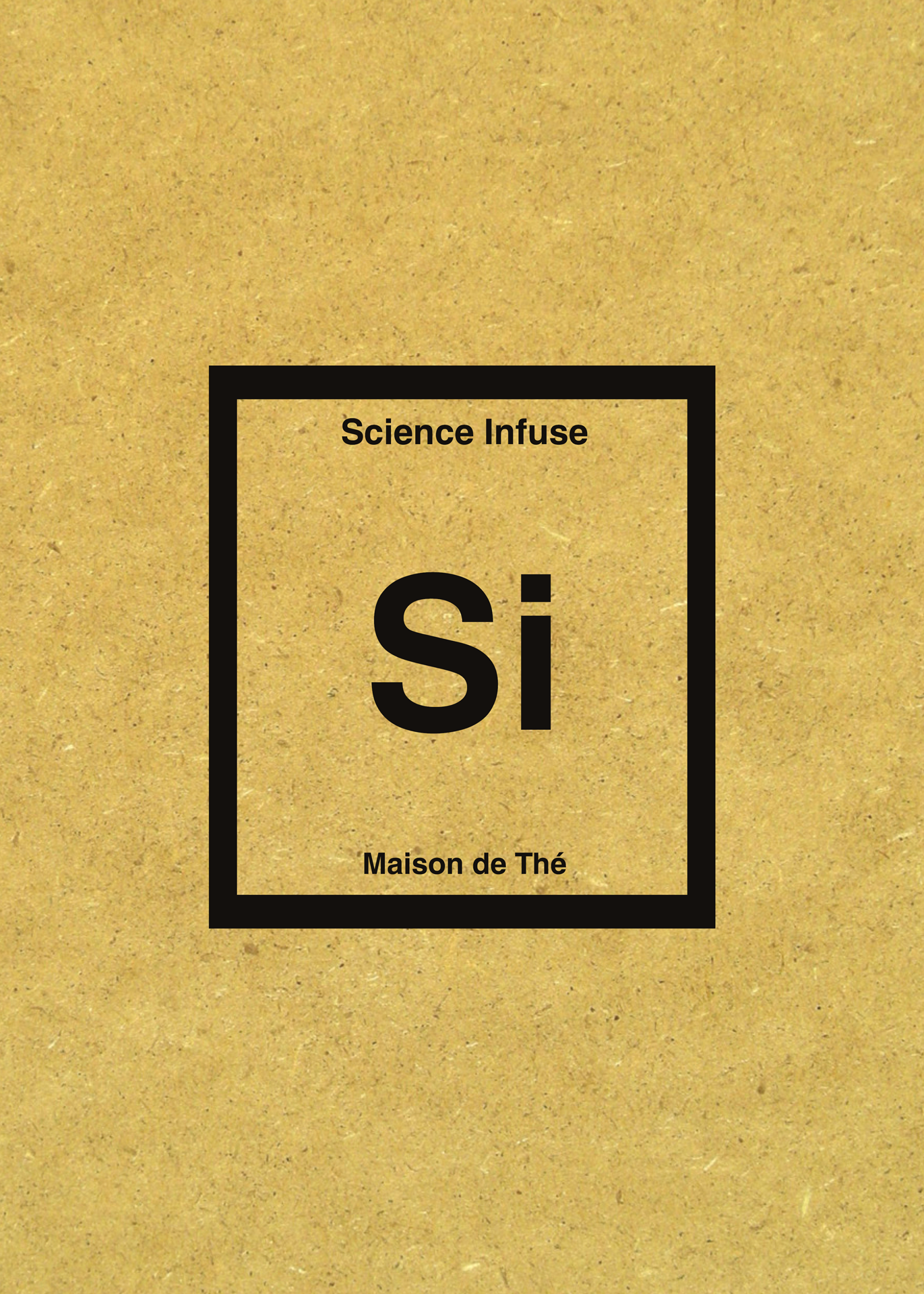
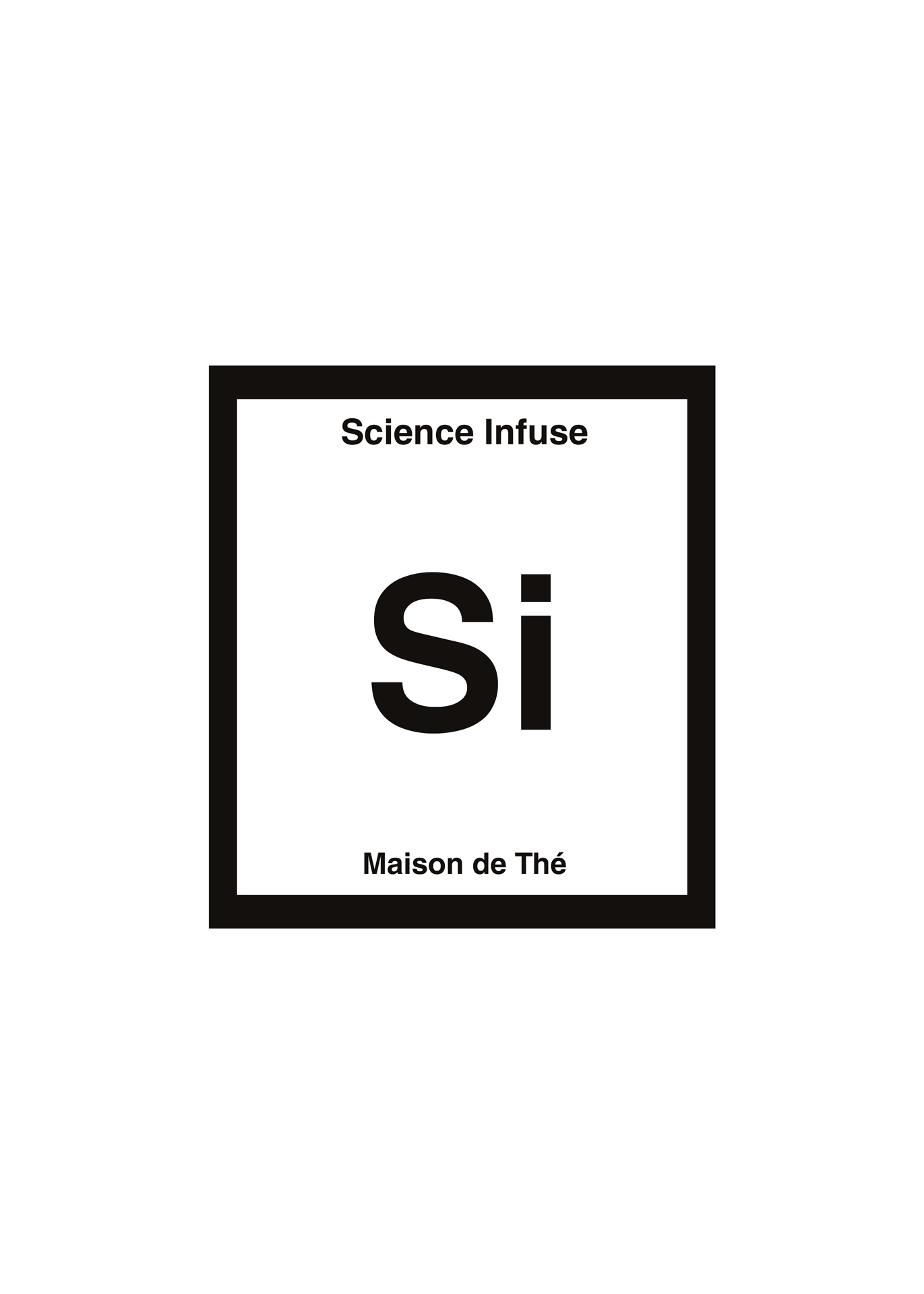
Still, I was missing my scientific teaching element, and what compiles information from a lot of different things in a "simple" way in science? The periodic table! It sorts and lists elements and their specific feature with a code you can easily understand once you learn how to read it.

The combination of both illustrations and periodic-table imagery creates each tea's pictogram. These pictograms will then be the structure the logo is based on.
SCIENCE

A clean, minimalistic and modern imagery, mixed with...

science infuse maison thé fictive tea house health graphisme print packaging del-ightful delphine morichon illustration graphic design webdesign stockholm sweden sverige

INFUSE

A more krafty, organic and artsy aspect.

science infuse maison thé fictive tea house health graphisme print packaging del-ightful delphine morichon illustration graphic design webdesign stockholm sweden sverige

Graphic Chart

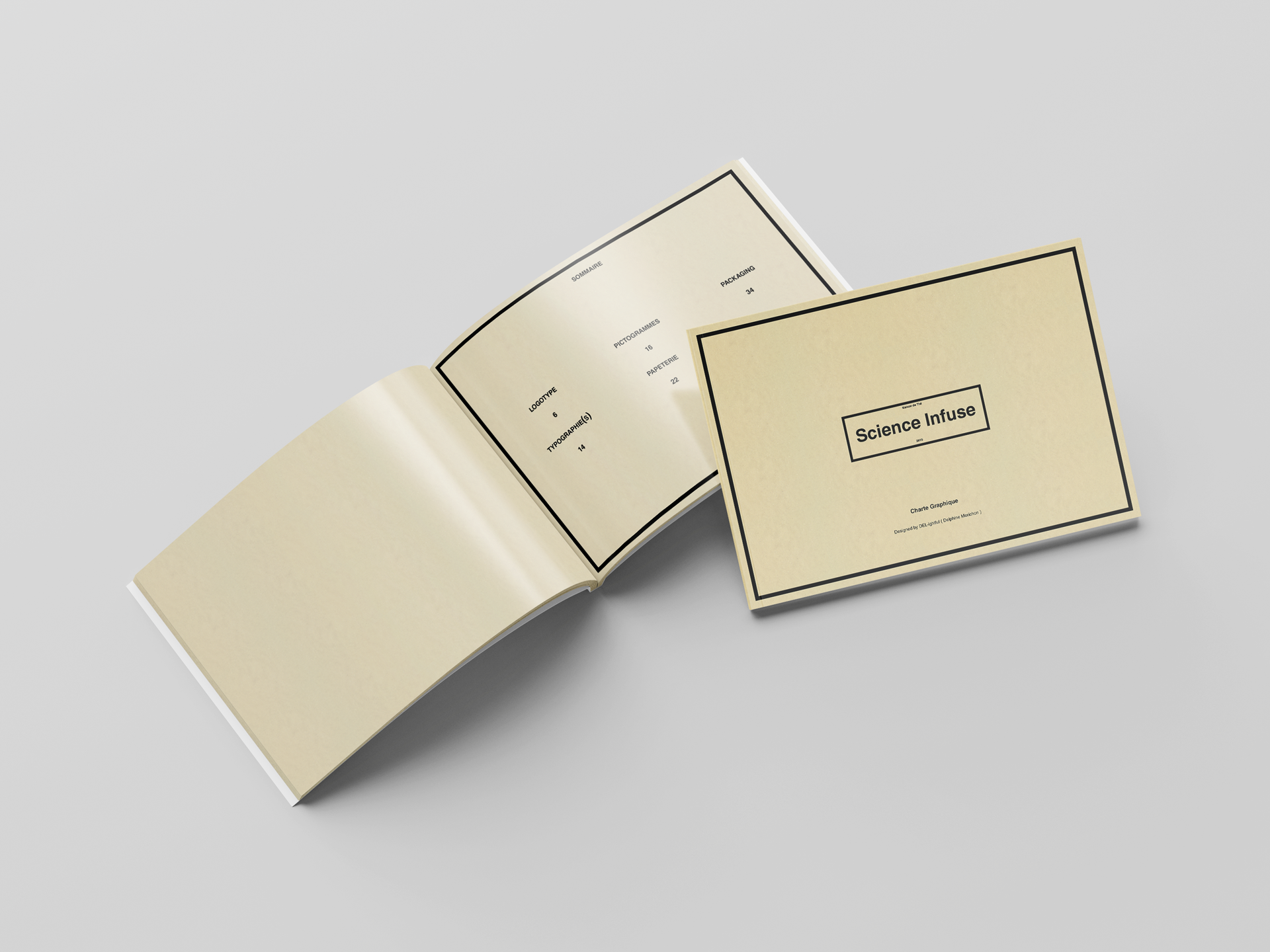
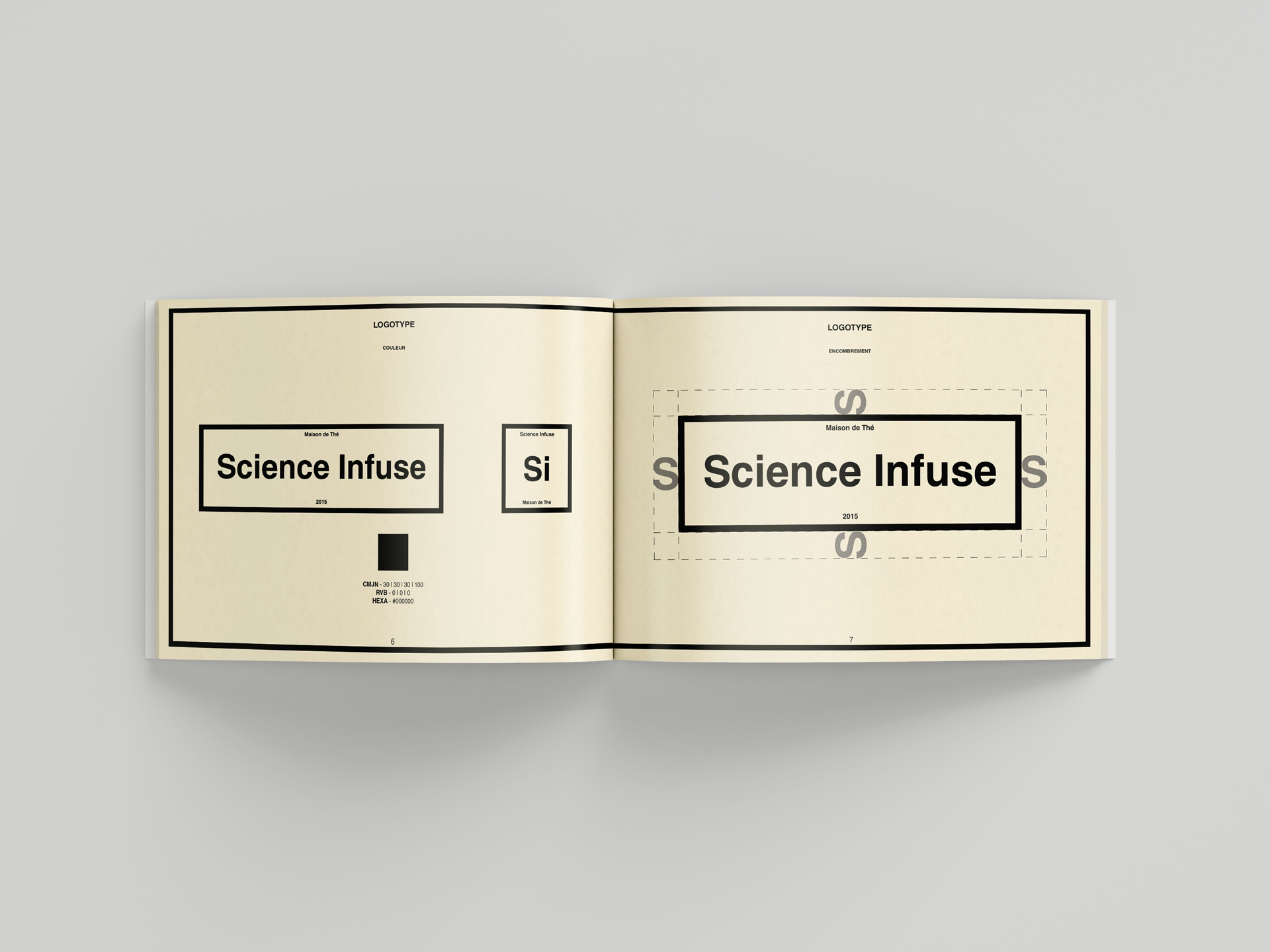
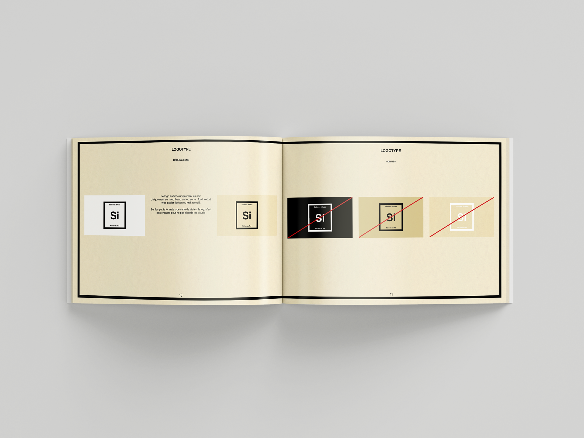
First, structure: as soon as I was happy with the logo, I built the Graphic Chart, which sets the layout and tone for every medium.

The black frame defines the cells of the periodic table, the teas' pictograms, and the visual margins, keeping the layout as close to a simple 3x3 square as possible.

To accentuate the easily readable, clean aspect, the brand uses only Helvetica in variations of weight and case to better organise the information.
Graphic Chart

Branding

Graphic Chart

Branding

Graphic Chart

Branding

Graphic Chart

Branding

Graphic Chart

Branding


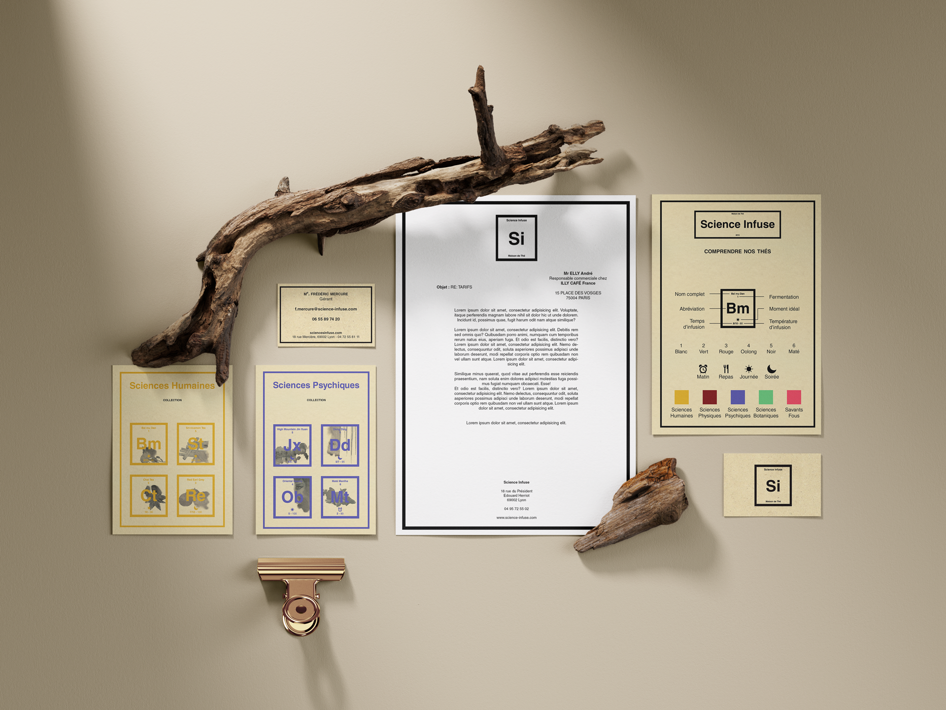
Stationary elements

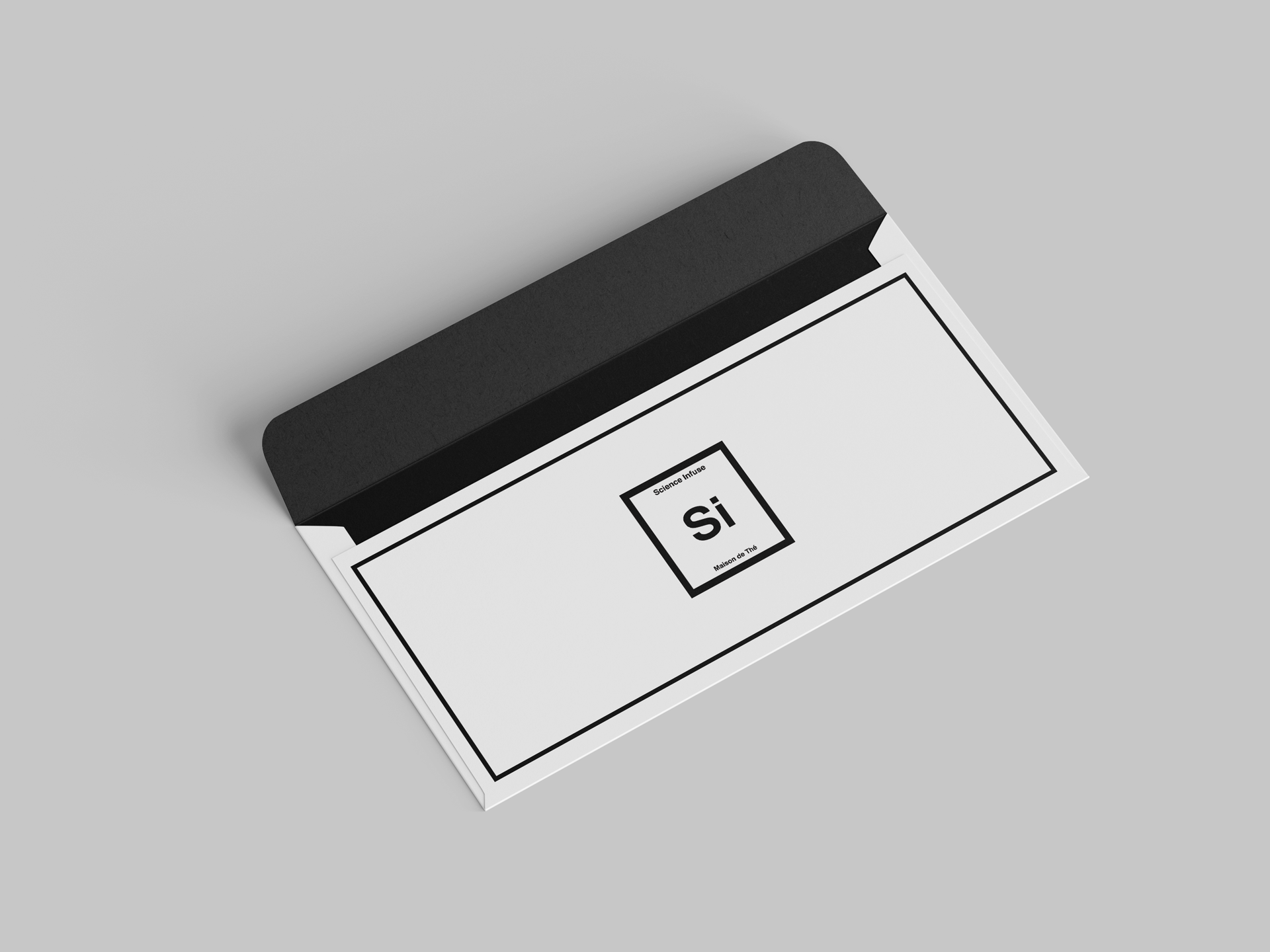
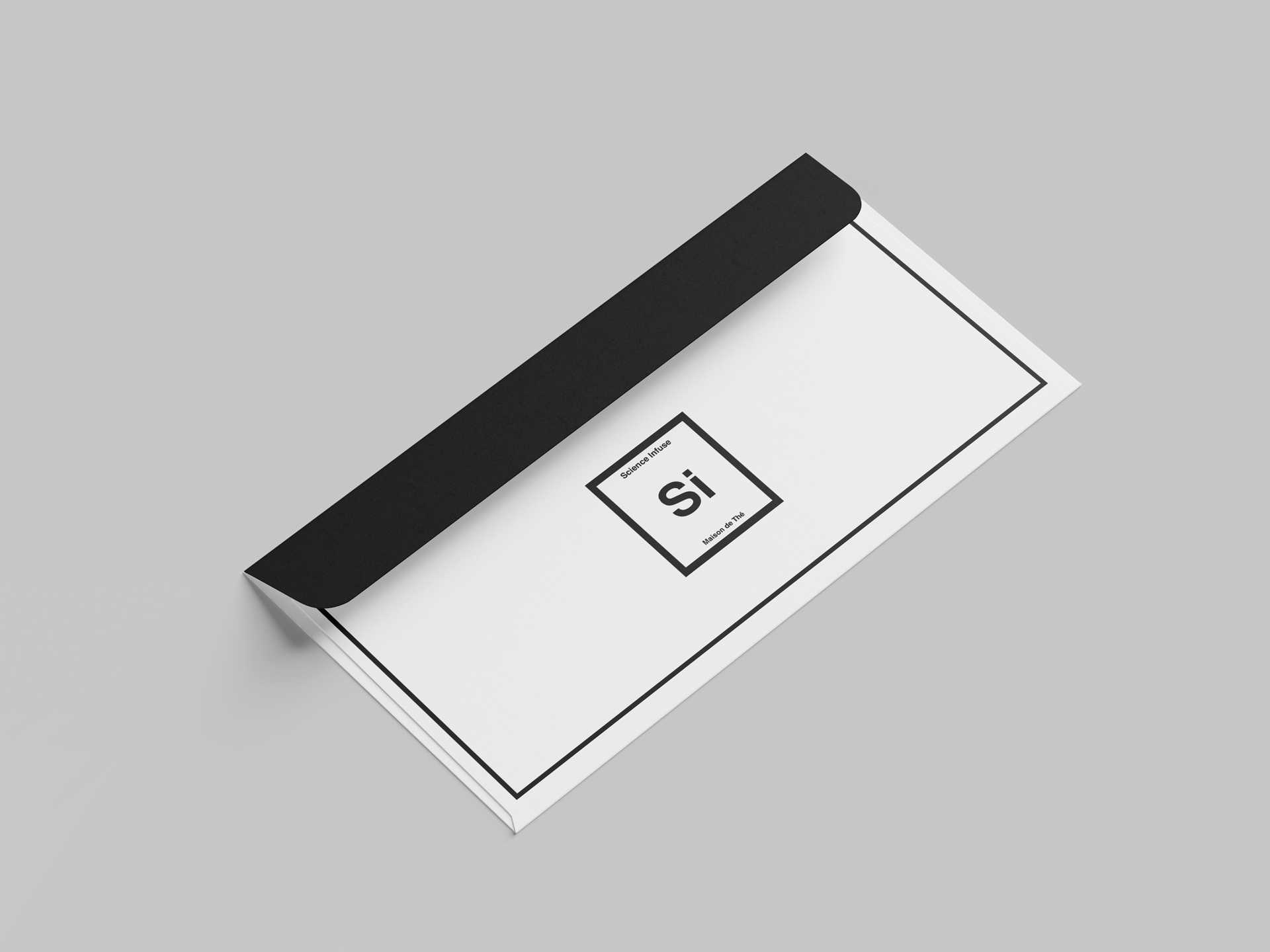
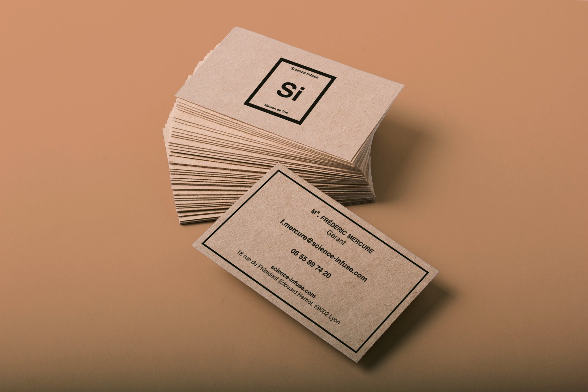
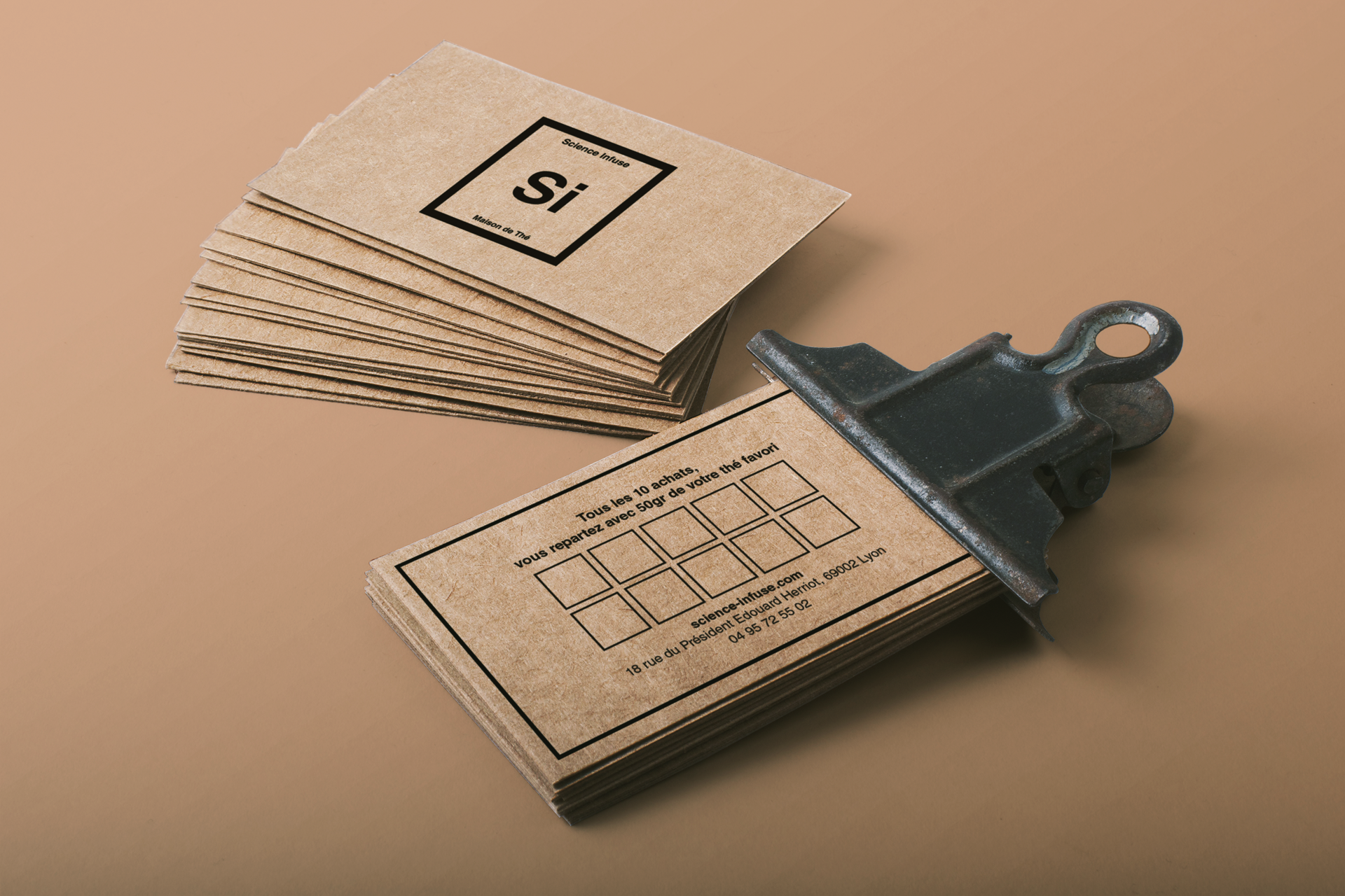
The "Business" or "Corporate" media use a more scientific, minimalist setup, while the rest is printed on brown kraft paper. The exception is the business cards, which are nominative and used in a more person-to-person setting.
Stationary

Branding / Print

Stationary

Branding / Print

Stationary

Branding / Print

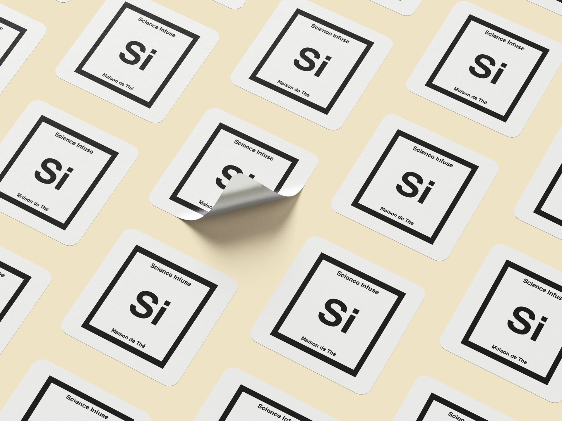
Stickers

Branding / Print

Business Cards

Branding / Print


Products

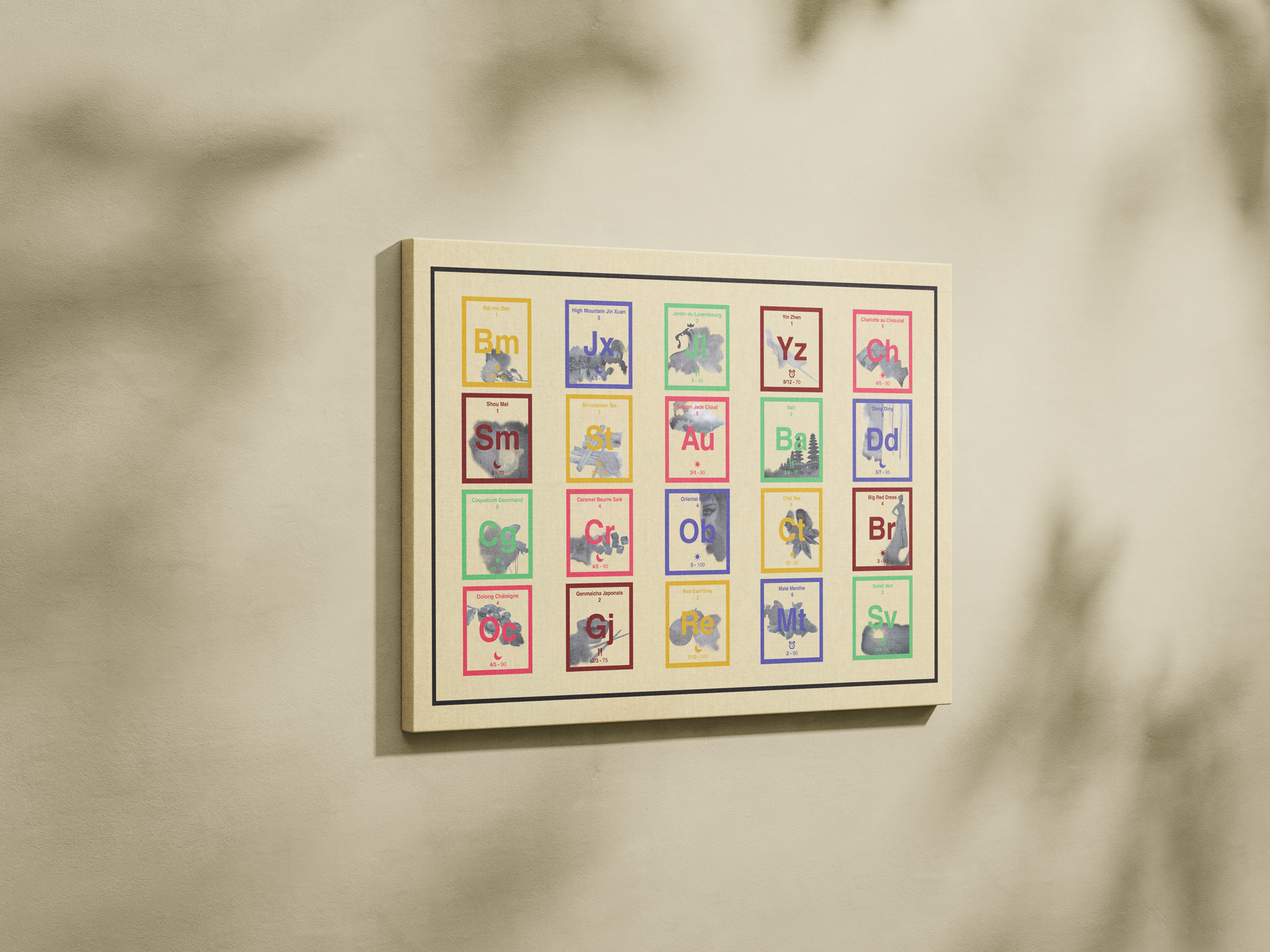
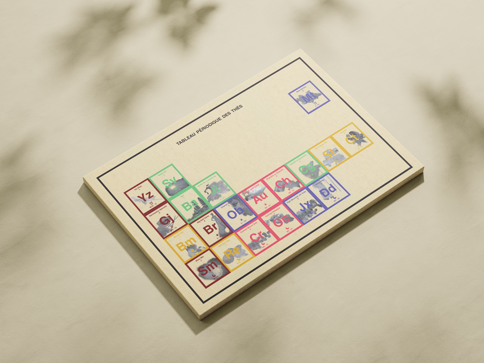
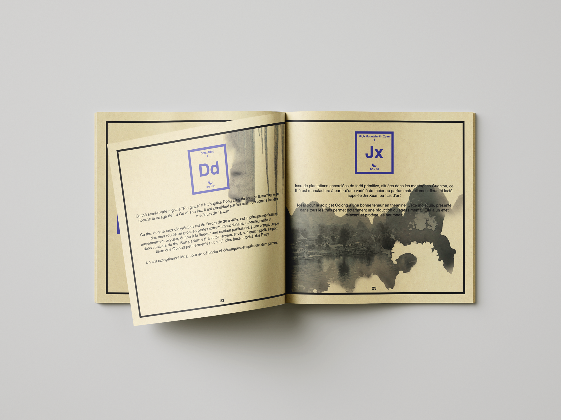
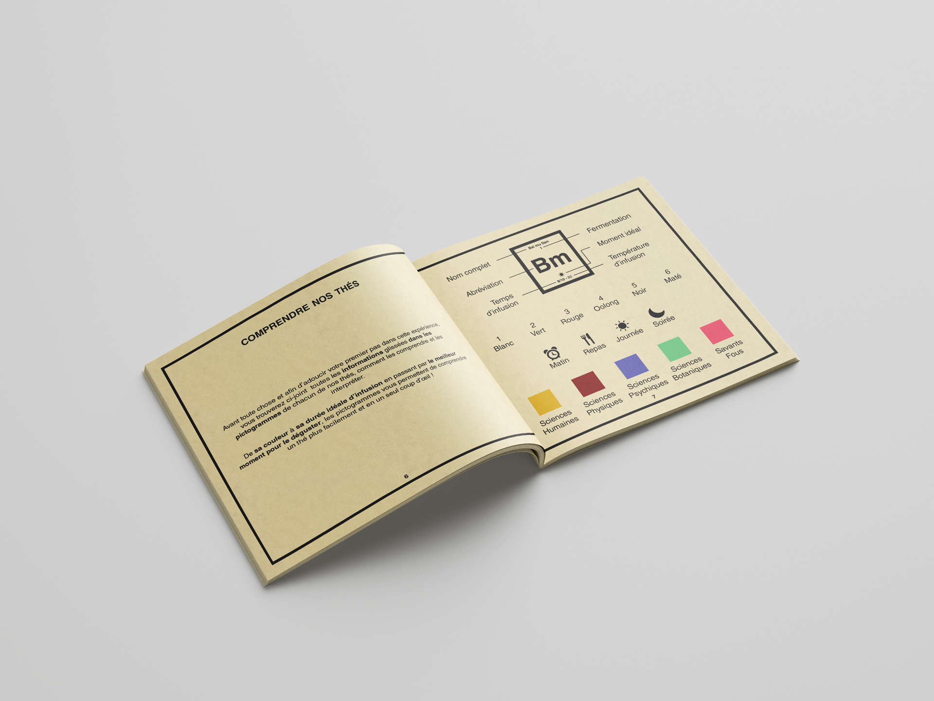
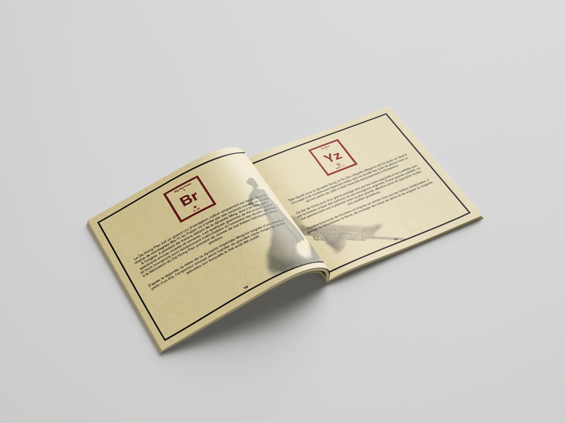
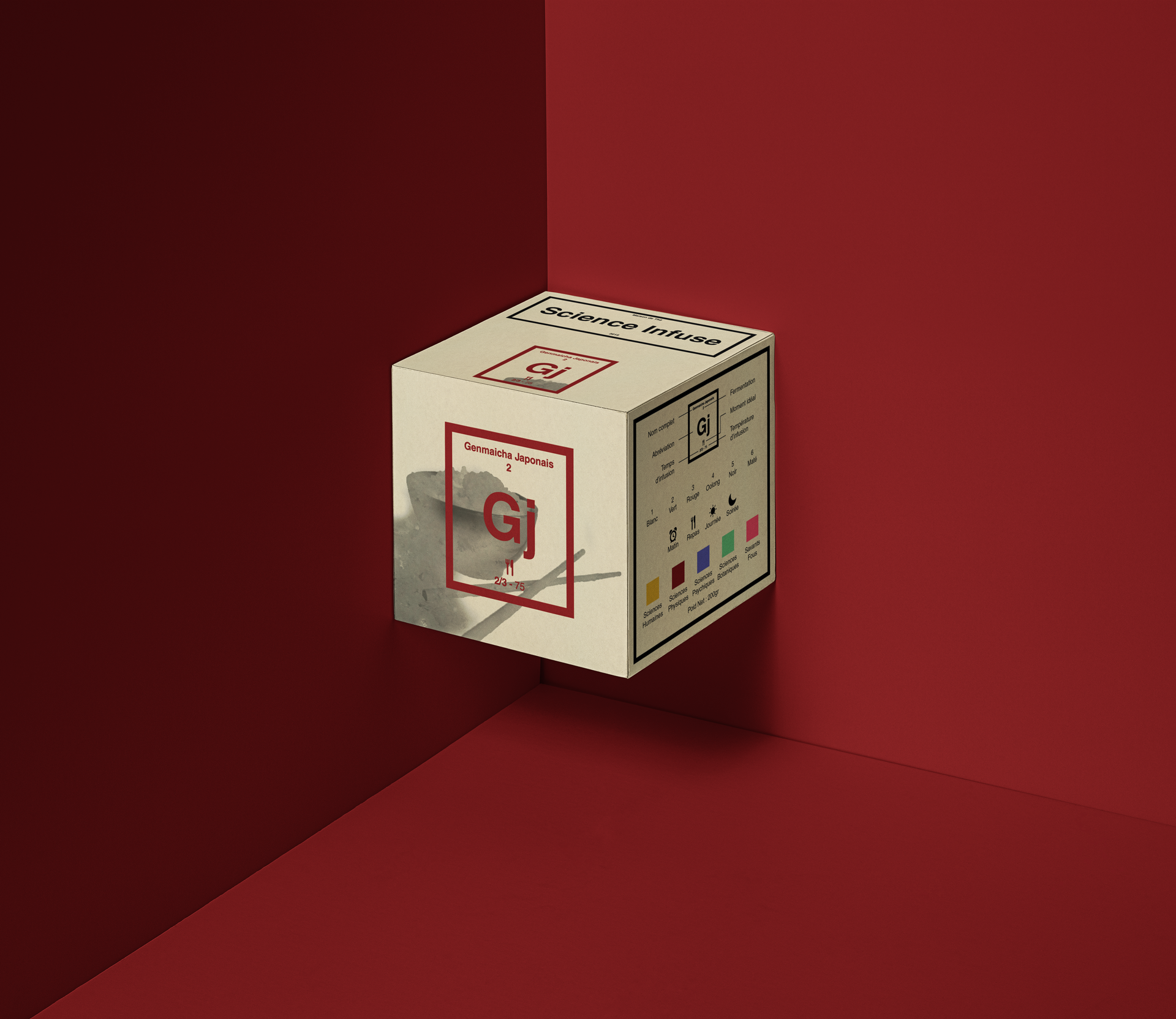
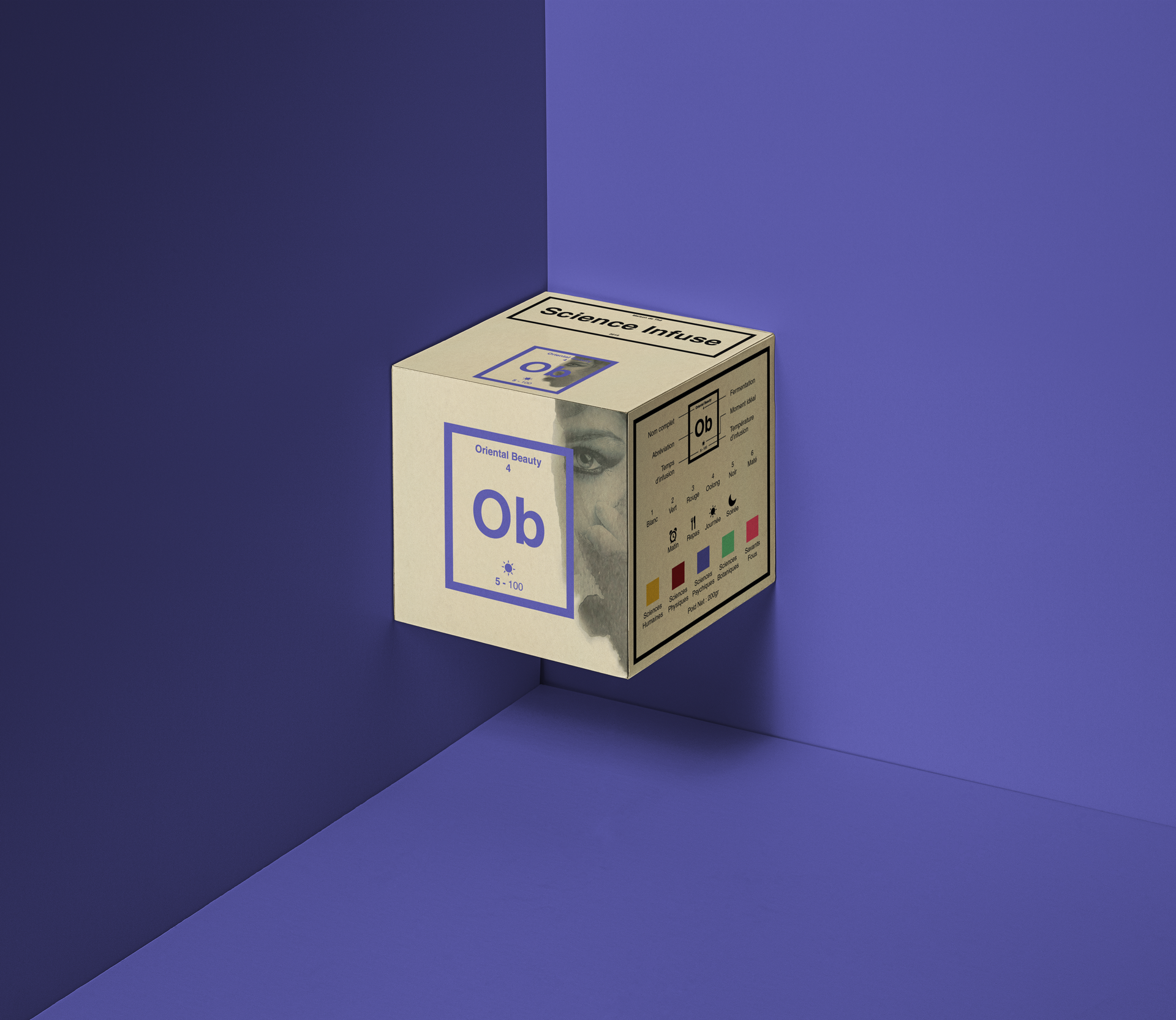
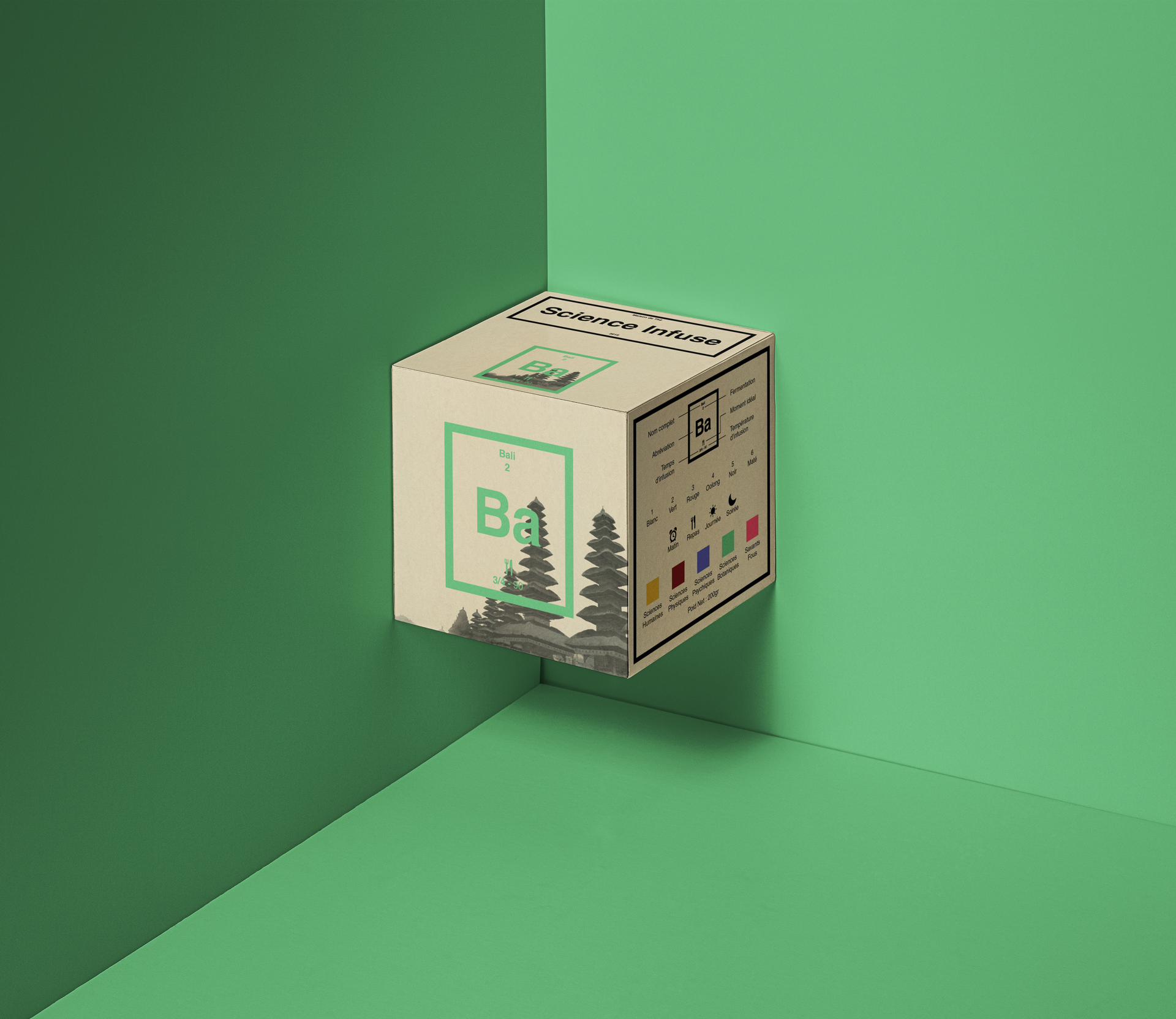
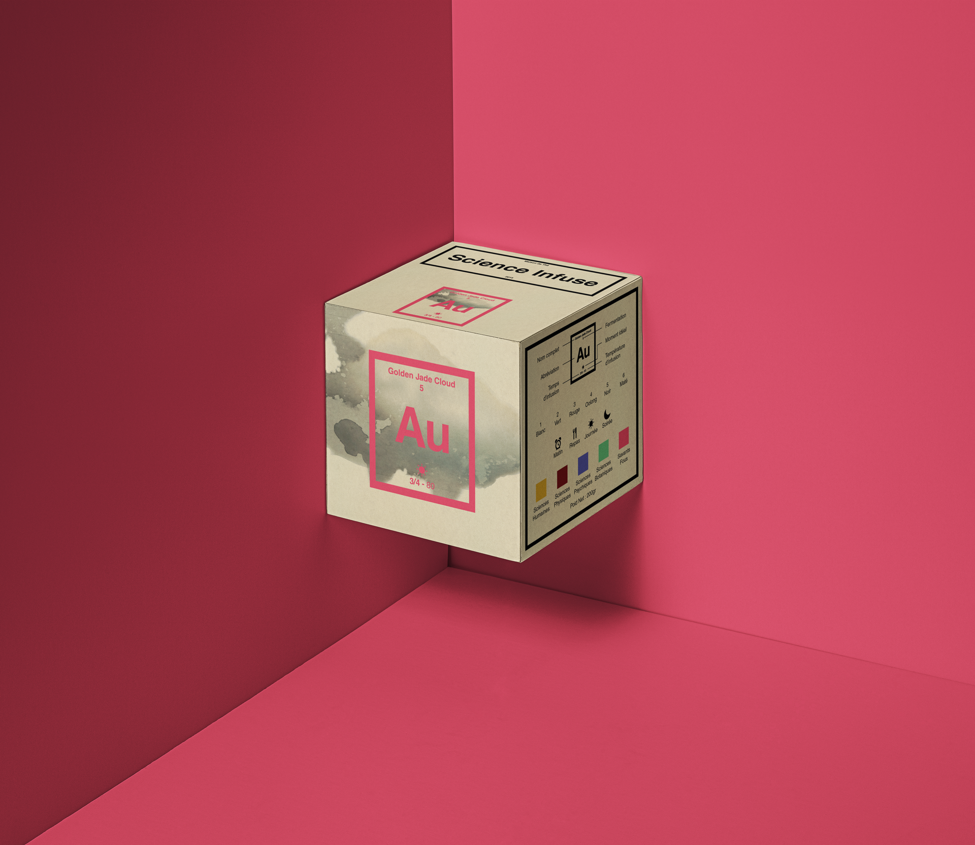
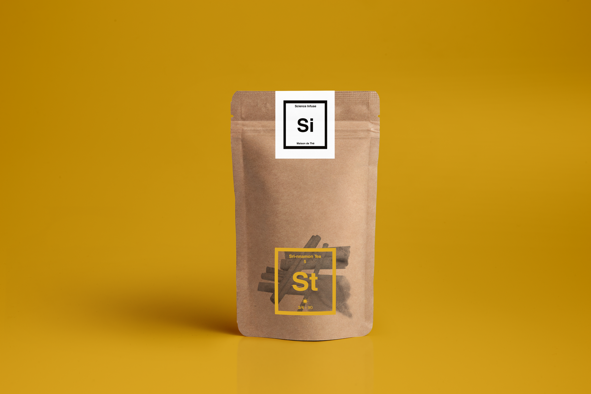
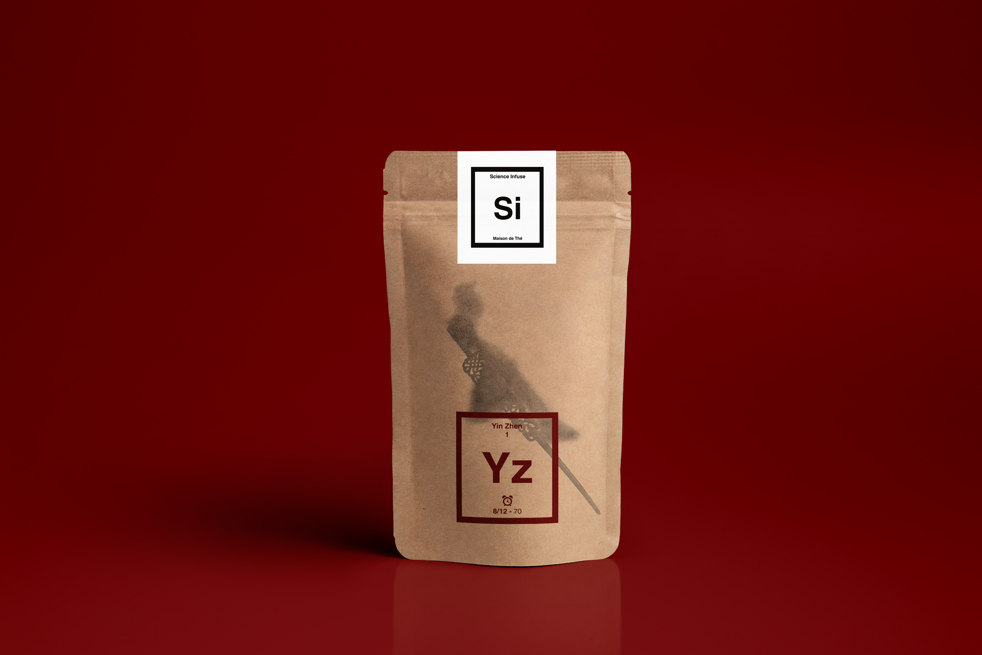
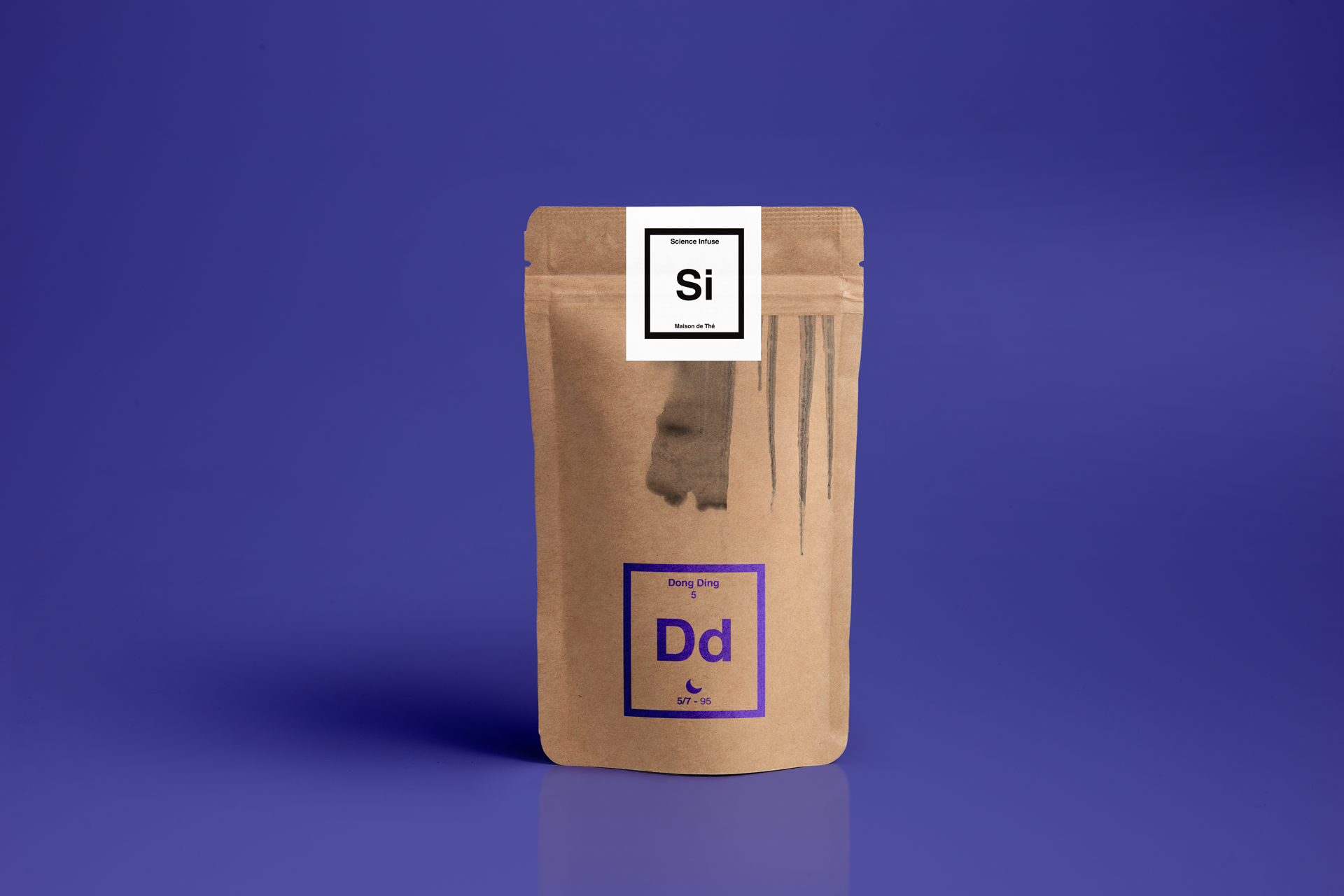
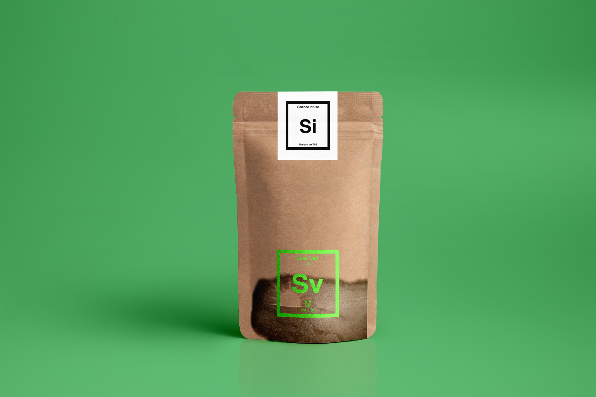
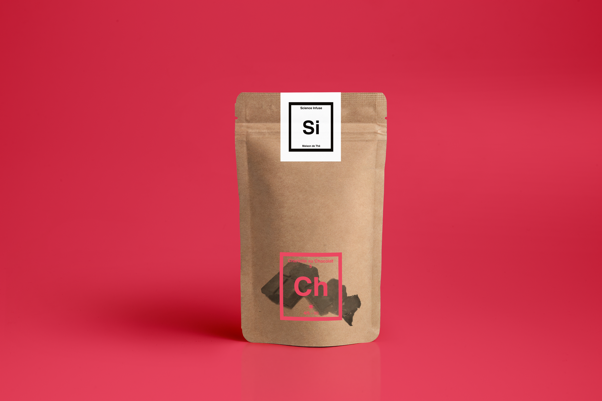
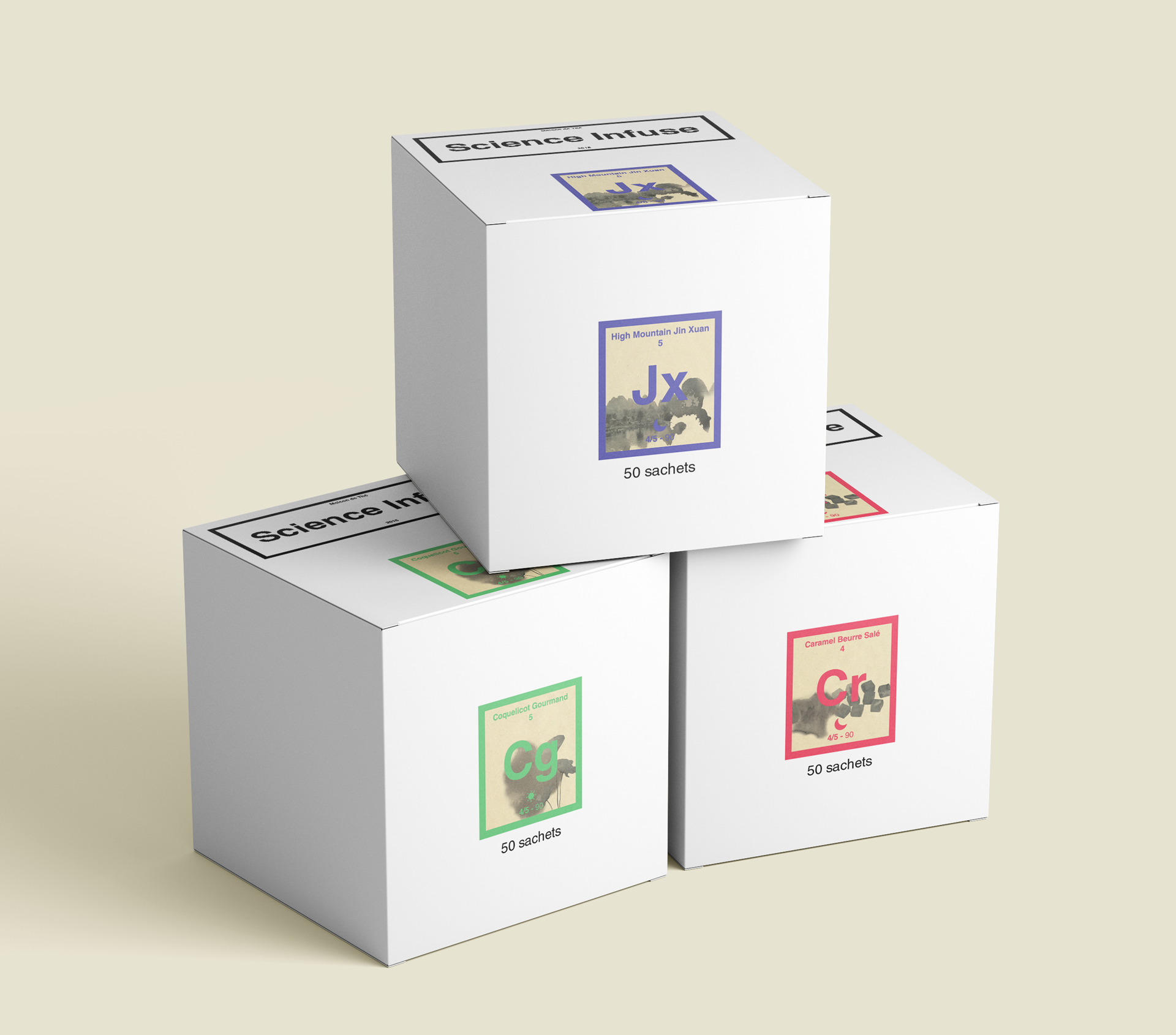
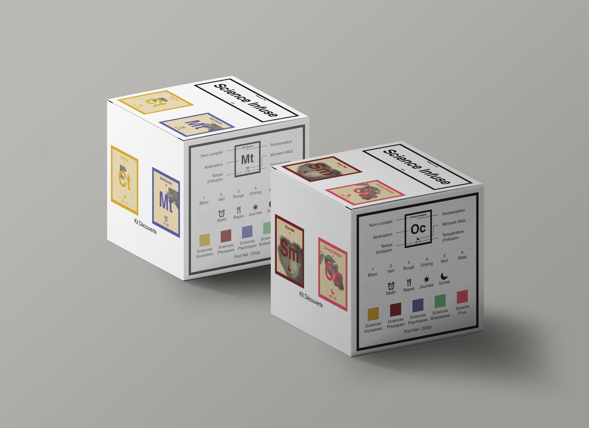
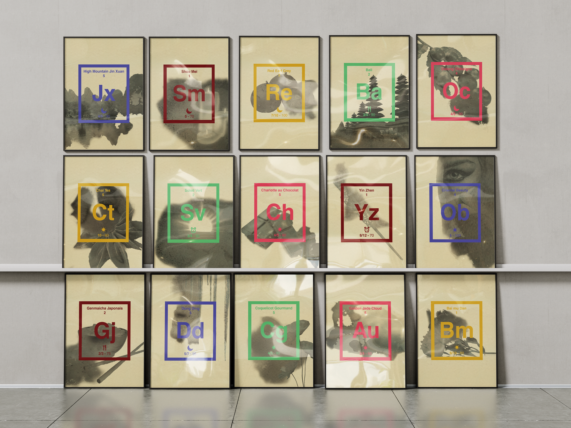
Now's time to spill the real Tea. Each pictogram contains the full name of the tea, its abbreviation, oxidation level, the best time of day to drink it, and its temperature and infusion time. On top of that, it comes in one of the 5 colours, which links back to the corresponding tea catergory/family:

Sciences Humaines for teas culturally used during social occasions, as a welcoming or hosting gesture.
Sciences Physiques for teas with real and/or legendary medicinal properties, physical health-improving properties.
Sciences Psychiques for teas with real and/or legendary medicinal properties, mental health-improving properties.
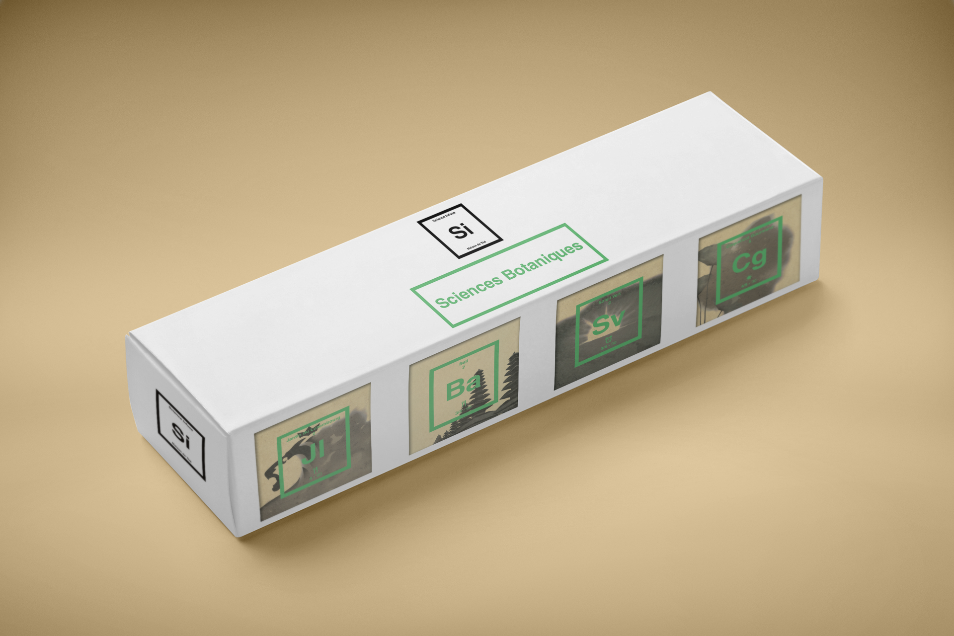
Sciences Botaniques for flavoured teas and blends tasting like fruity, flowery or herbal.
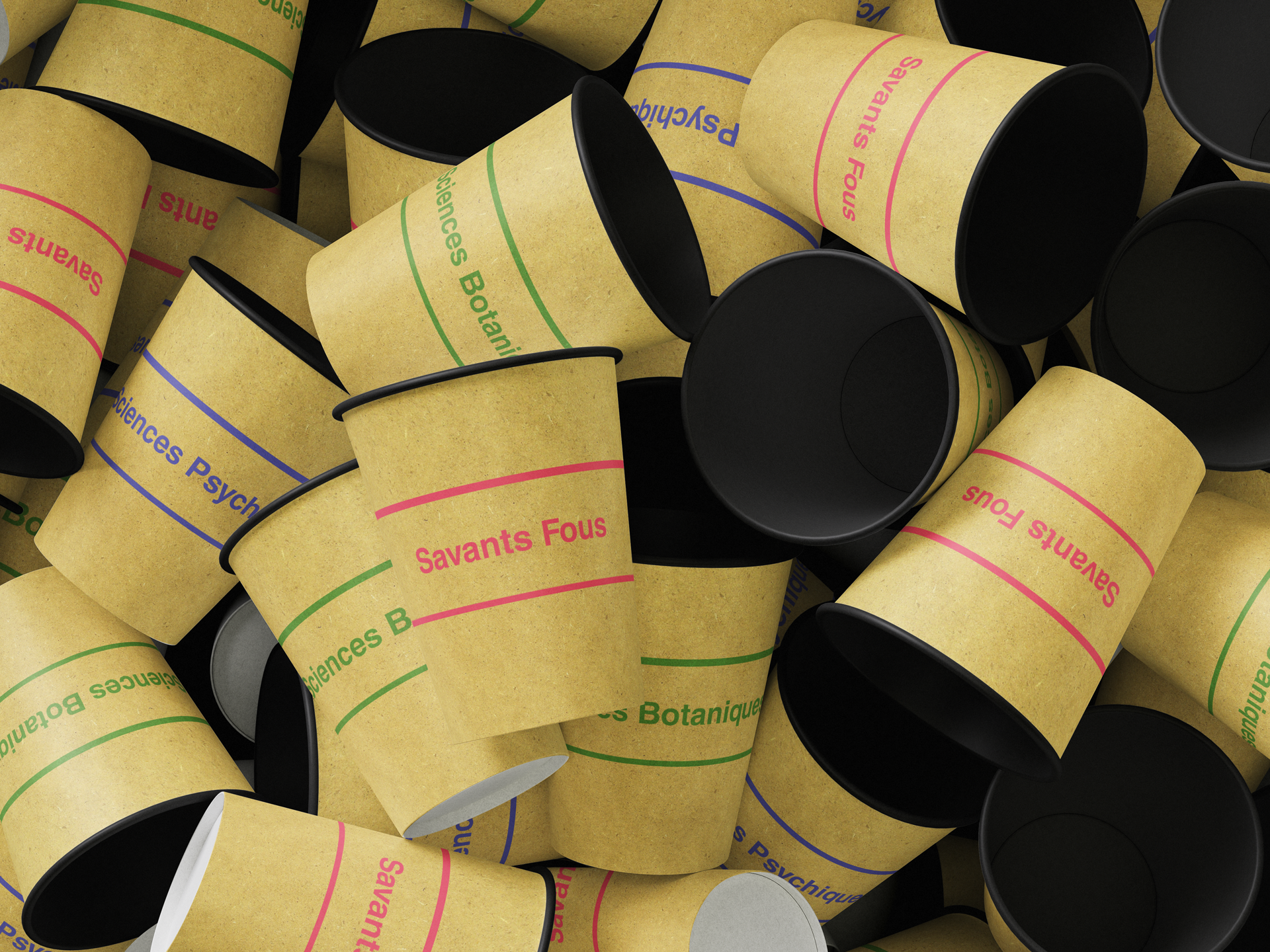
Savants Fous for more pop, funky or unconventional teas and blends.

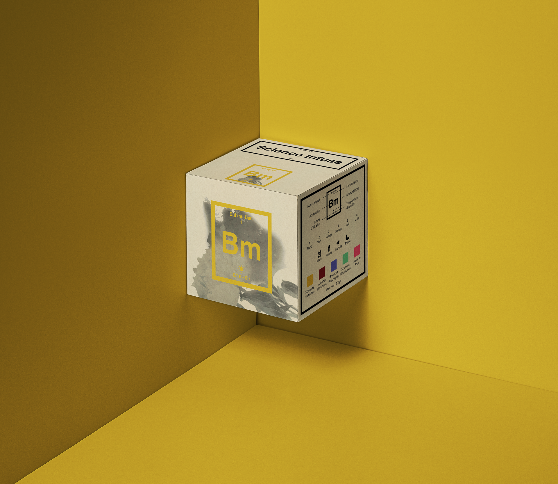
And finally, in the background, an inky illustration of one of the tea's ingredients or the tea's name.
When it's not contained within the pictogram frame, the illustration stretches across a larger layout.

A guide on how to read the pictograms is available in the tea's menu and on most of the packaging. In any case, it will be delivered in postcard format to every client who needs it.

All pictograms

Branding / Packaging

Periodic Table

Branding / Packaging

Tea Menu

Branding

Tea Menu

Branding

Tea Menu

Branding

Tea Menu

Branding

Tea Menu

Branding

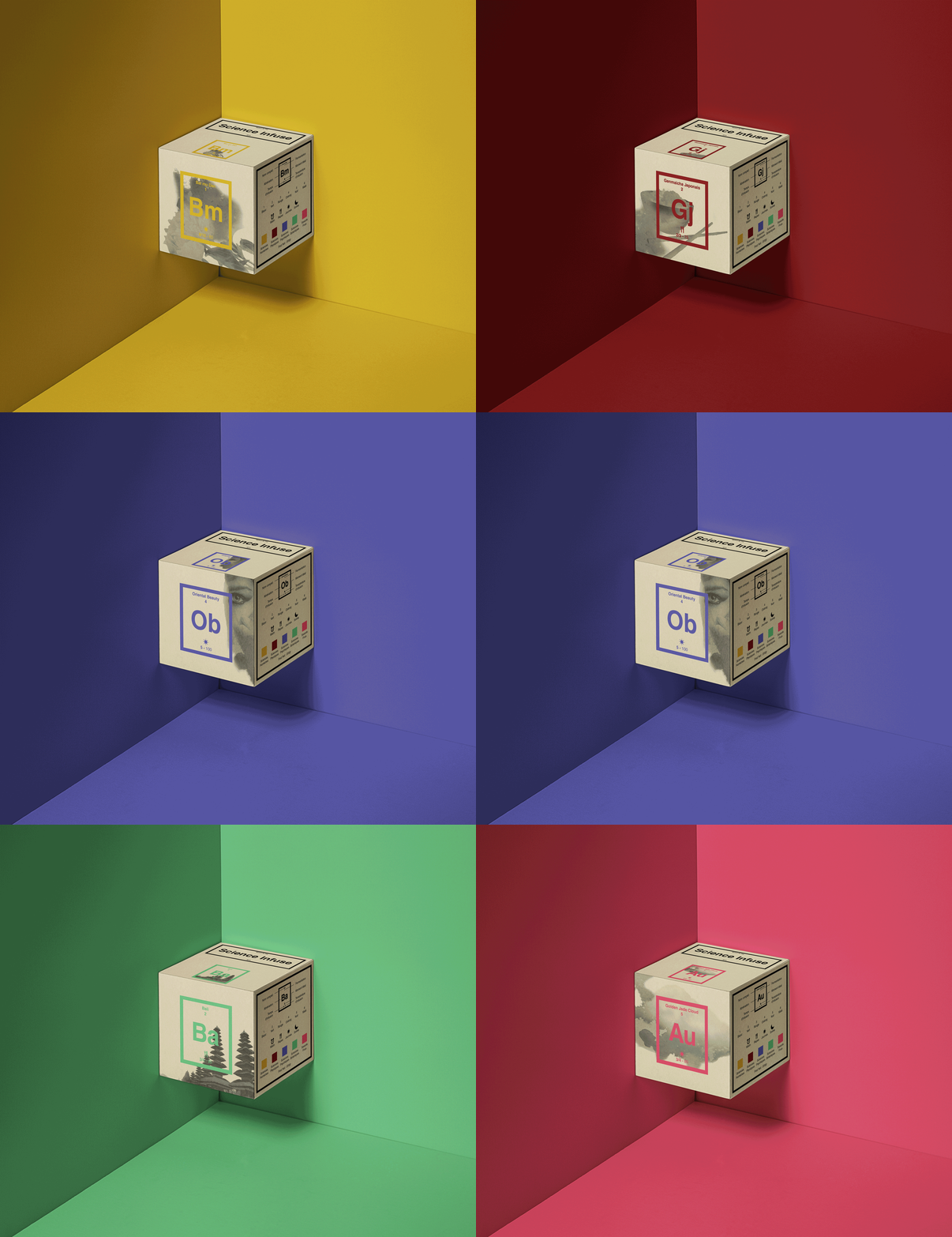
Loose Tea Boxes (200gr)

Branding / Packaging

Bm 200gr Box

Branding / Packaging

Gj 200gr Box

Branding / Packaging

Ob 200gr Box

Branding / Packaging

Ba 200gr Box

Branding / Packaging

Au 200gr Box

Branding / Packaging

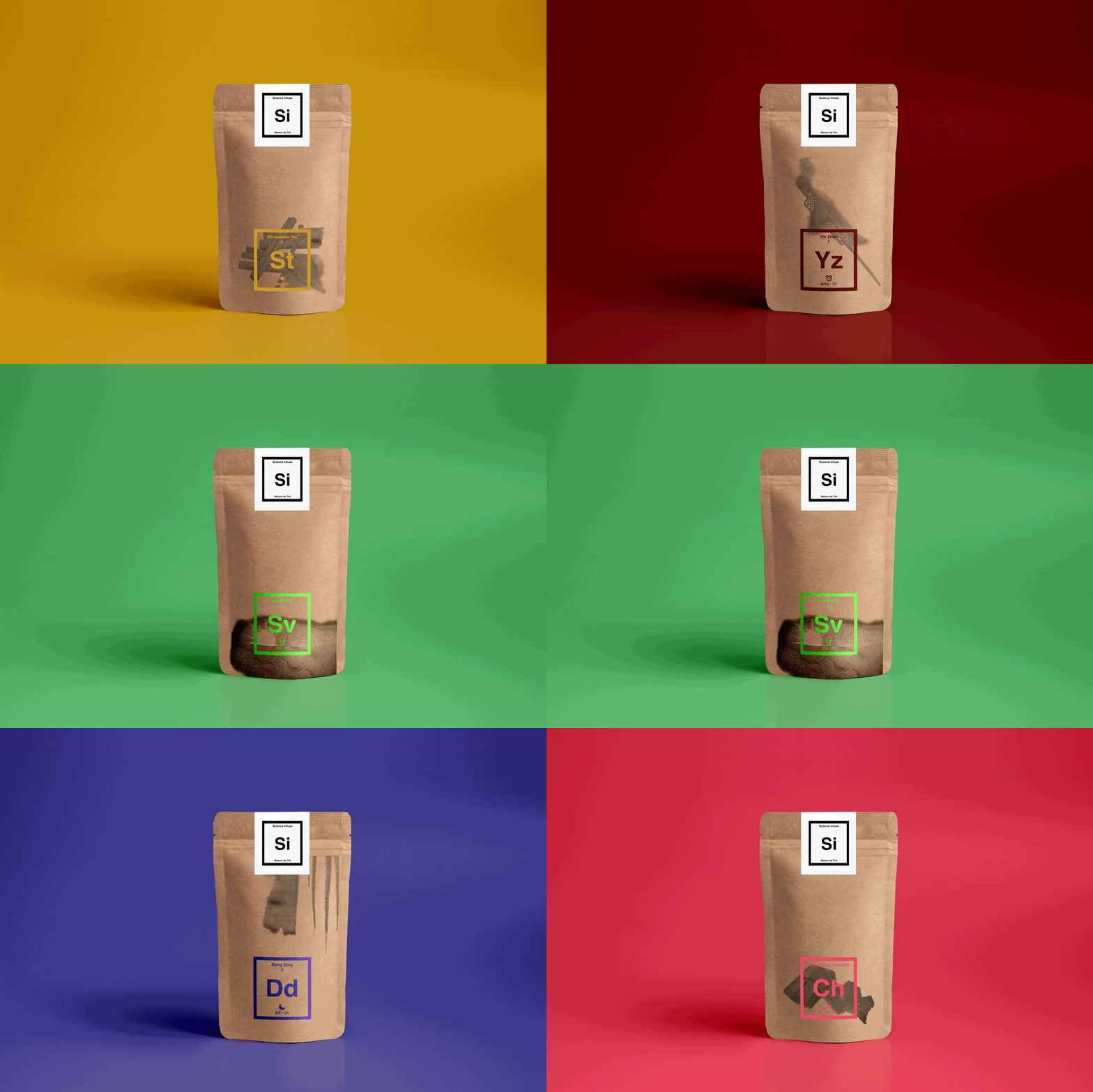
St 100gr Pouch

Branding / Packaging

Yz 100gr Pouch

Branding / Packaging

Dd 100gr Pouch

Branding / Packaging

Sv 100gr Pouch

Branding / Packaging

Ch 100gr Pouch

Branding / Packaging

Loose Tea Pouches (100gr)

Branding / Packaging

Crystal Bags Boxes

Branding / Packaging

Science's Collection

Branding / Packaging

Samples Packs

Branding / Packaging

Fidelity Cards

Branding / Print

Bags & Cups

Branding / Packaging

Gift Bag

Branding / Packaging

Gift Card

Branding / Packaging

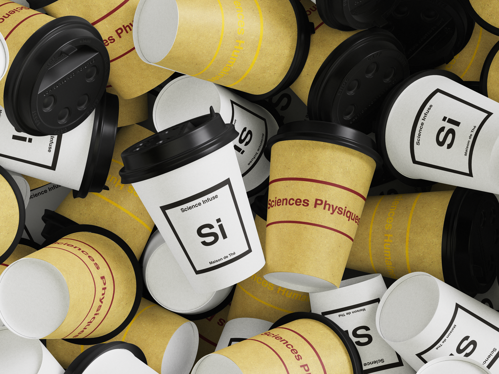
Paper Cups

Branding / Packaging

Paper Cups

Branding / Packaging


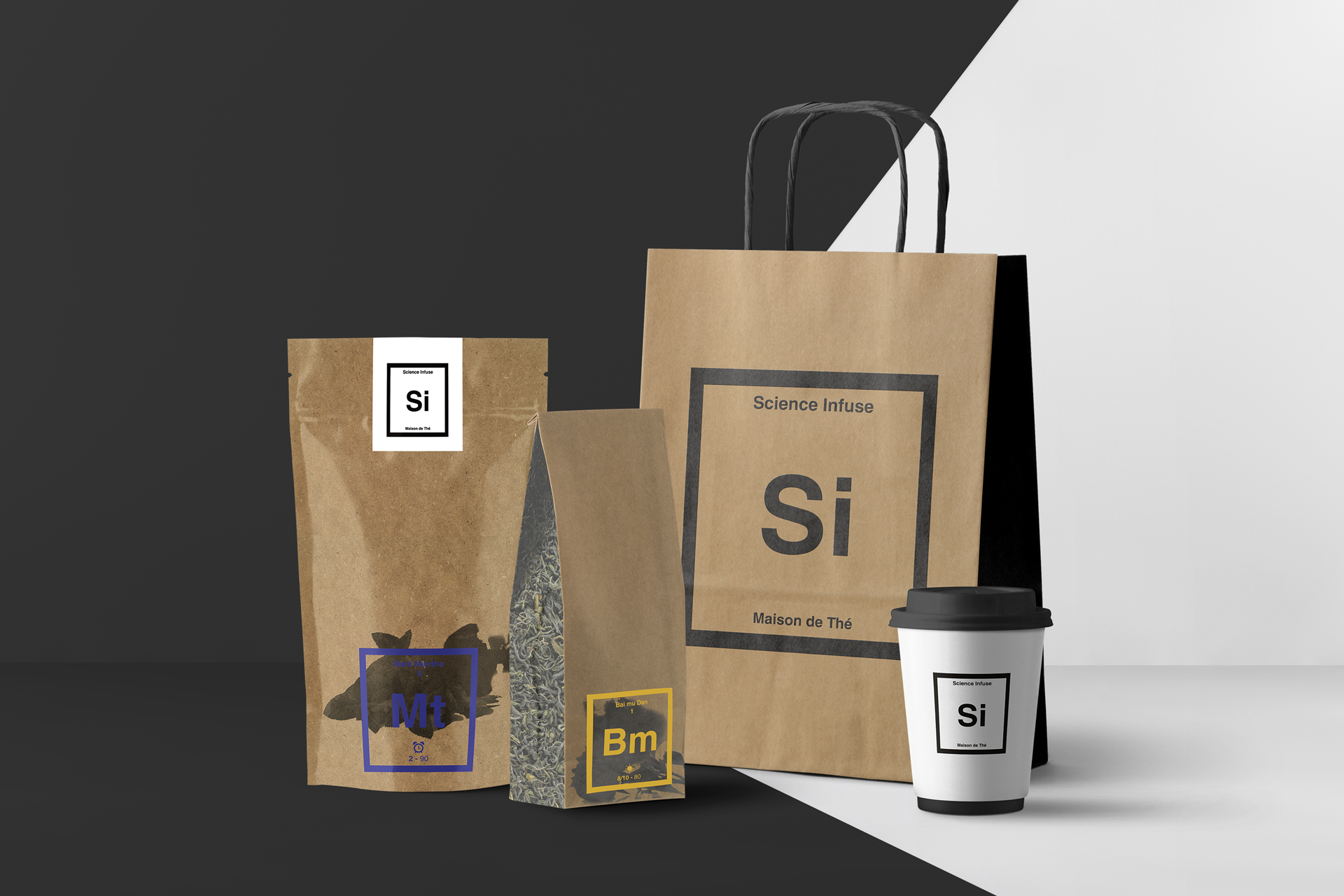
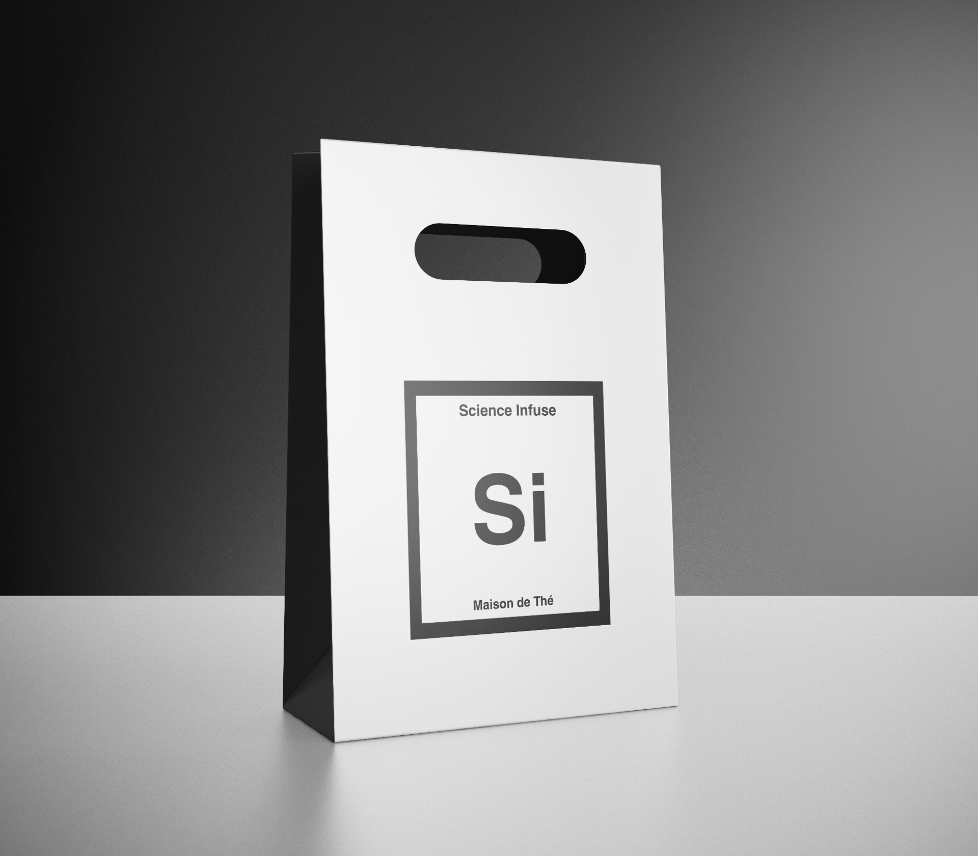
When it's not brought in loose leaves or as a collection, the packaging design switches to a more scientific, minimalist style.
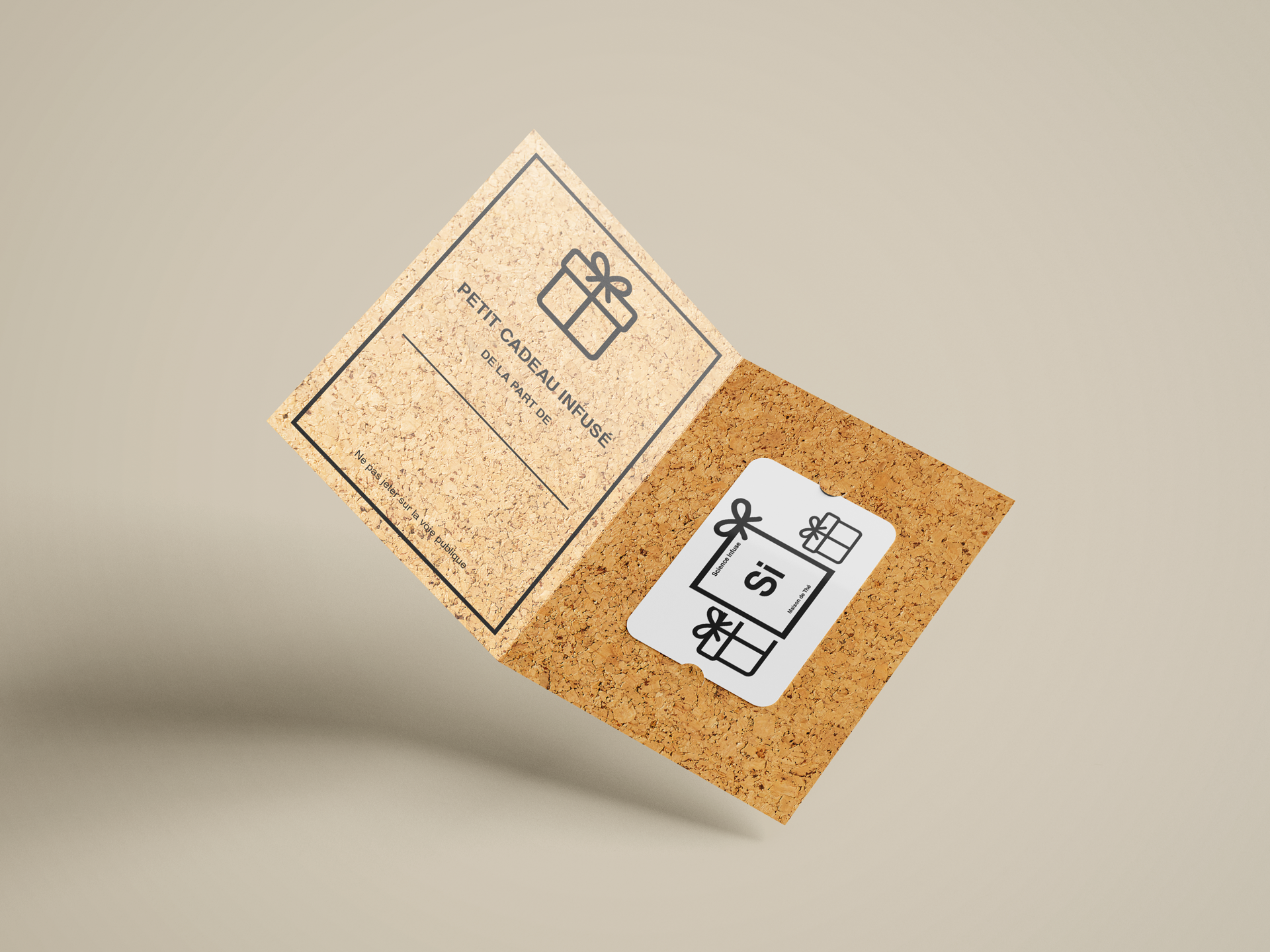
The same applies to gift bags and cards for a more "prestigious" look.


Signs

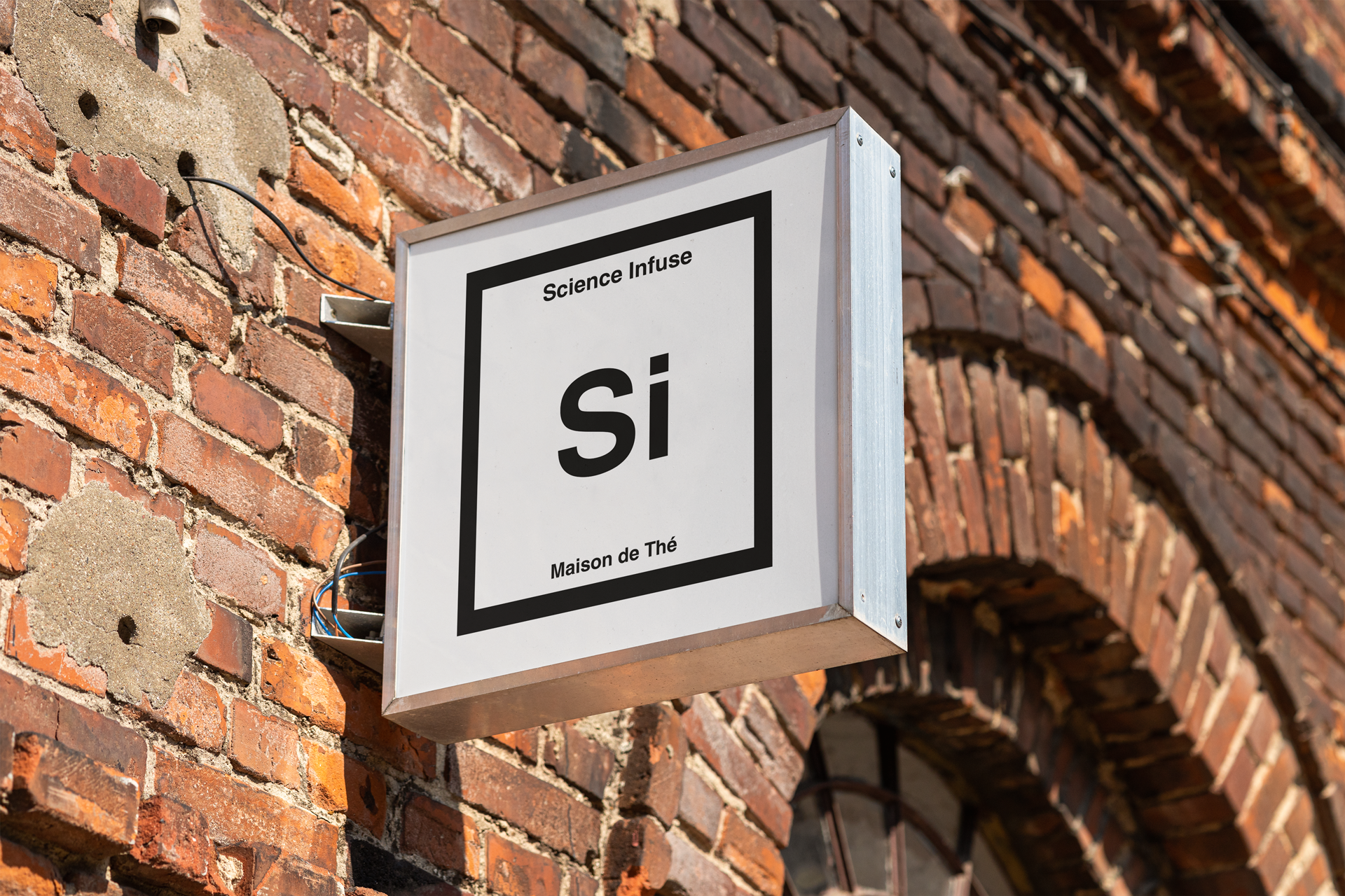
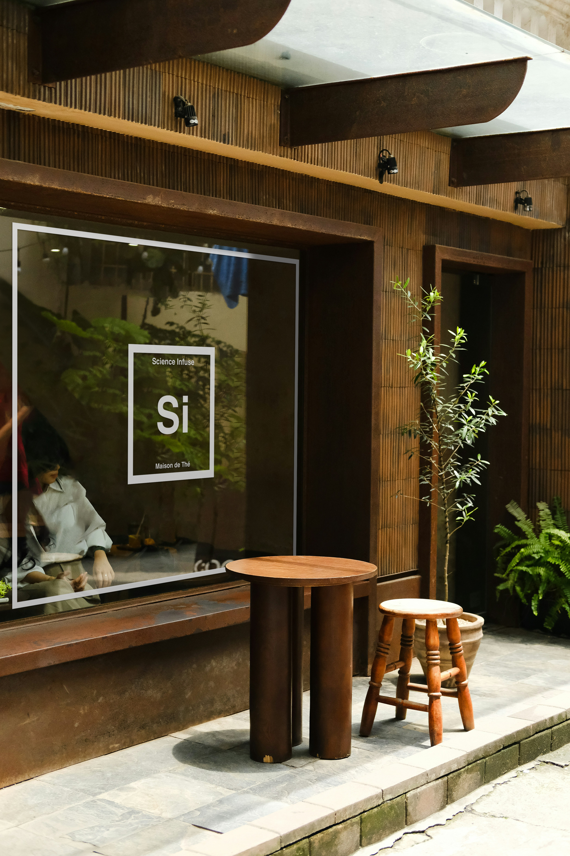
To push the concept all the way, I imagine what a store would look like. With more time and skills, I'd love to try my hand at interior design, but that's a gift for future-Me.

Shop Sign

Branding / Sign

Store Front

Branding / Sign


...& more!

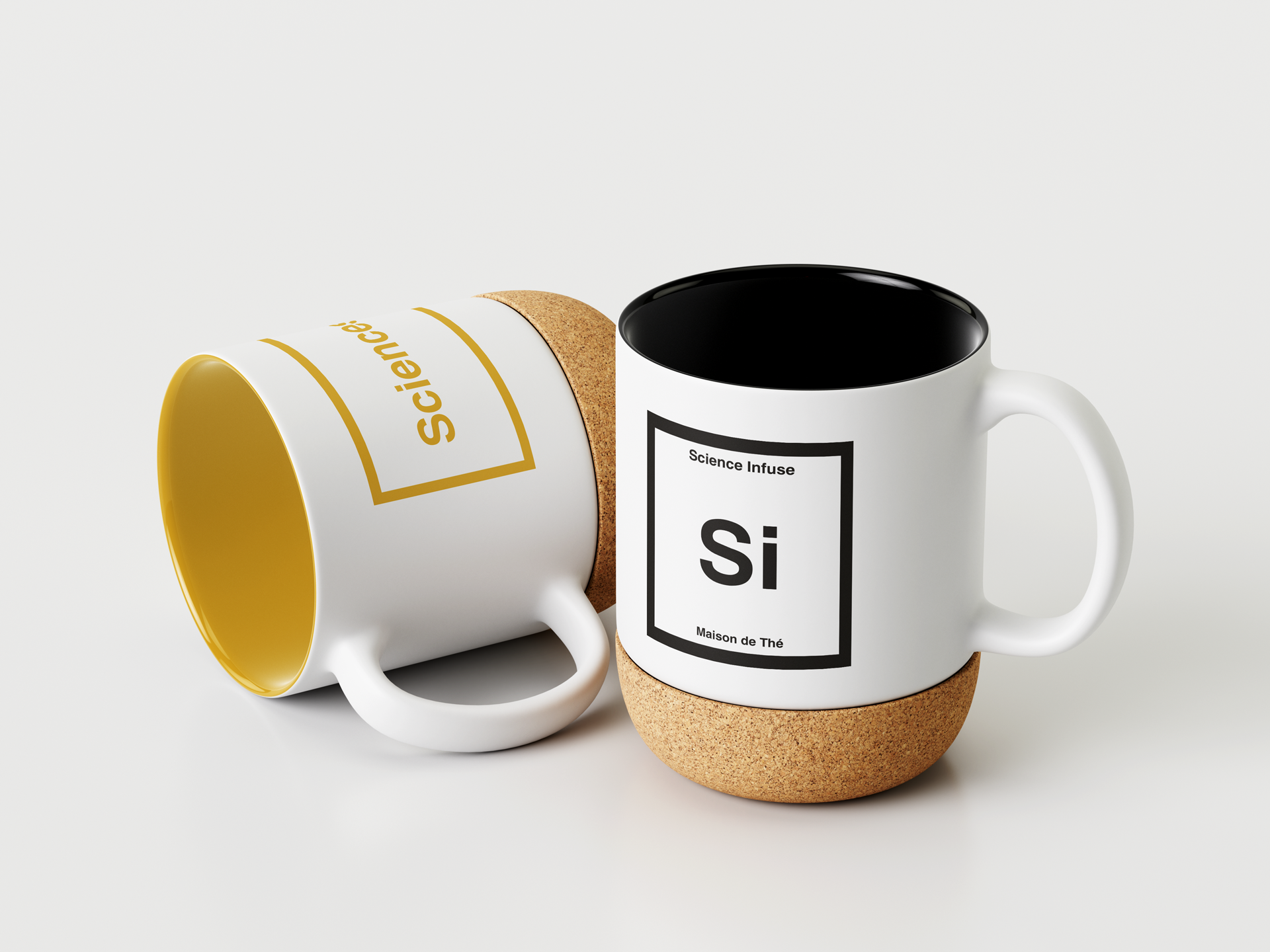
Because I love pretty objects and because I think good communication is also "soft advertisement", I imagined what Science Infuse could offer in addition to tea.
So I created things that I would like to see and use, and that would also keep the essence of the brand and spread its spirit.

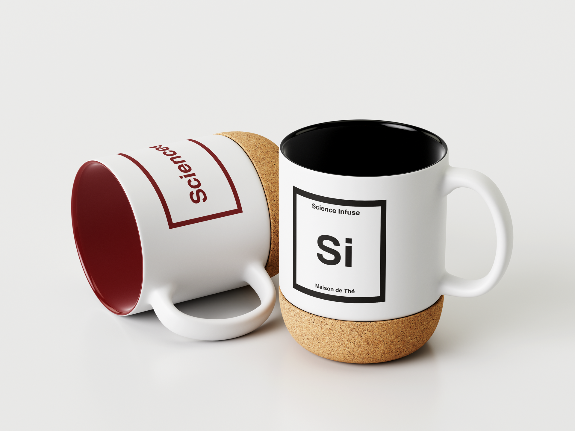
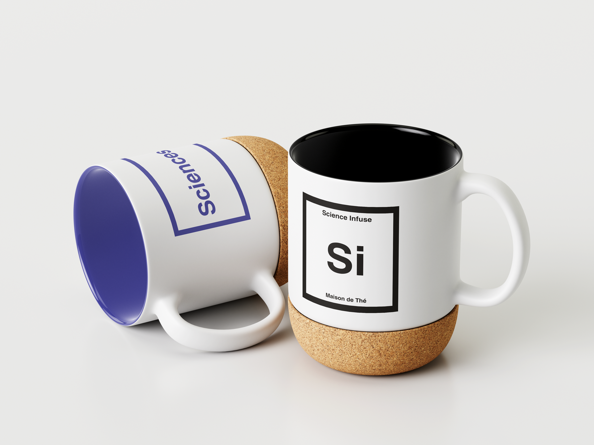
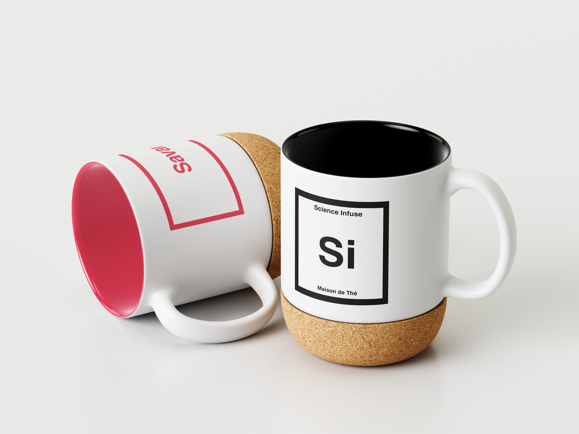
Human Sciences' Mug

Branding / Goodies

Physical Sciences' Mug

Branding / Goodies

Psychological Sciences' Mug

Branding / Goodies

Botanical Sciences' Mug

Branding / Goodies

Mad Scientistes' Mug

Branding / Goodies

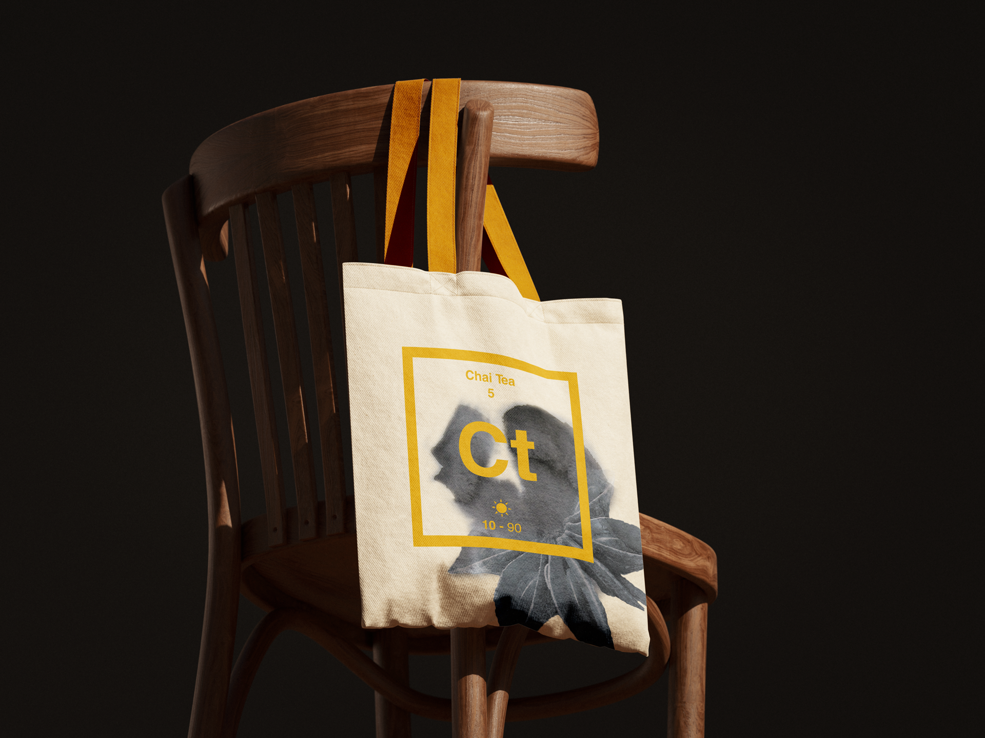
Ct's Tote Bag

Branding / Goodies

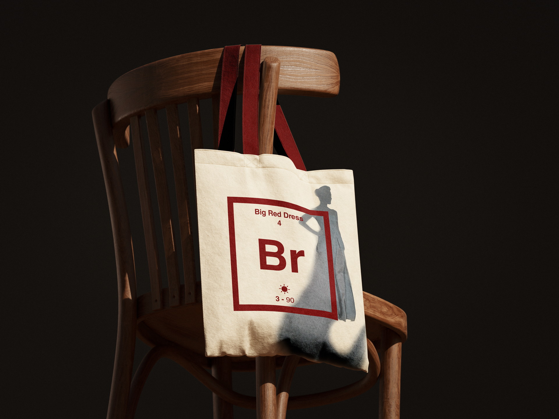
Br's Tote Bag

Branding / Goodies

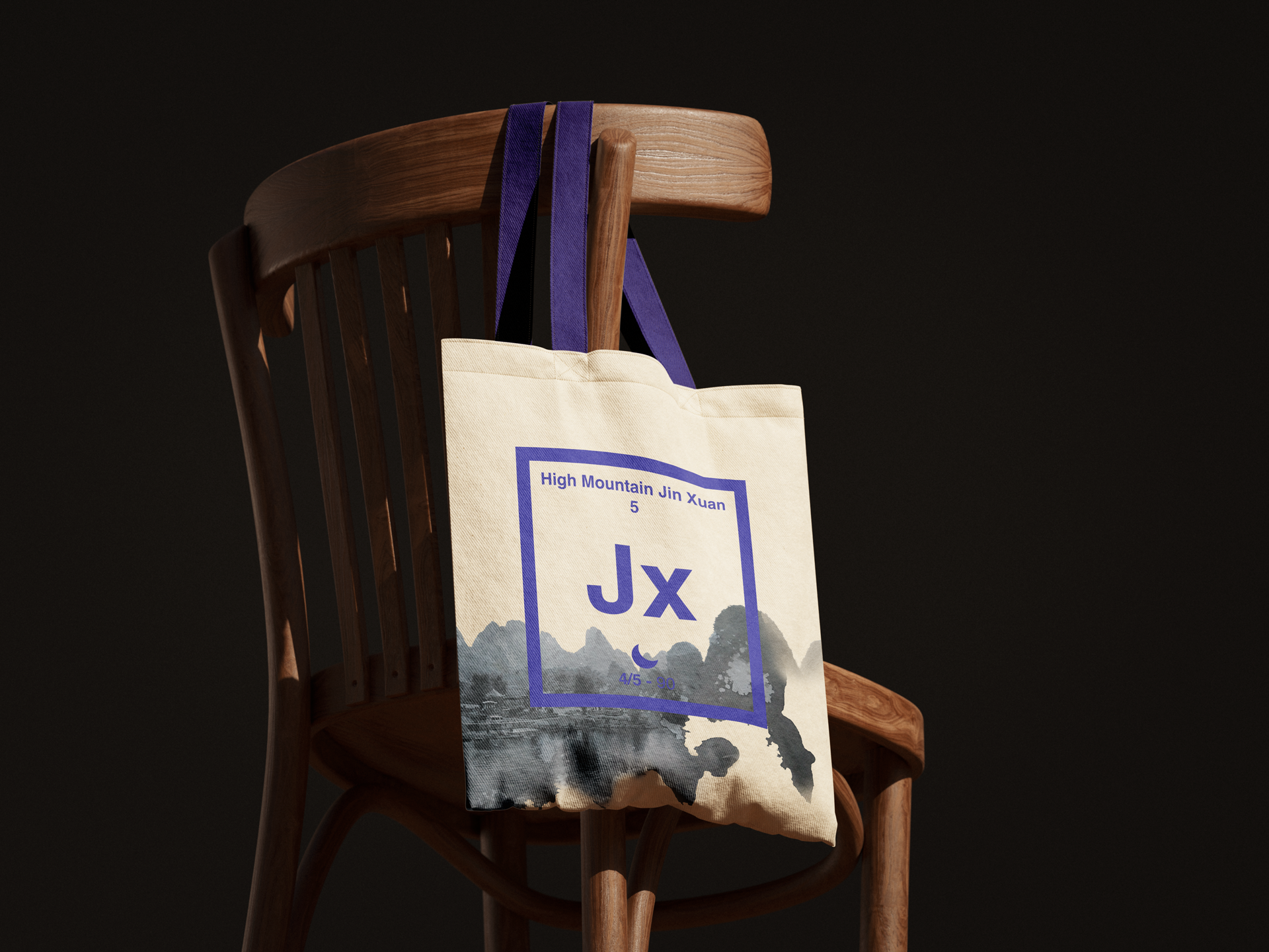
Jx's Tote Bag

Branding / Goodies

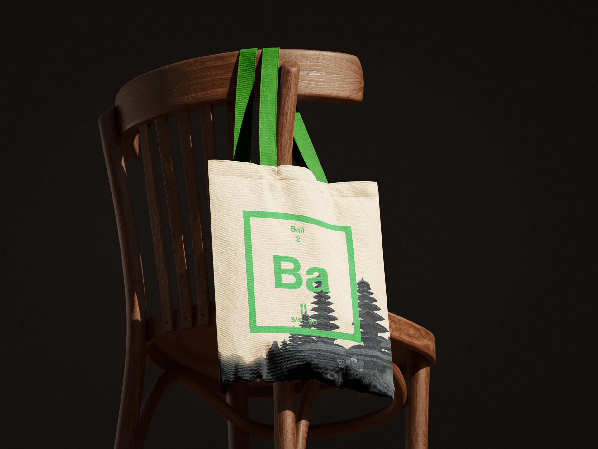
Ba's Tote Bag

Branding / Goodies

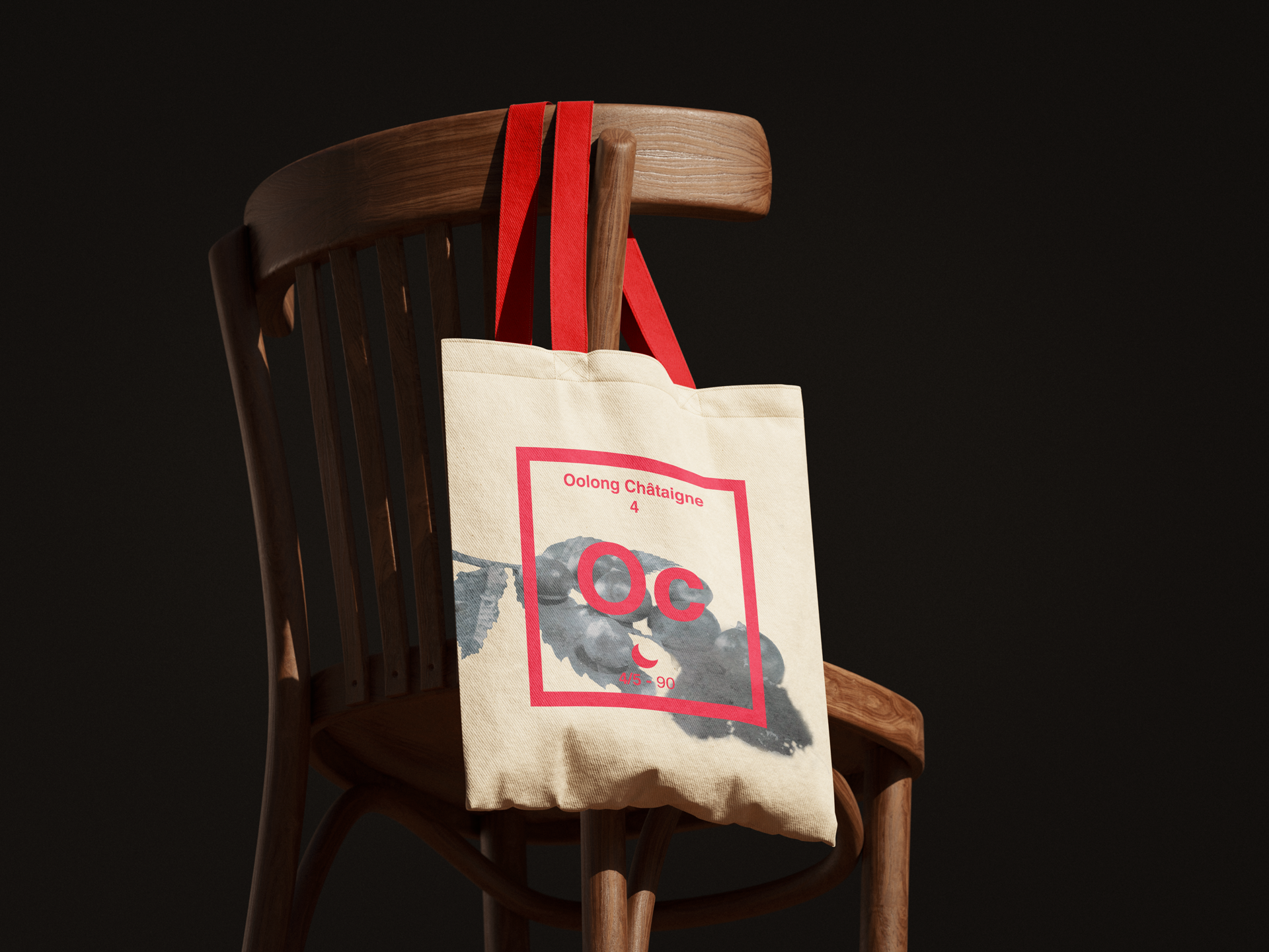
Oc's Tote Bag

Branding / Goodies

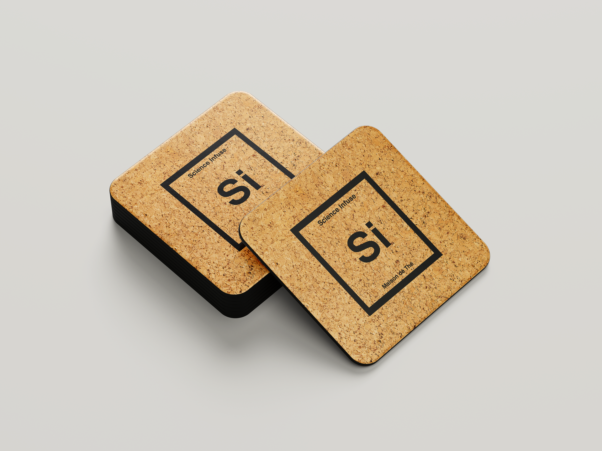
Costers

Branding / Goodies

Teas' Posters

Branding / Goodies


There's so much more I'd like to create for this concept. I keep coming back to it to try new things, new skills, to improve myself and how I create. It embodies what I love in Graphic and Web Design: how much I like to push an idea to explore its potential, confront ideas and different worlds, and mix them to create something new and unique.